plotCorrM
plotCorrM.RdPlot Correlation Matrix and Correlation vs. Time Gap
Arguments
- r
correlation matrix
- what
specifies whether to return plots or the data frame used in making the plots
- type
specifies whether to use bottom-aligned rectangles (the default) or centered circles
- xlab
x-axis label for correlation matrix
- ylab
y-axis label for correlation matrix
- maxsize
maximum circle size if
type='circle'- xangle
angle for placing x-axis labels, defaulting to 0. Consider using
xangle=45when labels are long.
Value
a list containing two ggplot2 objects if what='plots', or a data frame if what='data'
Details
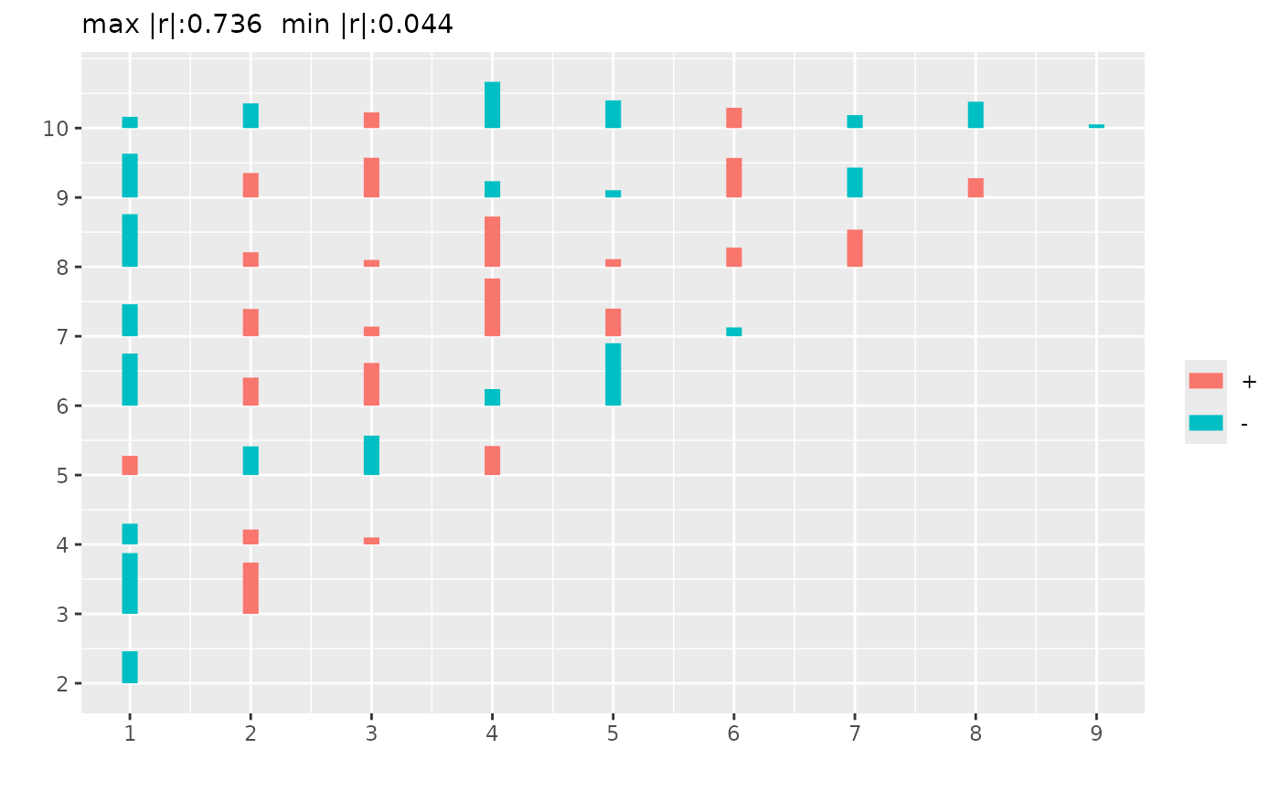
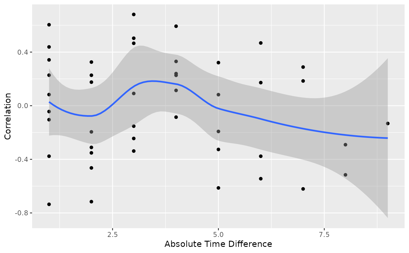
Constructs two ggplot2 graphics. The first is a half matrix of rectangles where the height of the rectangle is proportional to the absolute value of the correlation coefficient, with positive and negative coefficients shown in different colors. The second graphic is a variogram-like graph of correlation coefficients on the y-axis and absolute time gap on the x-axis, with a loess smoother added. The times are obtained from the correlation matrix's row and column names if these are numeric. If any names are not numeric, the times are taken as the integers 1, 2, 3, ... The two graphics are ggplotly-ready if you use plotly::ggplotly(..., tooltip='label').
Examples
set.seed(1)
r <- cor(matrix(rnorm(100), ncol=10))
g <- plotCorrM(r)
g[[1]] # plot matrix
 g[[2]] # plot correlation vs gap time
#> `geom_smooth()` using formula = 'y ~ x'
#> Warning: The following aesthetics were dropped during statistical transformation: label.
#> ℹ This can happen when ggplot fails to infer the correct grouping structure in
#> the data.
#> ℹ Did you forget to specify a `group` aesthetic or to convert a numerical
#> variable into a factor?
g[[2]] # plot correlation vs gap time
#> `geom_smooth()` using formula = 'y ~ x'
#> Warning: The following aesthetics were dropped during statistical transformation: label.
#> ℹ This can happen when ggplot fails to infer the correct grouping structure in
#> the data.
#> ℹ Did you forget to specify a `group` aesthetic or to convert a numerical
#> variable into a factor?
 # ggplotlyr(g[[2]])
# ggplotlyr uses ggplotly with tooltip='label' then removes
# txt: from hover text
# ggplotlyr(g[[2]])
# ggplotlyr uses ggplotly with tooltip='label' then removes
# txt: from hover text