Summarize Multiple Response Variables and Make Multipanel Scatter or Dot Plot
summaryS.RdMultiple left-hand formula variables along with right-hand side
conditioning variables are reshaped into a "tall and thin" data frame if
fun is not specified. The resulting raw data can be plotted with
the plot method using user-specified panel functions for
lattice graphics, typically to make a scatterplot or loess
smooths, or both. The Hmisc panel.plsmo function is handy
in this context. Instead, if fun is specified, this function
takes individual response variables (which may be matrices, as in
Surv objects) and creates one or more summary
statistics that will be computed while the resulting data frame is being
collapsed to one row per condition. The plot method in this case
plots a multi-panel dot chart using the lattice
dotplot function if panel is not specified
to plot. There is an option to print
selected statistics as text on the panels. summaryS pays special
attention to Hmisc variable annotations: label, units.
When panel is specified in addition to fun, a special
x-y plot is made that assumes that the x-axis variable
(typically time) is discrete. This is used for example to plot multiple
quantile intervals as vertical lines next to the main point. A special
panel function mvarclPanel is provided for this purpose.
The plotp method produces corresponding plotly graphics.
When fun is given and panel is omitted, and the result of
fun is a vector of more than one
statistic, the first statistic is taken as the main one. Any columns
with names not in textonly will figure into the calculation of
axis limits. Those in textonly will be printed right under the
dot lines in the dot chart. Statistics with names in textplot
will figure into limits, be plotted, and printed. pch.stats can
be used to specify symbols for statistics after the first column. When
fun computed three columns that are plotted, columns two and
three are taken as confidence limits for which horizontal "error bars"
are drawn. Two levels with different thicknesses are drawn if there are
four plotted summary statistics beyond the first.
mbarclPanel is used to draw multiple vertical lines around the
main points, such as a series of quantile intervals stratified by
x and paneling variables. If mbarclPanel finds a column
of an arument yother that is named "se", and if there are
exactly two levels to a superpositioning variable, the half-height of
the approximate 0.95 confidence interval for the difference between two
point estimates is shown, positioned at the midpoint of the two point
estimates at an x value. This assume normality of point
estimates, and the standard error of the difference is the square root
of the sum of squares of the two standard errors. By positioning the
intervals in this fashion, a failure of the two point estimates to touch
the half-confidence interval is consistent with rejecting the null
hypothesis of no difference at the 0.05 level.
mbarclpl is the sfun function corresponding to
mbarclPanel for plotp, and medvpl is the
sfun replacement for medvPanel.
medvPanel takes raw data and plots median y vs. x,
along with confidence intervals and half-interval for the difference in
medians as with mbarclPanel. Quantile intervals are optional.
Very transparent vertical violin plots are added by default. Unlike
panel.violin, only half of the violin is plotted, and when there
are two superpose groups they are side-by-side in different colors.
For plotp, the function corresponding to medvPanel is
medvpl, which draws back-to-back spike histograms, optional Gini
mean difference, optional SD, quantiles (thin line version of box
plot with 0.05 0.25 0.5 0.75 0.95 quantiles), and half-width confidence
interval for differences in medians. For quantiles, the Harrell-Davis
estimator is used.
summaryS(formula, fun = NULL, data = NULL, subset = NULL,
         na.action = na.retain, continuous=10, ...)

# S3 method for class 'summaryS'
plot(x, formula=NULL, groups=NULL, panel=NULL,
           paneldoesgroups=FALSE, datadensity=NULL, ylab='',
           funlabel=NULL, textonly='n', textplot=NULL,
           digits=3, custom=NULL,
           xlim=NULL, ylim=NULL, cex.strip=1, cex.values=0.5, pch.stats=NULL,
           key=list(columns=length(groupslevels),
             x=.75, y=-.04, cex=.9,
             col=lattice::trellis.par.get('superpose.symbol')$col,
             corner=c(0,1)),
           outerlabels=TRUE, autoarrange=TRUE, scat1d.opts=NULL, ...)

# S3 method for class 'summaryS'
plotp(data, formula=NULL, groups=NULL, sfun=NULL,
           fitter=NULL, showpts=! length(fitter), funlabel=NULL,
           digits=5, xlim=NULL, ylim=NULL,
           shareX=TRUE, shareY=FALSE, autoarrange=TRUE, ...)

mbarclPanel(x, y, subscripts, groups=NULL, yother, ...)

medvPanel(x, y, subscripts, groups=NULL, violin=TRUE, quantiles=FALSE, ...)

mbarclpl(x, y, groups=NULL, yother, yvar=NULL, maintracename='y',
         xlim=NULL, ylim=NULL, xname='x', alphaSegments=0.45, ...)

medvpl(x, y, groups=NULL, yvar=NULL, maintracename='y',
       xlim=NULL, ylim=NULL, xlab=xname, ylab=NULL, xname='x',
       zeroline=FALSE, yother=NULL, alphaSegments=0.45,
       dhistboxp.opts=NULL, ...)
Arguments
- formula
a formula with possibly multiple left and right-side variables separated by
+. Analysis (response) variables are on the left and are typically numeric. Forplot,formulais optional and overrides the default formula inferred for the reshaped data frame.- fun
an optional summarization function, e.g.,
smean.sd- data
optional input data frame. For
plotpis the object produced bysummaryS.- subset
optional subsetting criteria
- na.action
function for dealing with
NAs when constructing the model data frame- continuous
minimum number of unique values for a numeric variable to have to be considered continuous
- ...
ignored for
summarySandmbarclPanel, passed tostripandpanelforplot. Passed to thedensityfunction bymedvPanel. Forplotp, are passed toplotlyMandsfun. Formbarclpl, passed toplotlyM.- x
an object created by
summaryS. FormbarclPanelis anx-axis argument provided bylattice- groups
a character string or factor specifying that one of the conditioning variables is used for superpositioning and not paneling
- panel
optional
latticepanelfunction- paneldoesgroups
set to
TRUEif, likepanel.plsmo, the paneling function internally handles superpositioning forgroups- datadensity
set to
TRUEto add rug plots etc. usingscat1d- ylab
optional
y-axis label- funlabel
optional axis label for when
funis given- textonly
names of statistics to print and not plot. By default, any statistic named
"n"is only printed.- textplot
names of statistics to print and plot
- digits
used if any statistics are printed as text (including
plotlyhovertext), to specify the number of significant digits to render- custom
a function that customizes formatting of statistics that are printed as text. This is useful for generating plotmath notation. See the example in the tests directory.
- xlim
optional
x-axis limits- ylim
optional
y-axis limits- cex.strip
size of strip labels
- cex.values
size of statistics printed as text
- pch.stats
symbols to use for statistics (not included the one one in columne one) that are plotted. This is a named vectors, with names exactly matching those created by
fun. When a column does not have an entry inpch.stats, no point is drawn for that column.- key
latticekeyspecification- outerlabels
set to
FALSEto not pass two-way charts throughuseOuterStrips- autoarrange
set to
FALSEto preventplotfrom trying to optimize which conditioning variable is vertical- scat1d.opts
a list of options to specify to
scat1d- y, subscripts
provided by
lattice- yother
passed to the panel function from the
plotmethod based on multiple statistics computed- violin
controls whether violin plots are included
- quantiles
controls whether quantile intervals are included
- sfun
a function called by
plotp.summarySto compute and plot user-specified summary measures. Two functions for doing this are provided here:mbarclpl, medvpl.- fitter
a fitting function such as
loessto smooth points. The smoothed values over a systematic grid will be evaluated and plotted as curves.- showpts
set to
TRUEto show raw data points in additon to smoothed curvesTRUEto causeplotlyto share a single x-axis when graphs are aligned verticallyTRUEto causeplotlyto share a single y-axis when graphs are aligned horizontally- yvar
a character or factor variable used to stratify the analysis into multiple y-variables
- maintracename
a default trace name when it can't be inferred
- xname
x-axis variable name for hover text when it can't be inferred
- xlab
x-axis label when it can't be inferred
- alphaSegments
alpha saturation to draw line segments for
plotly- dhistboxp.opts
listof options to pass todhistboxp- zeroline
set to
FALSEto suppressplotlyzero line at x=0
Value
a data frame with added attributes for summaryS or a
lattice object ready to render for plot
Examples
# See tests directory file summaryS.r for more examples, and summarySp.r
# for plotp examples
require(survival)
n <- 100
set.seed(1)
d <- data.frame(sbp=rnorm(n, 120, 10),
dbp=rnorm(n, 80, 10),
age=rnorm(n, 50, 10),
days=sample(1:n, n, TRUE),
S1=Surv(2*runif(n)), S2=Surv(runif(n)),
race=sample(c('Asian', 'Black/AA', 'White'), n, TRUE),
sex=sample(c('Female', 'Male'), n, TRUE),
treat=sample(c('A', 'B'), n, TRUE),
region=sample(c('North America','Europe'), n, TRUE),
meda=sample(0:1, n, TRUE), medb=sample(0:1, n, TRUE))
d <- upData(d, labels=c(sbp='Systolic BP', dbp='Diastolic BP',
race='Race', sex='Sex', treat='Treatment',
days='Time Since Randomization',
S1='Hospitalization', S2='Re-Operation',
meda='Medication A', medb='Medication B'),
units=c(sbp='mmHg', dbp='mmHg', age='Year', days='Days'))
#> Input object size: 14568 bytes; 12 variables 100 observations
#> New object size: 20320 bytes; 12 variables 100 observations
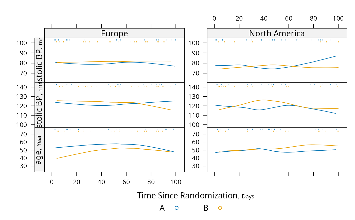
s <- summaryS(age + sbp + dbp ~ days + region + treat, data=d)
# plot(s) # 3 pages
plot(s, groups='treat', datadensity=TRUE,
scat1d.opts=list(lwd=.5, nhistSpike=0))
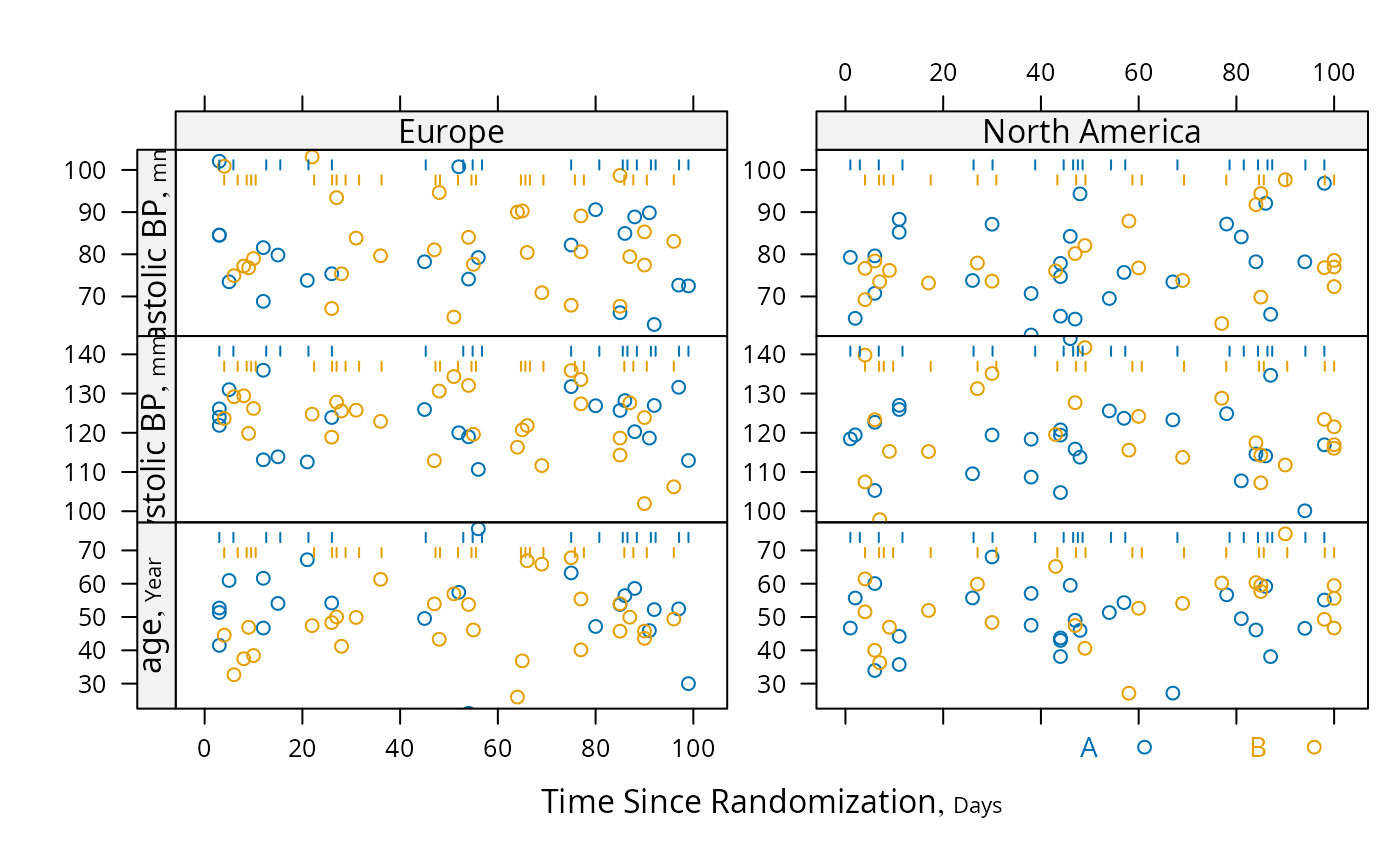 plot(s, groups='treat', panel=lattice::panel.loess,
key=list(space='bottom', columns=2),
datadensity=TRUE, scat1d.opts=list(lwd=.5))
plot(s, groups='treat', panel=lattice::panel.loess,
key=list(space='bottom', columns=2),
datadensity=TRUE, scat1d.opts=list(lwd=.5))
 # To make a plotly graph when the stratification variable region is not
# present, run the following (showpts adds raw data points):
# plotp(s, groups='treat', fitter=loess, showpts=TRUE)
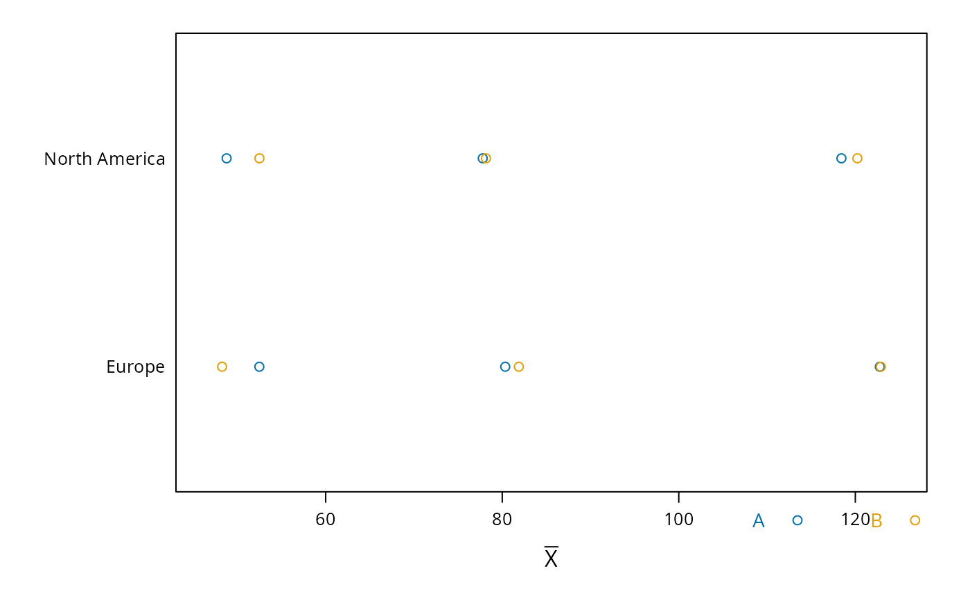
# Make your own plot using data frame created by summaryP
# xyplot(y ~ days | yvar * region, groups=treat, data=s,
# scales=list(y='free', rot=0))
# Use loess to estimate the probability of two different types of events as
# a function of time
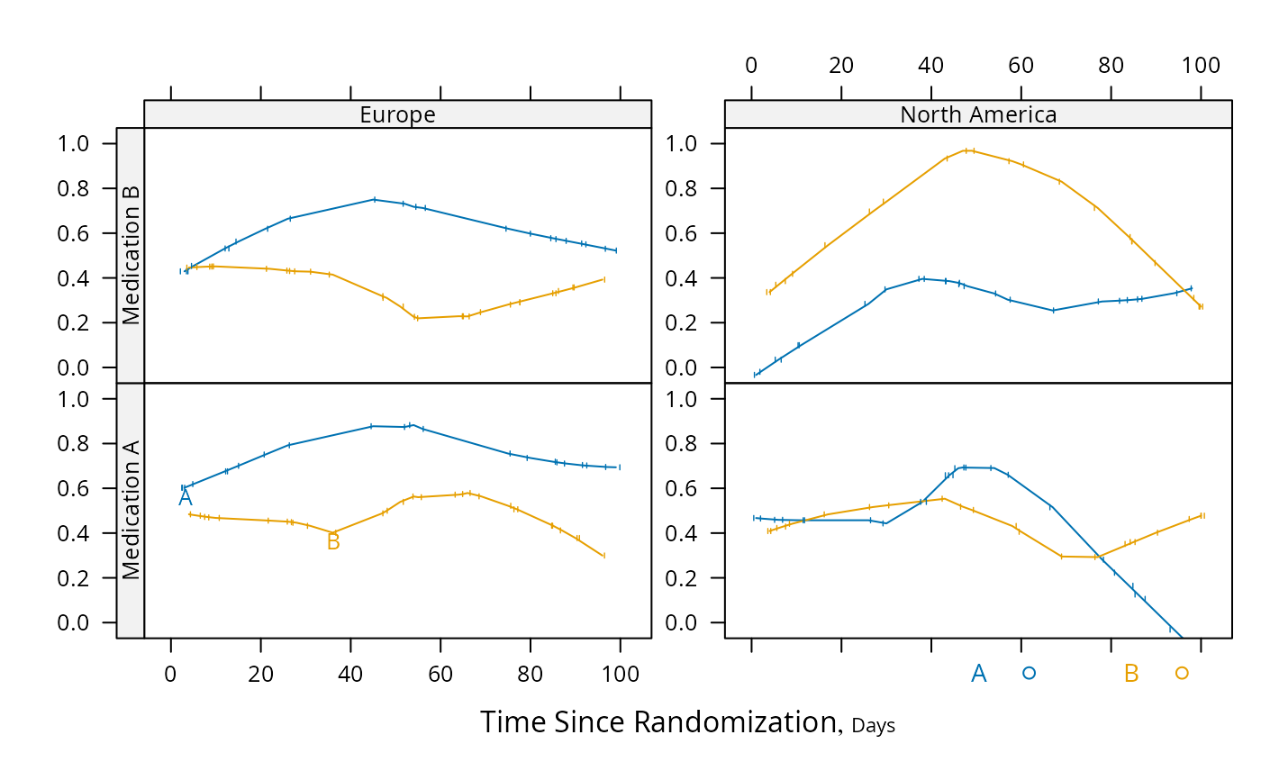
s <- summaryS(meda + medb ~ days + treat + region, data=d)
pan <- function(...)
panel.plsmo(..., type='l', label.curves=max(which.packet()) == 1,
datadensity=TRUE)
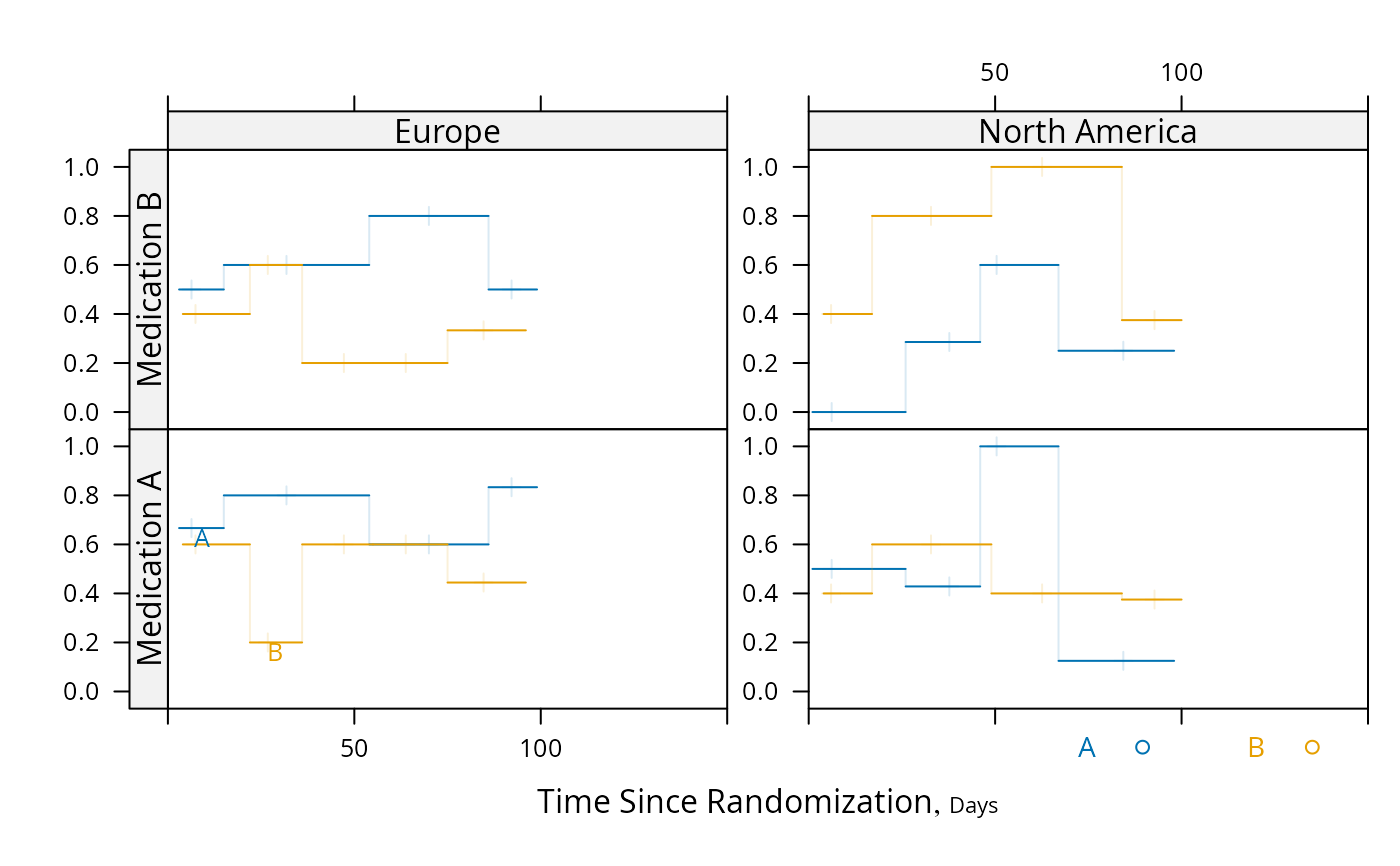
plot(s, groups='treat', panel=pan, paneldoesgroups=TRUE,
scat1d.opts=list(lwd=.7), cex.strip=.8)
#> Warning: collapsing to unique 'x' values
#> Warning: collapsing to unique 'x' values
#> Warning: collapsing to unique 'x' values
#> Warning: collapsing to unique 'x' values
#> Warning: collapsing to unique 'x' values
#> Warning: collapsing to unique 'x' values
#> Warning: collapsing to unique 'x' values
#> Warning: collapsing to unique 'x' values
#> Warning: collapsing to unique 'x' values
#> Warning: collapsing to unique 'x' values
#> Warning: collapsing to unique 'x' values
#> Warning: collapsing to unique 'x' values
# To make a plotly graph when the stratification variable region is not
# present, run the following (showpts adds raw data points):
# plotp(s, groups='treat', fitter=loess, showpts=TRUE)
# Make your own plot using data frame created by summaryP
# xyplot(y ~ days | yvar * region, groups=treat, data=s,
# scales=list(y='free', rot=0))
# Use loess to estimate the probability of two different types of events as
# a function of time
s <- summaryS(meda + medb ~ days + treat + region, data=d)
pan <- function(...)
panel.plsmo(..., type='l', label.curves=max(which.packet()) == 1,
datadensity=TRUE)
plot(s, groups='treat', panel=pan, paneldoesgroups=TRUE,
scat1d.opts=list(lwd=.7), cex.strip=.8)
#> Warning: collapsing to unique 'x' values
#> Warning: collapsing to unique 'x' values
#> Warning: collapsing to unique 'x' values
#> Warning: collapsing to unique 'x' values
#> Warning: collapsing to unique 'x' values
#> Warning: collapsing to unique 'x' values
#> Warning: collapsing to unique 'x' values
#> Warning: collapsing to unique 'x' values
#> Warning: collapsing to unique 'x' values
#> Warning: collapsing to unique 'x' values
#> Warning: collapsing to unique 'x' values
#> Warning: collapsing to unique 'x' values
 # Repeat using intervals instead of nonparametric smoother
pan <- function(...) # really need mobs > 96 to est. proportion
panel.plsmo(..., type='l', label.curves=max(which.packet()) == 1,
method='intervals', mobs=5)
plot(s, groups='treat', panel=pan, paneldoesgroups=TRUE, xlim=c(0, 150))
# Repeat using intervals instead of nonparametric smoother
pan <- function(...) # really need mobs > 96 to est. proportion
panel.plsmo(..., type='l', label.curves=max(which.packet()) == 1,
method='intervals', mobs=5)
plot(s, groups='treat', panel=pan, paneldoesgroups=TRUE, xlim=c(0, 150))
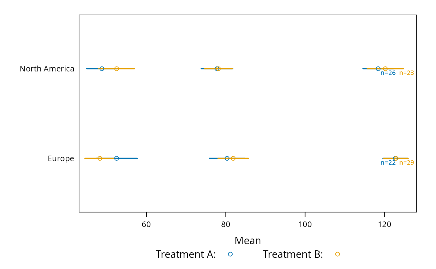
 # Demonstrate dot charts of summary statistics
s <- summaryS(age + sbp + dbp ~ region + treat, data=d, fun=mean)
plot(s)
# Demonstrate dot charts of summary statistics
s <- summaryS(age + sbp + dbp ~ region + treat, data=d, fun=mean)
plot(s)
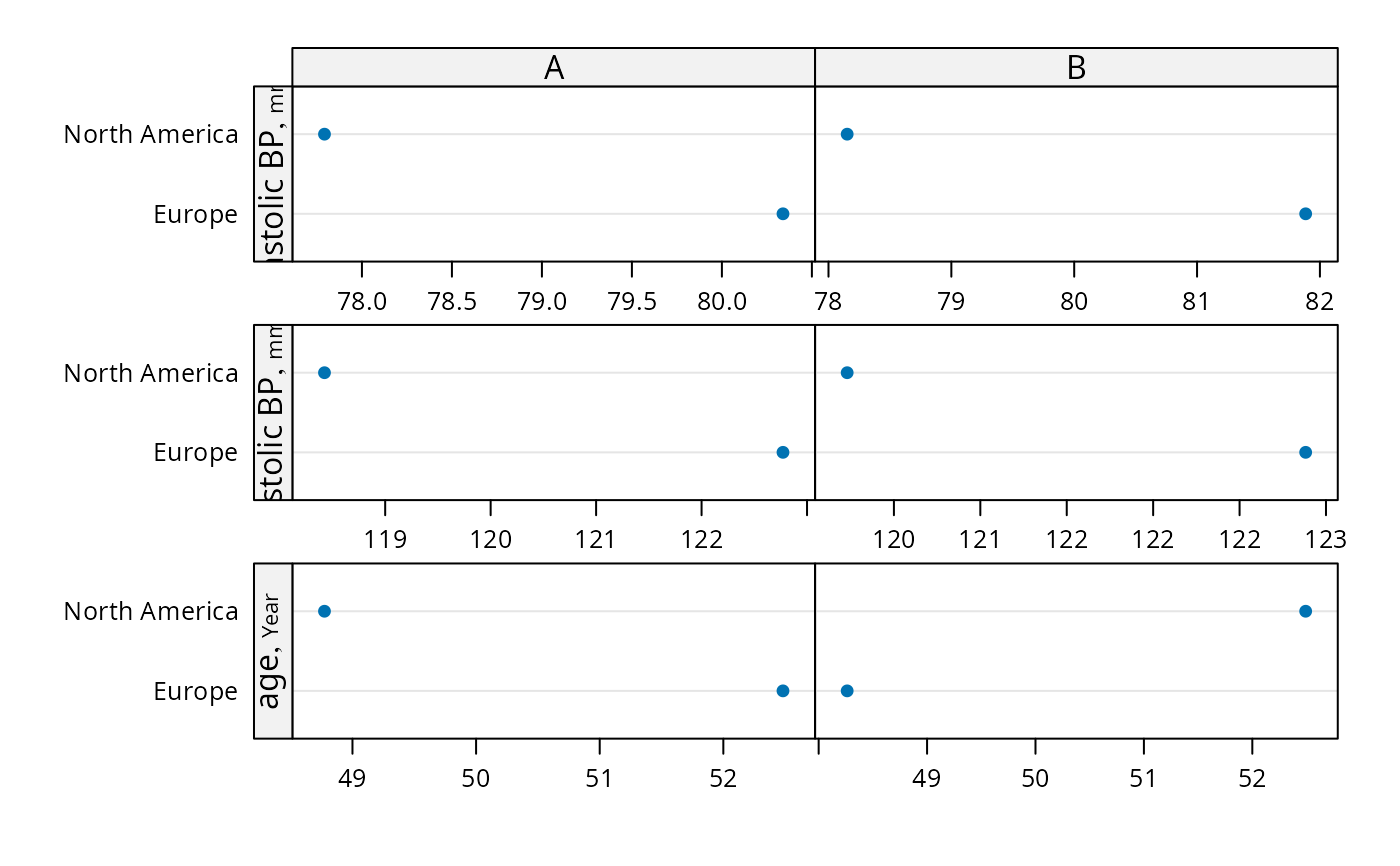 plot(s, groups='treat', funlabel=expression(bar(X)))
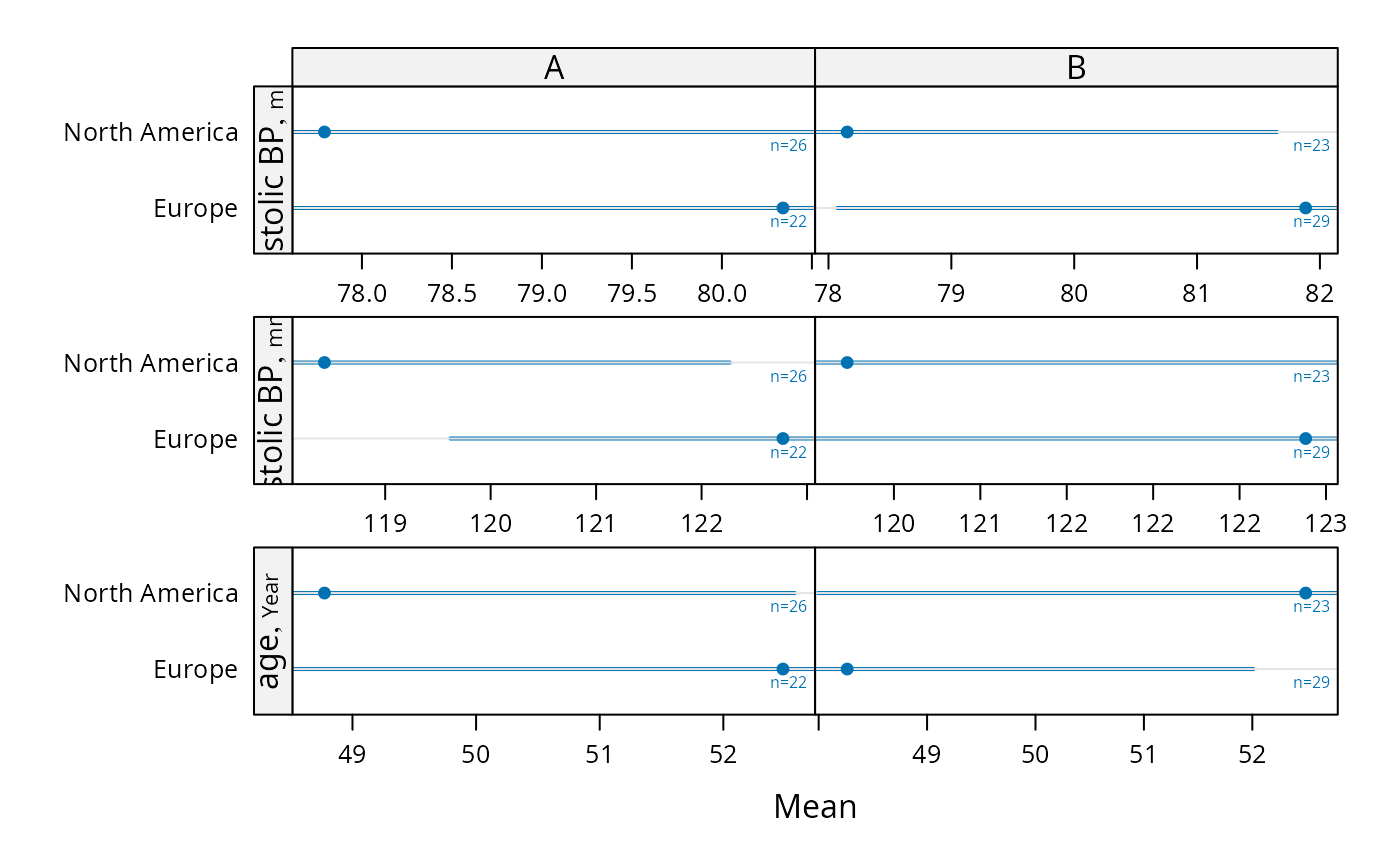
 # Compute parametric confidence limits for mean, and include sample
# sizes by naming a column "n"
f <- function(x) {
x <- x[! is.na(x)]
c(smean.cl.normal(x, na.rm=FALSE), n=length(x))
}
s <- summaryS(age + sbp + dbp ~ region + treat, data=d, fun=f)
plot(s, funlabel=expression(bar(X) %+-% t[0.975] %*% s))
# Compute parametric confidence limits for mean, and include sample
# sizes by naming a column "n"
f <- function(x) {
x <- x[! is.na(x)]
c(smean.cl.normal(x, na.rm=FALSE), n=length(x))
}
s <- summaryS(age + sbp + dbp ~ region + treat, data=d, fun=f)
plot(s, funlabel=expression(bar(X) %+-% t[0.975] %*% s))
 plot(s, groups='treat', cex.values=.65,
key=list(space='bottom', columns=2,
text=c('Treatment A:','Treatment B:')))
plot(s, groups='treat', cex.values=.65,
key=list(space='bottom', columns=2,
text=c('Treatment A:','Treatment B:')))
 # For discrete time, plot Harrell-Davis quantiles of y variables across
# time using different line characteristics to distinguish quantiles
d <- upData(d, days=round(days / 30) * 30)
#> Input object size: 20320 bytes; 12 variables 100 observations
#> Modified variable days
#> New object size: 20320 bytes; 12 variables 100 observations
g <- function(y) {
probs <- c(0.05, 0.125, 0.25, 0.375)
probs <- sort(c(probs, 1 - probs))
y <- y[! is.na(y)]
w <- hdquantile(y, probs)
m <- hdquantile(y, 0.5, se=TRUE)
se <- as.numeric(attr(m, 'se'))
c(Median=as.numeric(m), w, se=se, n=length(y))
}
s <- summaryS(sbp + dbp ~ days + region, fun=g, data=d)
plot(s, panel=mbarclPanel)
# For discrete time, plot Harrell-Davis quantiles of y variables across
# time using different line characteristics to distinguish quantiles
d <- upData(d, days=round(days / 30) * 30)
#> Input object size: 20320 bytes; 12 variables 100 observations
#> Modified variable days
#> New object size: 20320 bytes; 12 variables 100 observations
g <- function(y) {
probs <- c(0.05, 0.125, 0.25, 0.375)
probs <- sort(c(probs, 1 - probs))
y <- y[! is.na(y)]
w <- hdquantile(y, probs)
m <- hdquantile(y, 0.5, se=TRUE)
se <- as.numeric(attr(m, 'se'))
c(Median=as.numeric(m), w, se=se, n=length(y))
}
s <- summaryS(sbp + dbp ~ days + region, fun=g, data=d)
plot(s, panel=mbarclPanel)
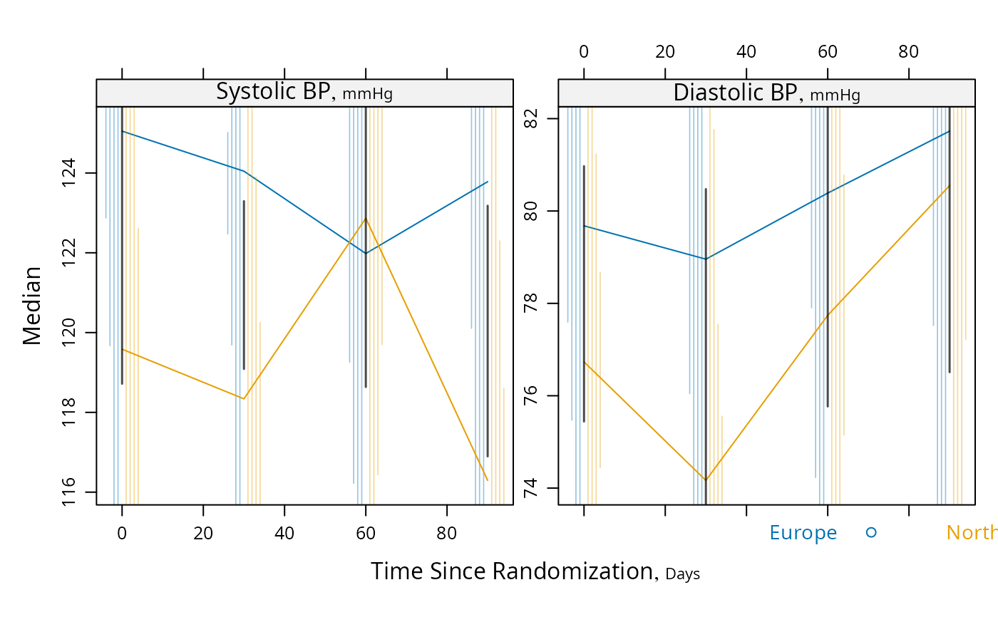
 plot(s, groups='region', panel=mbarclPanel, paneldoesgroups=TRUE)
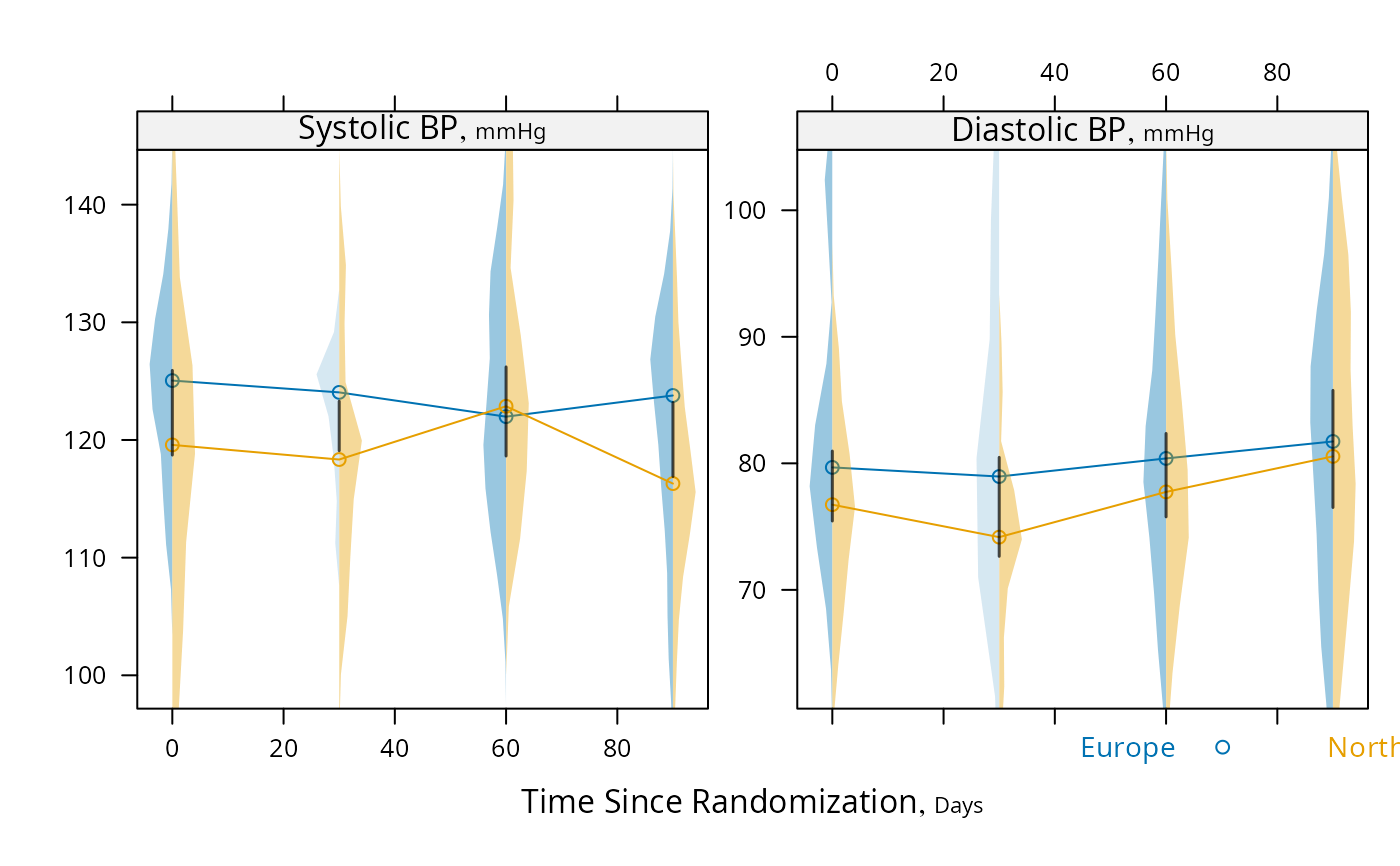
 # For discrete time, plot median y vs x along with CL for difference,
# using Harrell-Davis median estimator and its s.e., and use violin
# plots
s <- summaryS(sbp + dbp ~ days + region, data=d)
plot(s, groups='region', panel=medvPanel, paneldoesgroups=TRUE)
# For discrete time, plot median y vs x along with CL for difference,
# using Harrell-Davis median estimator and its s.e., and use violin
# plots
s <- summaryS(sbp + dbp ~ days + region, data=d)
plot(s, groups='region', panel=medvPanel, paneldoesgroups=TRUE)
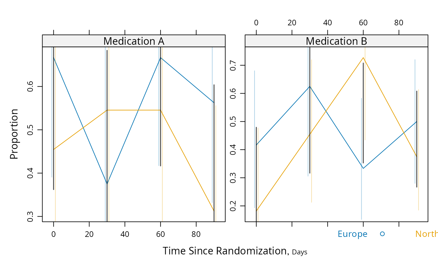
 # Proportions and Wilson confidence limits, plus approx. Gaussian
# based half/width confidence limits for difference in probabilities
g <- function(y) {
y <- y[!is.na(y)]
n <- length(y)
p <- mean(y)
se <- sqrt(p * (1. - p) / n)
structure(c(binconf(sum(y), n), se=se, n=n),
names=c('Proportion', 'Lower', 'Upper', 'se', 'n'))
}
s <- summaryS(meda + medb ~ days + region, fun=g, data=d)
plot(s, groups='region', panel=mbarclPanel, paneldoesgroups=TRUE)
# Proportions and Wilson confidence limits, plus approx. Gaussian
# based half/width confidence limits for difference in probabilities
g <- function(y) {
y <- y[!is.na(y)]
n <- length(y)
p <- mean(y)
se <- sqrt(p * (1. - p) / n)
structure(c(binconf(sum(y), n), se=se, n=n),
names=c('Proportion', 'Lower', 'Upper', 'se', 'n'))
}
s <- summaryS(meda + medb ~ days + region, fun=g, data=d)
plot(s, groups='region', panel=mbarclPanel, paneldoesgroups=TRUE)