Create a bar plot.
Usage
ggbarplot(
  data,
  x,
  y,
  combine = FALSE,
  merge = FALSE,
  color = "black",
  fill = "white",
  palette = NULL,
  size = NULL,
  width = NULL,
  title = NULL,
  xlab = NULL,
  ylab = NULL,
  facet.by = NULL,
  panel.labs = NULL,
  short.panel.labs = TRUE,
  select = NULL,
  remove = NULL,
  order = NULL,
  add = "none",
  add.params = list(),
  error.plot = "errorbar",
  label = FALSE,
  lab.col = "black",
  lab.size = 4,
  lab.pos = c("out", "in"),
  lab.vjust = NULL,
  lab.hjust = NULL,
  lab.nb.digits = NULL,
  sort.val = c("none", "desc", "asc"),
  sort.by.groups = TRUE,
  top = Inf,
  position = position_stack(),
  numeric.x.axis = FALSE,
  ggtheme = theme_pubr(),
  ...
)
Arguments
- data
a data frame
- x, y
x and y variables for drawing.
- combine
logical value. Default is FALSE. Used only when y is a vector containing multiple variables to plot. If TRUE, create a multi-panel plot by combining the plot of y variables.
- merge
logical or character value. Default is FALSE. Used only when y is a vector containing multiple variables to plot. If TRUE, merge multiple y variables in the same plotting area. Allowed values include also "asis" (TRUE) and "flip". If merge = "flip", then y variables are used as x tick labels and the x variable is used as grouping variable.
- color, fill
outline and fill colors.
- palette
the color palette to be used for coloring or filling by groups. Allowed values include "grey" for grey color palettes; brewer palettes e.g. "RdBu", "Blues", ...; or custom color palette e.g. c("blue", "red"); and scientific journal palettes from ggsci R package, e.g.: "npg", "aaas", "lancet", "jco", "ucscgb", "uchicago", "simpsons" and "rickandmorty".
- size
Numeric value (e.g.: size = 1). change the size of points and outlines.
- width
numeric value between 0 and 1 specifying the width of the plot elements.
- title
plot main title.
- xlab
character vector specifying x axis labels. Use xlab = FALSE to hide xlab.
- ylab
character vector specifying y axis labels. Use ylab = FALSE to hide ylab.
- facet.by
character vector, of length 1 or 2, specifying grouping variables for faceting the plot into multiple panels. Should be in the data.
- panel.labs
a list of one or two character vectors to modify facet panel labels. For example, panel.labs = list(sex = c("Male", "Female")) specifies the labels for the "sex" variable. For two grouping variables, you can use for example panel.labs = list(sex = c("Male", "Female"), rx = c("Obs", "Lev", "Lev2") ).
- short.panel.labs
logical value. Default is TRUE. If TRUE, create short labels for panels by omitting variable names; in other words panels will be labelled only by variable grouping levels.
- select
character vector specifying which items to display.
- remove
character vector specifying which items to remove from the plot.
- order
character vector specifying the order of items.
- add
character vector for adding another plot element (e.g.: dot plot or error bars). Allowed values are one or the combination of: "none", "dotplot", "jitter", "boxplot", "point", "mean", "mean_se", "mean_sd", "mean_ci", "mean_range", "median", "median_iqr", "median_hilow", "median_q1q3", "median_mad", "median_range"; see ?desc_statby for more details.
- add.params
parameters (color, shape, size, fill, linetype) for the argument 'add'; e.g.: add.params = list(color = "red").
- error.plot
plot type used to visualize error. Allowed values are one of c("pointrange", "linerange", "crossbar", "errorbar", "upper_errorbar", "lower_errorbar", "upper_pointrange", "lower_pointrange", "upper_linerange", "lower_linerange"). Default value is "pointrange" or "errorbar". Used only when add != "none" and add contains one "mean_*" or "med_*" where "*" = sd, se, ....
- label
specify whether to add labels on the bar plot. Allowed values are:
logical value: If TRUE, y values are added as labels on the bar plot
character vector: Used as text labels; must be the same length as y.
- lab.col, lab.size
text color and size for labels.
- lab.pos
character specifying the position for labels. Allowed values are "out" (for outside) or "in" (for inside). Ignored when lab.vjust != NULL.
- lab.vjust
numeric, vertical justification of labels. Provide negative value (e.g.: -0.4) to put labels outside the bars or positive value to put labels inside (e.g.: 2).
- lab.hjust
numeric, horizontal justification of labels.
- lab.nb.digits
integer indicating the number of decimal places (round) to be used.
- sort.val
a string specifying whether the value should be sorted. Allowed values are "none" (no sorting), "asc" (for ascending) or "desc" (for descending).
- sort.by.groups
logical value. If TRUE the data are sorted by groups. Used only when sort.val != "none".
- top
a numeric value specifying the number of top elements to be shown.
- position
position adjustment, either as a string, or the result of a call to a position adjustment function (e.g.
position_dodge(0.8)). Used to control the spacing between grouped elements.- numeric.x.axis
logical. If TRUE, x axis will be treated as numeric. Default is FALSE. Useful, for example, to plot bars at their numeric x positions (e.g. a time axis) instead of at equally-spaced discrete categories. Ignored when
orderis set orsort.val != "none", which require a discrete x axis.- ggtheme
function, ggplot2 theme name. Default value is theme_pubr(). Set ggtheme = NULL to skip applying a ggpubr theme, so the plot keeps ggplot2 default theme or the theme set globally via theme_set(). Allowed values include ggplot2 official themes: theme_gray(), theme_bw(), theme_minimal(), theme_classic(), theme_void(), ....
- ...
other arguments to be passed to be passed to ggpar().
Details
The plot can be easily customized using the function ggpar(). Read ?ggpar for changing:
main title and axis labels: main, xlab, ylab
axis limits: xlim, ylim (e.g.: ylim = c(0, 30))
axis scales: xscale, yscale (e.g.: yscale = "log2")
color palettes: palette = "Dark2" or palette = c("gray", "blue", "red")
legend title, labels and position: legend = "right"
plot orientation : orientation = c("vertical", "horizontal", "reverse")
Faceting a summarized bar plot
When the bars show a computed summary (e.g. add = "mean_se"), facet the
plot with the facet.by argument - not by appending
+ facet_wrap() / + facet_grid(). The summaries are pre-computed,
grouping by x, color/fill and facet.by; a facet added
afterwards is not part of that grouping, so the bars (and, for stacked bars, the
error bars) are pooled over the whole data set and repeated identically in every
panel. Use ggbarplot(..., facet.by = "group") for correct per-panel
summaries.
Examples
# Data
df <- data.frame(
dose = c("D0.5", "D1", "D2"),
len = c(4.2, 10, 29.5)
)
print(df)
#> dose len
#> 1 D0.5 4.2
#> 2 D1 10.0
#> 3 D2 29.5
# Basic plot with label outsite
# +++++++++++++++++++++++++++
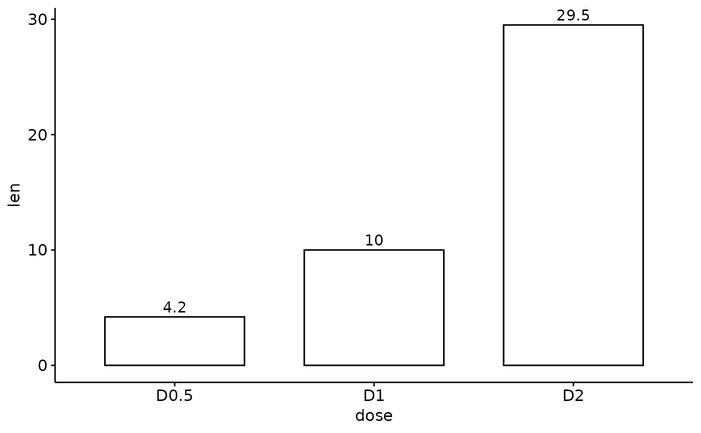
ggbarplot(df,
x = "dose", y = "len",
label = TRUE, label.pos = "out"
)
 # Change width
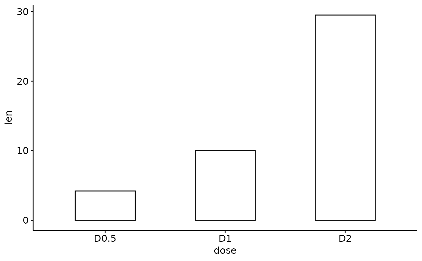
ggbarplot(df, x = "dose", y = "len", width = 0.5)
# Change width
ggbarplot(df, x = "dose", y = "len", width = 0.5)
 # Change the plot orientation: horizontal
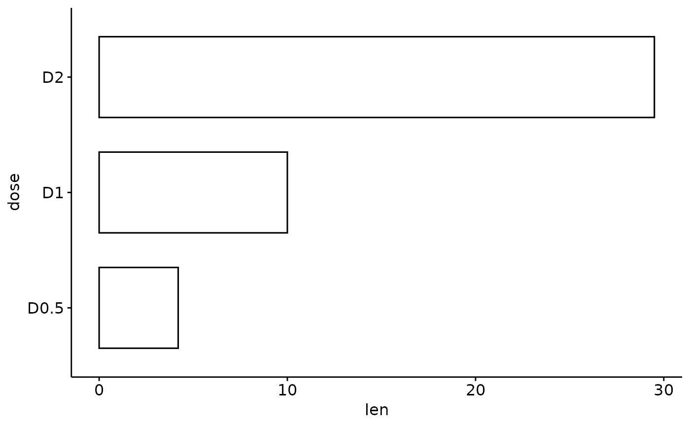
ggbarplot(df, "dose", "len", orientation = "horiz")
# Change the plot orientation: horizontal
ggbarplot(df, "dose", "len", orientation = "horiz")
 # Change the default order of items
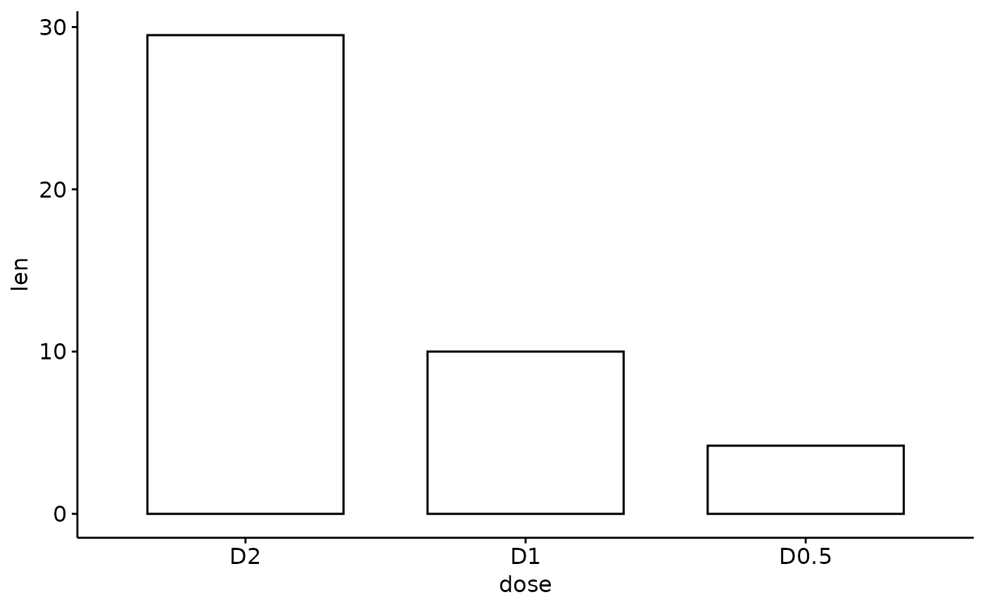
ggbarplot(df, "dose", "len",
order = c("D2", "D1", "D0.5")
)
# Change the default order of items
ggbarplot(df, "dose", "len",
order = c("D2", "D1", "D0.5")
)
 # Change colors
# +++++++++++++++++++++++++++
# Change fill and outline color
# add labels inside bars
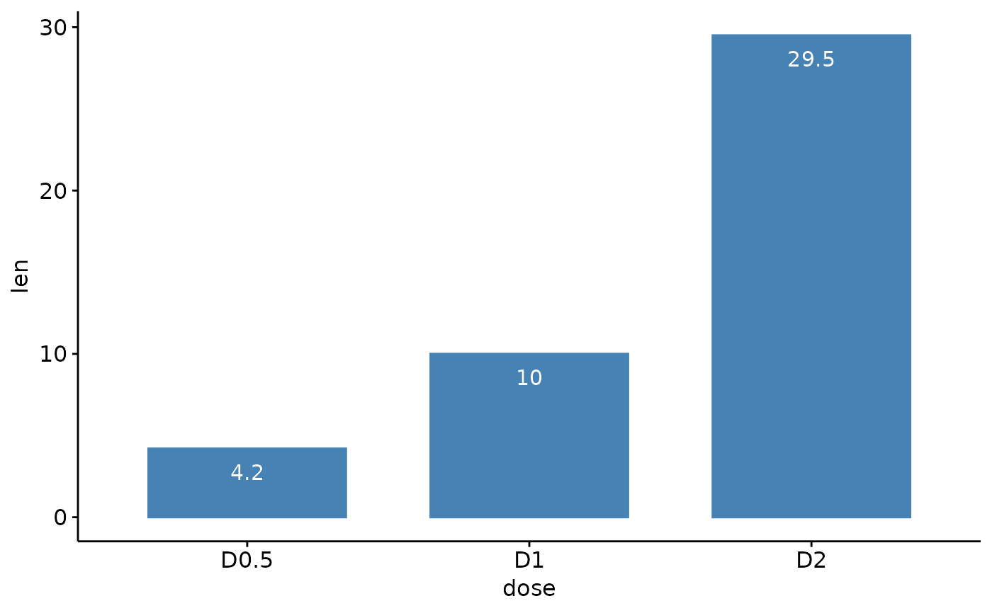
ggbarplot(df, "dose", "len",
fill = "steelblue", color = "steelblue",
label = TRUE, lab.pos = "in", lab.col = "white"
)
# Change colors
# +++++++++++++++++++++++++++
# Change fill and outline color
# add labels inside bars
ggbarplot(df, "dose", "len",
fill = "steelblue", color = "steelblue",
label = TRUE, lab.pos = "in", lab.col = "white"
)
 # Change colors by groups: dose
# Use custom color palette
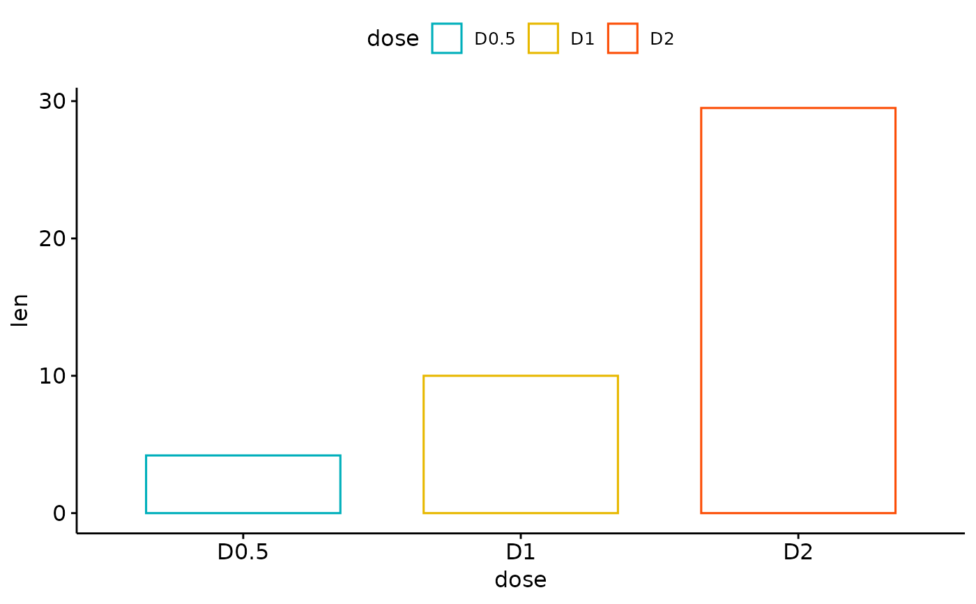
ggbarplot(df, "dose", "len",
color = "dose",
palette = c("#00AFBB", "#E7B800", "#FC4E07")
)
# Change colors by groups: dose
# Use custom color palette
ggbarplot(df, "dose", "len",
color = "dose",
palette = c("#00AFBB", "#E7B800", "#FC4E07")
)
 # Change fill and outline colors by groups
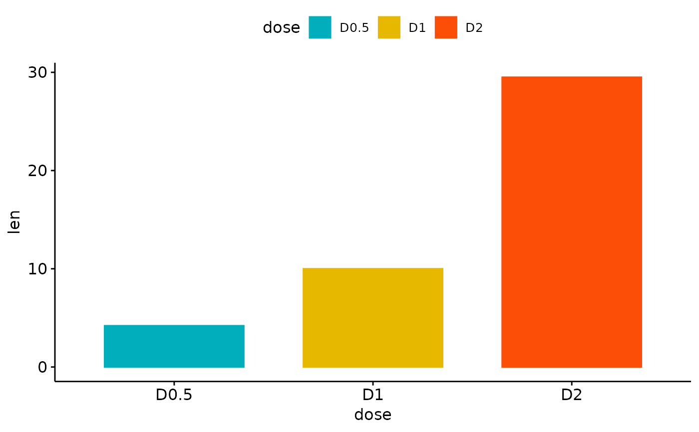
ggbarplot(df, "dose", "len",
fill = "dose", color = "dose",
palette = c("#00AFBB", "#E7B800", "#FC4E07")
)
# Change fill and outline colors by groups
ggbarplot(df, "dose", "len",
fill = "dose", color = "dose",
palette = c("#00AFBB", "#E7B800", "#FC4E07")
)
 # Plot with multiple groups
# +++++++++++++++++++++
# Create some data
df2 <- data.frame(
supp = rep(c("VC", "OJ"), each = 3),
dose = rep(c("D0.5", "D1", "D2"), 2),
len = c(6.8, 15, 33, 4.2, 10, 29.5)
)
print(df2)
#> supp dose len
#> 1 VC D0.5 6.8
#> 2 VC D1 15.0
#> 3 VC D2 33.0
#> 4 OJ D0.5 4.2
#> 5 OJ D1 10.0
#> 6 OJ D2 29.5
# Plot "len" by "dose" and change color by a second group: "supp"
# Add labels inside bars
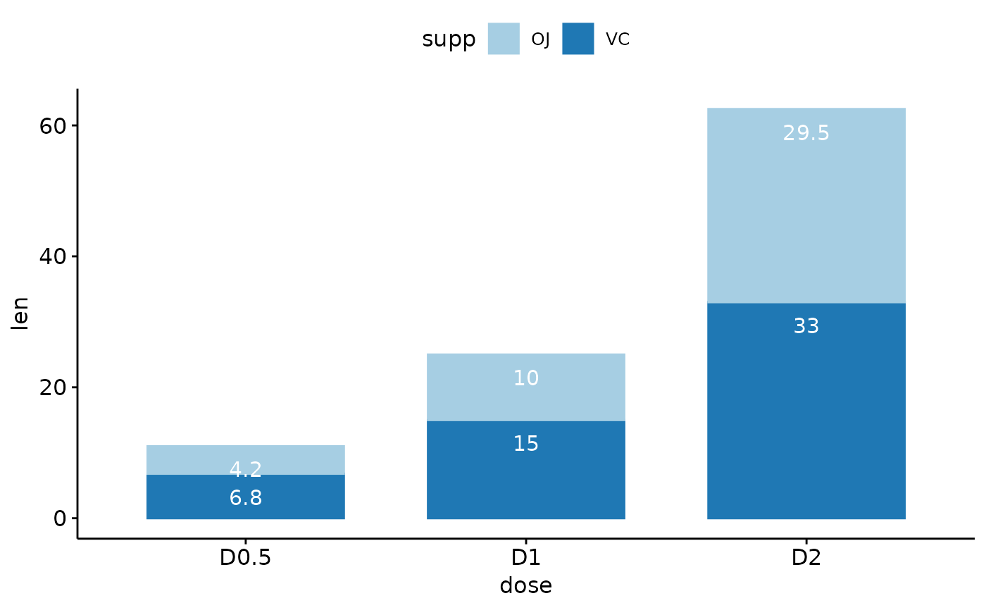
ggbarplot(df2, "dose", "len",
fill = "supp", color = "supp", palette = "Paired",
label = TRUE, lab.col = "white", lab.pos = "in"
)
# Plot with multiple groups
# +++++++++++++++++++++
# Create some data
df2 <- data.frame(
supp = rep(c("VC", "OJ"), each = 3),
dose = rep(c("D0.5", "D1", "D2"), 2),
len = c(6.8, 15, 33, 4.2, 10, 29.5)
)
print(df2)
#> supp dose len
#> 1 VC D0.5 6.8
#> 2 VC D1 15.0
#> 3 VC D2 33.0
#> 4 OJ D0.5 4.2
#> 5 OJ D1 10.0
#> 6 OJ D2 29.5
# Plot "len" by "dose" and change color by a second group: "supp"
# Add labels inside bars
ggbarplot(df2, "dose", "len",
fill = "supp", color = "supp", palette = "Paired",
label = TRUE, lab.col = "white", lab.pos = "in"
)
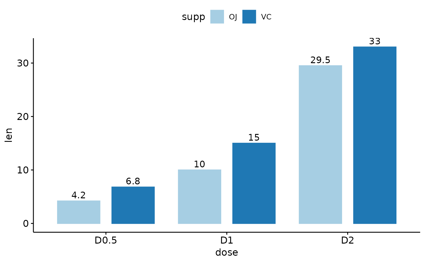
 # Change position: Interleaved (dodged) bar plot
ggbarplot(df2, "dose", "len",
fill = "supp", color = "supp", palette = "Paired",
label = TRUE,
position = position_dodge(0.9)
)
# Change position: Interleaved (dodged) bar plot
ggbarplot(df2, "dose", "len",
fill = "supp", color = "supp", palette = "Paired",
label = TRUE,
position = position_dodge(0.9)
)
 # Add points and errors
# ++++++++++++++++++++++++++
# Data: ToothGrowth data set we'll be used.
df3 <- ToothGrowth
head(df3, 10)
#> len supp dose
#> 1 4.2 VC 0.5
#> 2 11.5 VC 0.5
#> 3 7.3 VC 0.5
#> 4 5.8 VC 0.5
#> 5 6.4 VC 0.5
#> 6 10.0 VC 0.5
#> 7 11.2 VC 0.5
#> 8 11.2 VC 0.5
#> 9 5.2 VC 0.5
#> 10 7.0 VC 0.5
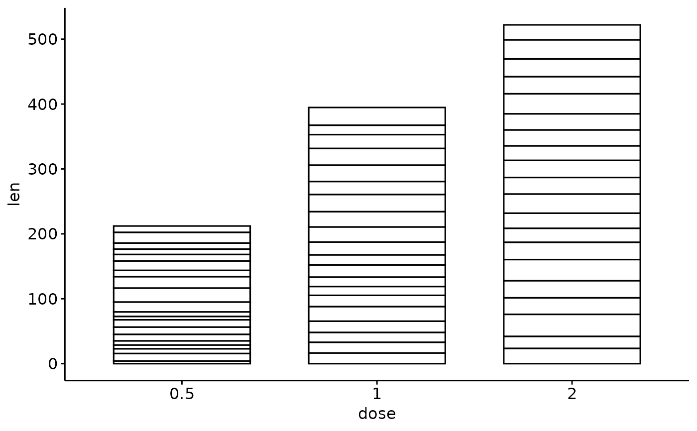
# It can be seen that for each group we have
# different values
ggbarplot(df3, x = "dose", y = "len")
# Add points and errors
# ++++++++++++++++++++++++++
# Data: ToothGrowth data set we'll be used.
df3 <- ToothGrowth
head(df3, 10)
#> len supp dose
#> 1 4.2 VC 0.5
#> 2 11.5 VC 0.5
#> 3 7.3 VC 0.5
#> 4 5.8 VC 0.5
#> 5 6.4 VC 0.5
#> 6 10.0 VC 0.5
#> 7 11.2 VC 0.5
#> 8 11.2 VC 0.5
#> 9 5.2 VC 0.5
#> 10 7.0 VC 0.5
# It can be seen that for each group we have
# different values
ggbarplot(df3, x = "dose", y = "len")
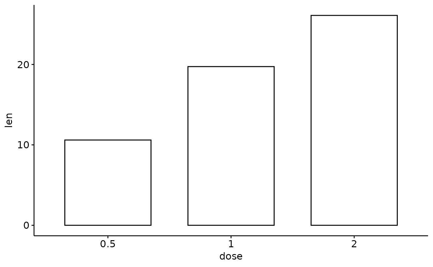
 # Visualize the mean of each group
ggbarplot(df3,
x = "dose", y = "len",
add = "mean"
)
# Visualize the mean of each group
ggbarplot(df3,
x = "dose", y = "len",
add = "mean"
)
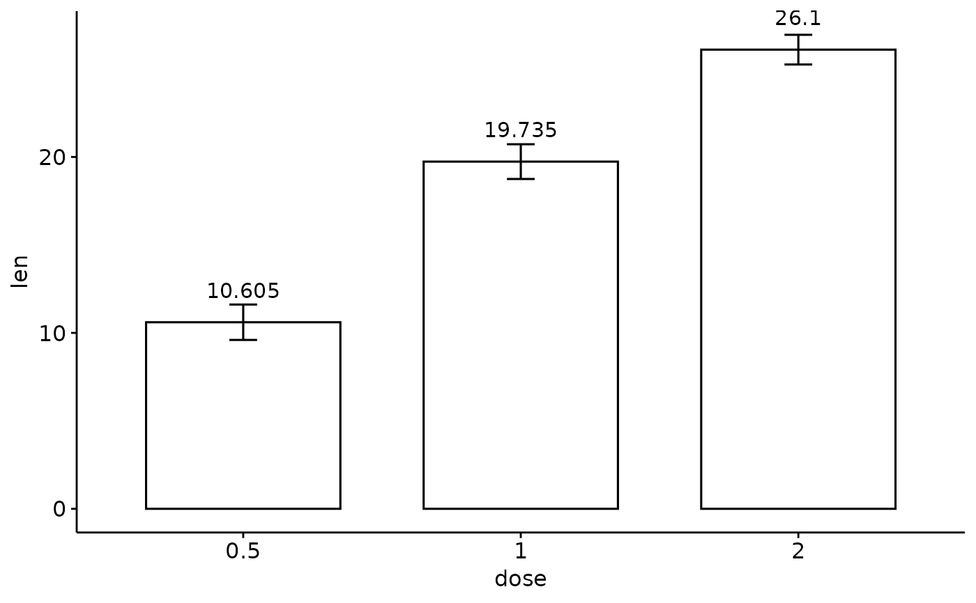
 # Add error bars: mean_se
# (other values include: mean_sd, mean_ci, median_iqr, ....)
# Add labels
ggbarplot(df3,
x = "dose", y = "len",
add = "mean_se", label = TRUE, lab.vjust = -1.6
)
# Add error bars: mean_se
# (other values include: mean_sd, mean_ci, median_iqr, ....)
# Add labels
ggbarplot(df3,
x = "dose", y = "len",
add = "mean_se", label = TRUE, lab.vjust = -1.6
)
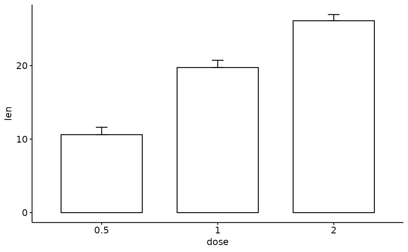
 # Use only "upper_errorbar"
ggbarplot(df3,
x = "dose", y = "len",
add = "mean_se", error.plot = "upper_errorbar"
)
# Use only "upper_errorbar"
ggbarplot(df3,
x = "dose", y = "len",
add = "mean_se", error.plot = "upper_errorbar"
)
 # Change error.plot to "pointrange"
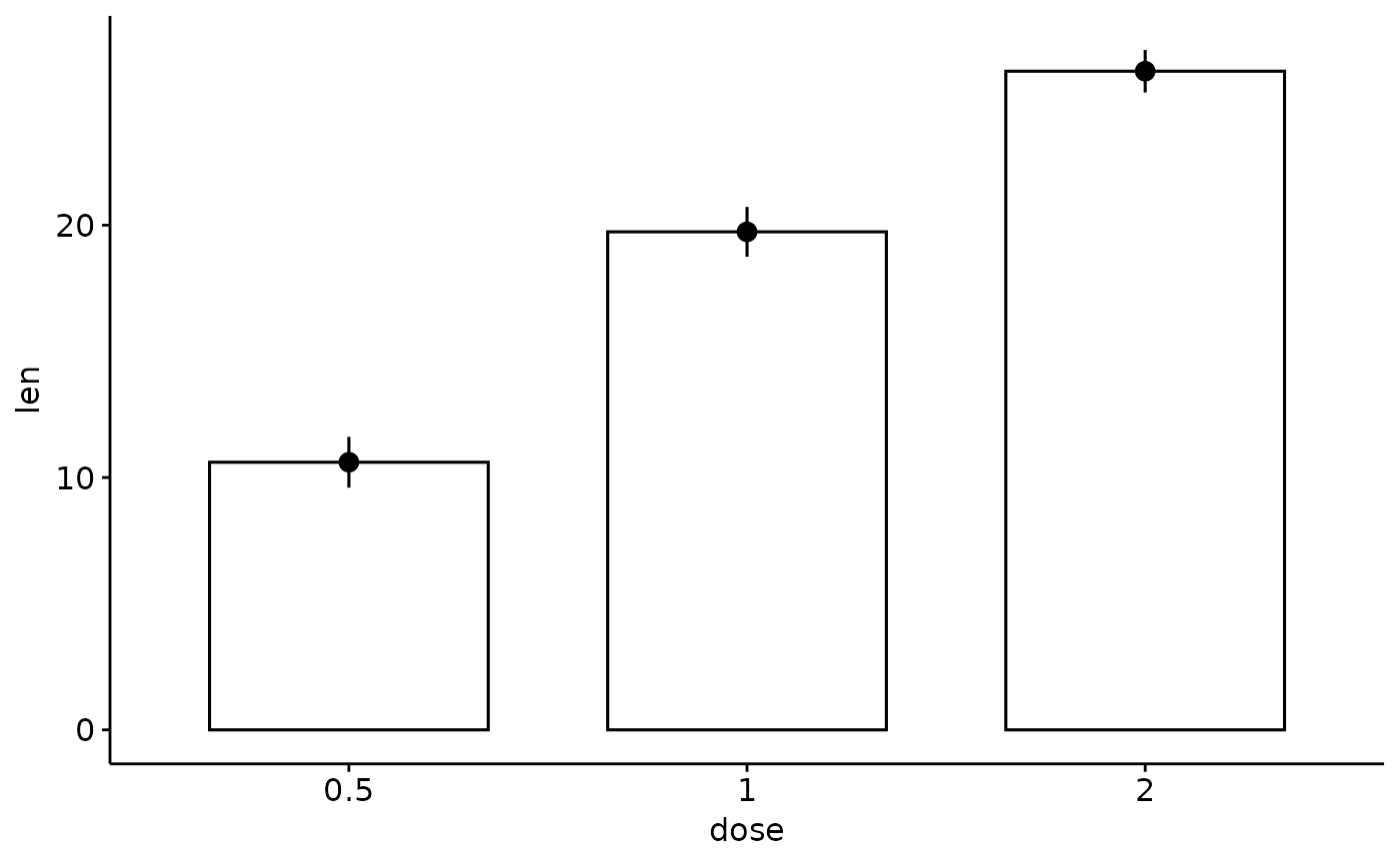
ggbarplot(df3,
x = "dose", y = "len",
add = "mean_se", error.plot = "pointrange"
)
# Change error.plot to "pointrange"
ggbarplot(df3,
x = "dose", y = "len",
add = "mean_se", error.plot = "pointrange"
)
 # Add jitter points and errors (mean_se)
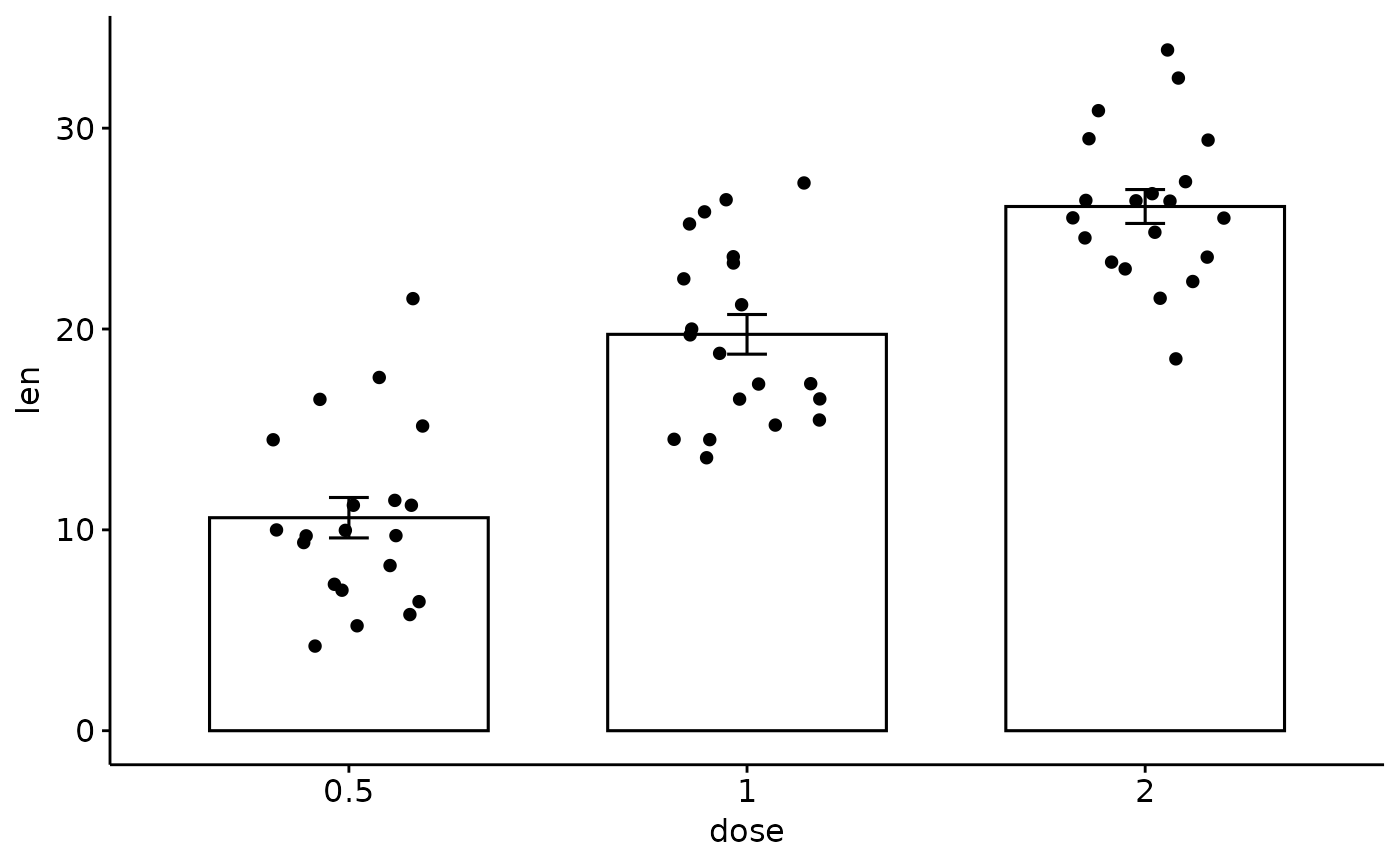
ggbarplot(df3,
x = "dose", y = "len",
add = c("mean_se", "jitter")
)
# Add jitter points and errors (mean_se)
ggbarplot(df3,
x = "dose", y = "len",
add = c("mean_se", "jitter")
)
 # Add dot and errors (mean_se)
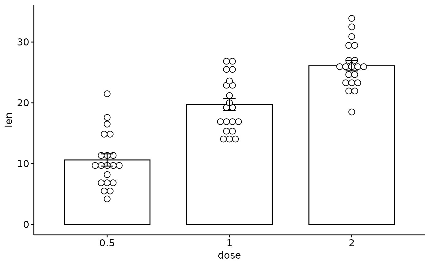
ggbarplot(df3,
x = "dose", y = "len",
add = c("mean_se", "dotplot")
)
#> Bin width defaults to 1/30 of the range of the data. Pick better value with
#> `binwidth`.
# Add dot and errors (mean_se)
ggbarplot(df3,
x = "dose", y = "len",
add = c("mean_se", "dotplot")
)
#> Bin width defaults to 1/30 of the range of the data. Pick better value with
#> `binwidth`.
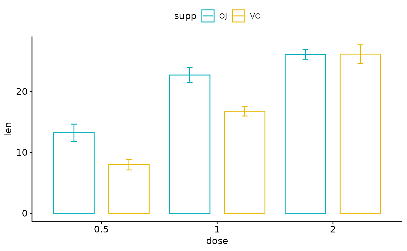
 # Multiple groups with error bars and jitter point
ggbarplot(df3,
x = "dose", y = "len", color = "supp",
add = "mean_se", palette = c("#00AFBB", "#E7B800"),
position = position_dodge()
)
# Multiple groups with error bars and jitter point
ggbarplot(df3,
x = "dose", y = "len", color = "supp",
add = "mean_se", palette = c("#00AFBB", "#E7B800"),
position = position_dodge()
)
 #
#