Draw two plot series with different y scales
doubleYScale.RdOverplot two trellis objects with different y scales, optionally in different styles, adding a second y axis, and/or a second y axis label.
Note: drawing plots with multiple scales is often a bad idea as it can be misleading.
Arguments
- obj1, obj2
trellis objects. Note that most settings, like main/sub/legend/etc are taken only from
obj1; only the panel, axis and ylab are taken from obj2.- use.style, style1, style2
style1andstyle2give the `group number' for obj1 and obj2 respectively. The style is taken from these indices into the values oftrellis.par.get("superpose.line"). Therefore these should be integers between 1 and 6; a value of 0 or NULL can be given to leave the default settings. These will also be applied to the y-axes and ylab, if relevant.use.stylesimply changes the defaults of the style arguments.- add.axis
if TRUE, draw a second y axis (for the
obj2series) on the right side of the plot.- add.ylab2
if TRUE, draw a second y axis label (from
obj2$ylab) on the right side of the plot. Note, this will replace any existing key or legend on the right side, i.e. withspace = "right".- text, auto.key, points, lines, ...
if non-NULL, add a
keyto the display, using entries named bytext. Further arguments are passed on tosimpleKeyat plot time.- under
if TRUE, draw
obj2underobj1.
Details
Panels from the trellis object obj2 will be drawn in the
corresponding panel of obj1.
Axis settings are taken from the trellis objects, so most
scales arguments such as draw, at, labels
etc from obj2 will carry over to the second y axis.
Value
a merged trellis object.
See also
Examples
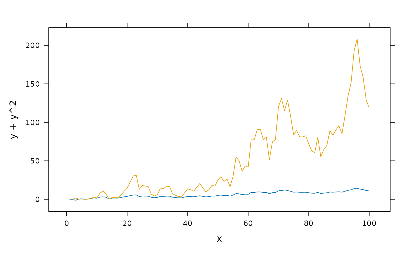
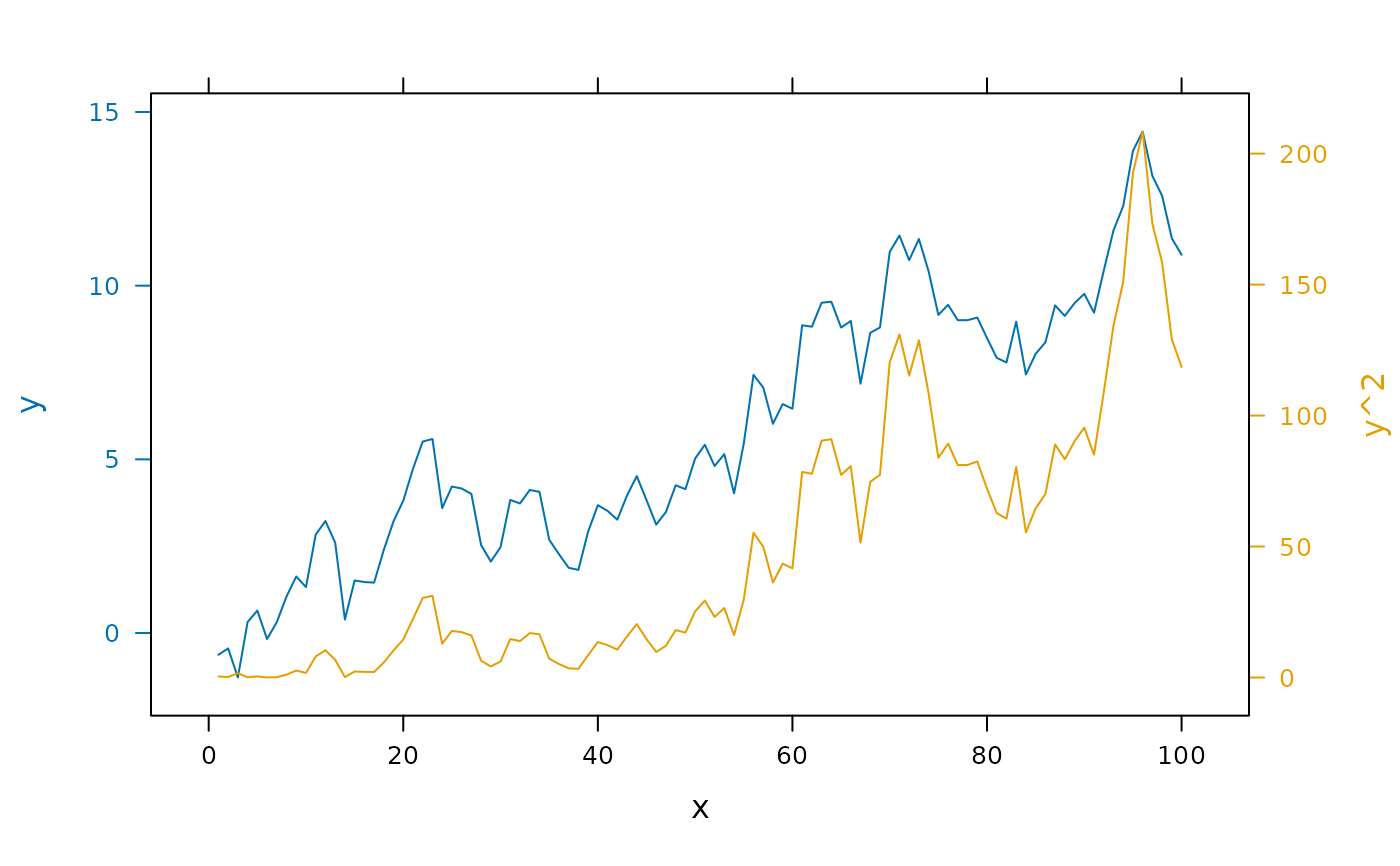
set.seed(1)
foo <- list(x = 1:100, y = cumsum(rnorm(100)))
## show original data
xyplot(y + y^2 ~ x, foo, type = "l")
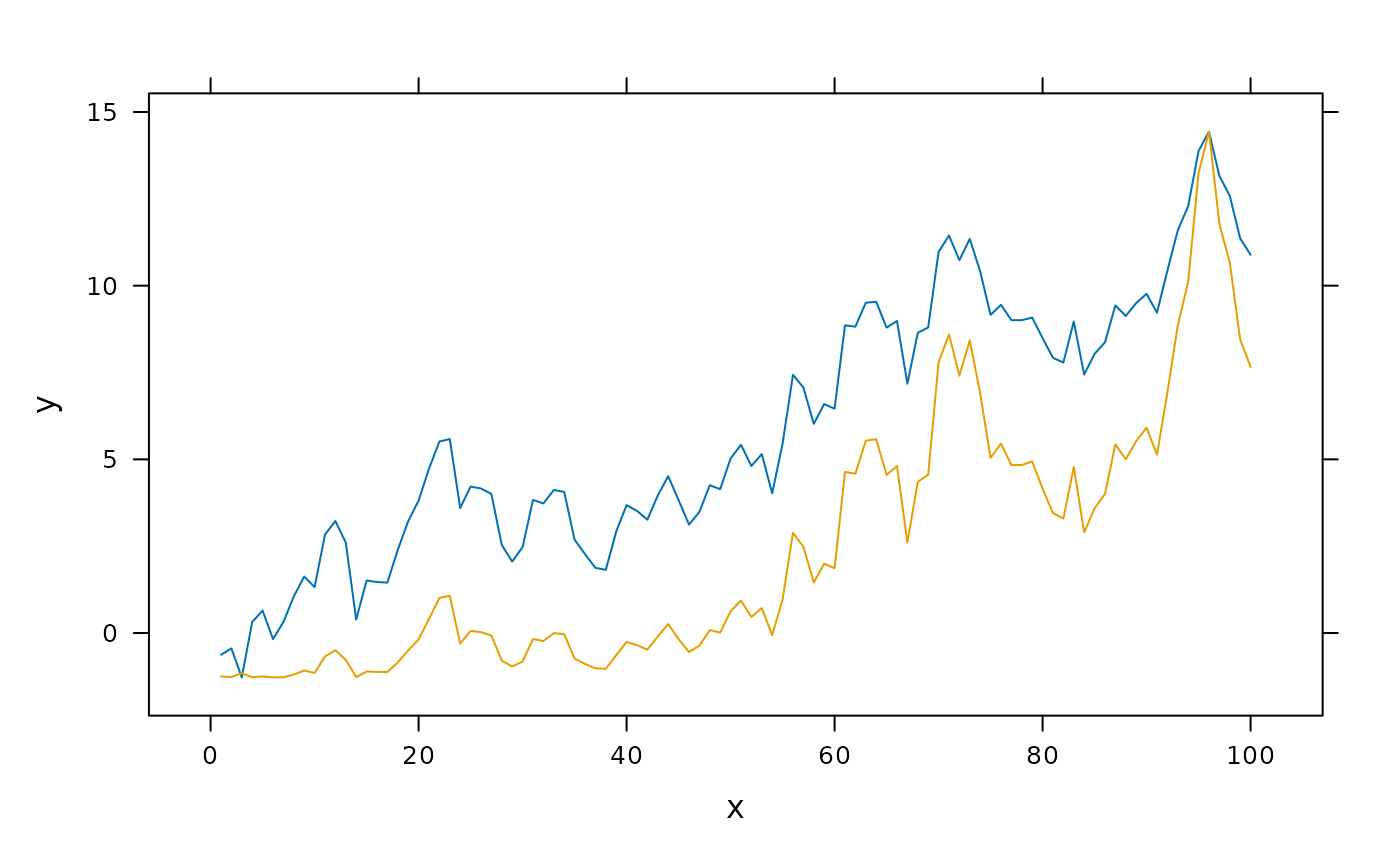
 ## construct separate plots for each series
obj1 <- xyplot(y ~ x, foo, type = "l")
obj2 <- xyplot(y^2 ~ x, foo, type = "l")
## simple case: no axis for the overlaid plot
doubleYScale(obj1, obj2, add.axis = FALSE)
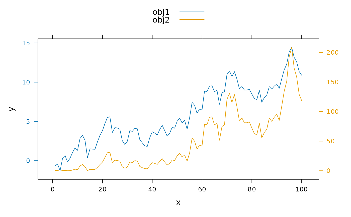
## construct separate plots for each series
obj1 <- xyplot(y ~ x, foo, type = "l")
obj2 <- xyplot(y^2 ~ x, foo, type = "l")
## simple case: no axis for the overlaid plot
doubleYScale(obj1, obj2, add.axis = FALSE)
 ## draw second y axis
doubleYScale(obj1, obj2)
## draw second y axis
doubleYScale(obj1, obj2)
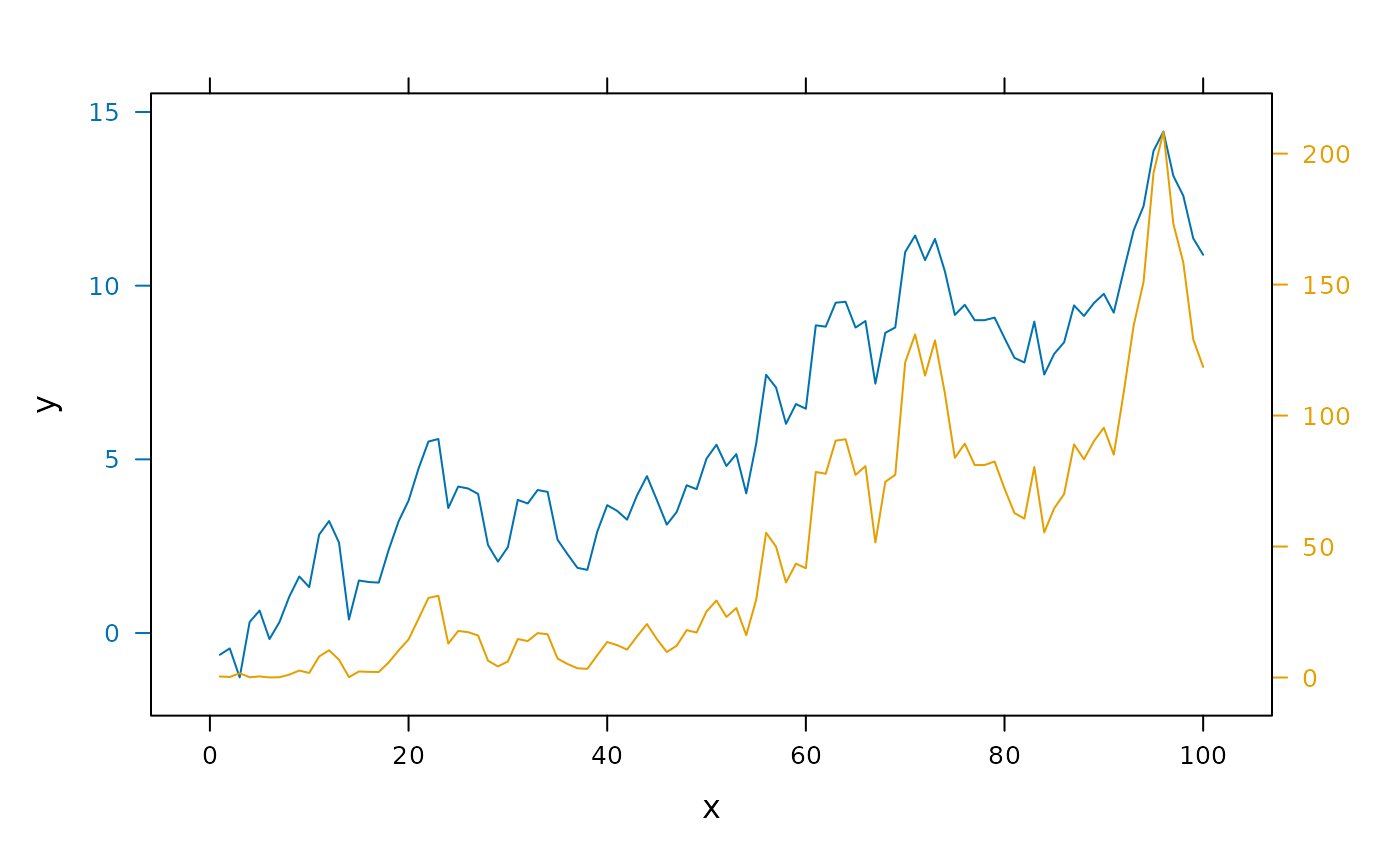 ## ...with second ylab
doubleYScale(obj1, obj2, add.ylab2 = TRUE)
## ...with second ylab
doubleYScale(obj1, obj2, add.ylab2 = TRUE)
 ## ...or with a key
doubleYScale(obj1, obj2, text = c("obj1", "obj2"))
## ...or with a key
doubleYScale(obj1, obj2, text = c("obj1", "obj2"))
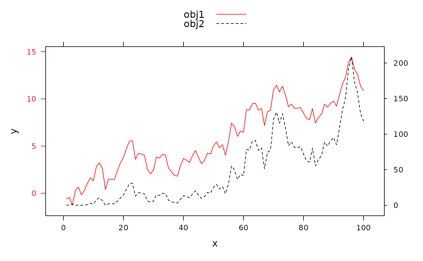
 ## ...with custom styles
update(doubleYScale(obj1, obj2, text = c("obj1", "obj2")),
par.settings = simpleTheme(col = c('red','black'), lty = 1:2))
## ...with custom styles
update(doubleYScale(obj1, obj2, text = c("obj1", "obj2")),
par.settings = simpleTheme(col = c('red','black'), lty = 1:2))
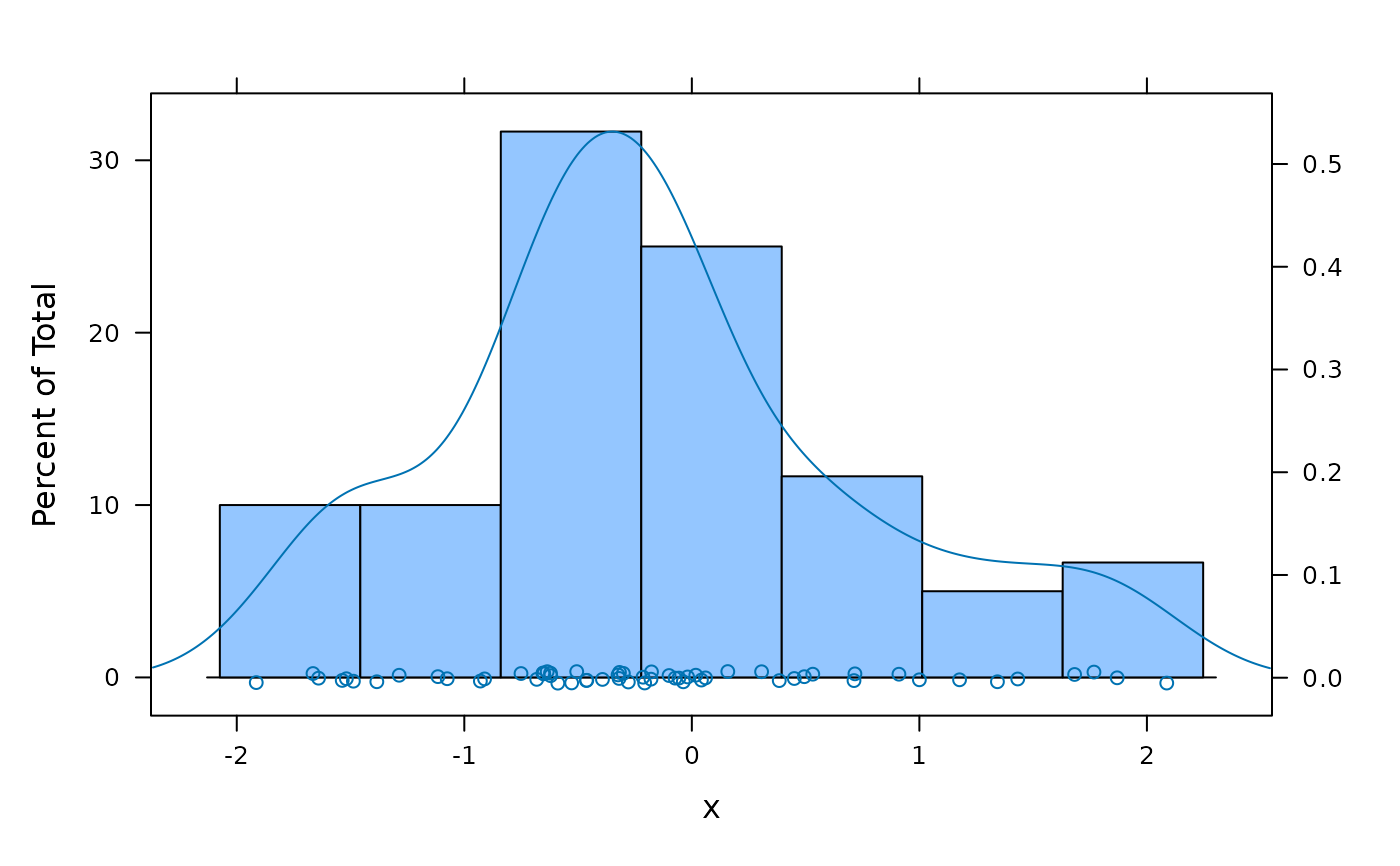
 ## different plot types
x <- rnorm(60)
doubleYScale(histogram(x), densityplot(x), use.style = FALSE)
## different plot types
x <- rnorm(60)
doubleYScale(histogram(x), densityplot(x), use.style = FALSE)
 ## (but see ?as.layer for a better way to do this)
## multi-panel example
## a variant of Figure 5.13 from Sarkar (2008)
## http://lmdvr.r-forge.r-project.org/figures/figures.html?chapter=05;figure=05_13
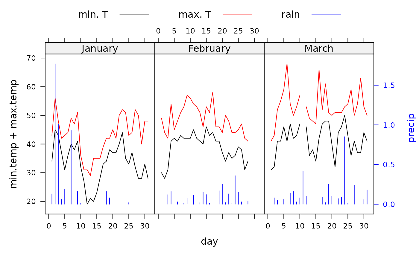
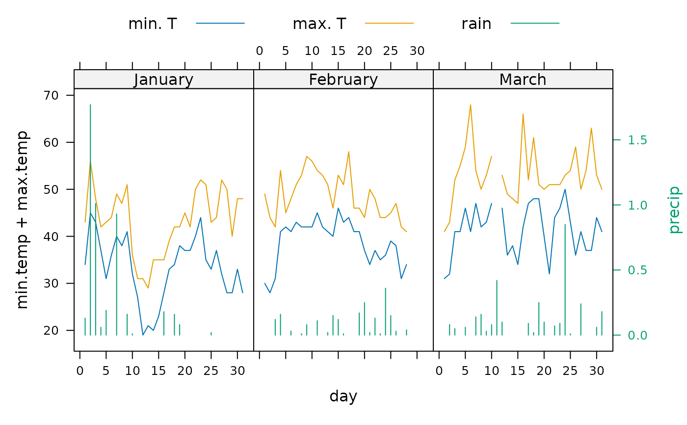
data(SeatacWeather)
temp <- xyplot(min.temp + max.temp ~ day | month,
data = SeatacWeather, type = "l", layout = c(3, 1))
rain <- xyplot(precip ~ day | month, data = SeatacWeather, type = "h")
doubleYScale(temp, rain, style1 = 0, style2 = 3, add.ylab2 = TRUE,
text = c("min. T", "max. T", "rain"), columns = 3)
## (but see ?as.layer for a better way to do this)
## multi-panel example
## a variant of Figure 5.13 from Sarkar (2008)
## http://lmdvr.r-forge.r-project.org/figures/figures.html?chapter=05;figure=05_13
data(SeatacWeather)
temp <- xyplot(min.temp + max.temp ~ day | month,
data = SeatacWeather, type = "l", layout = c(3, 1))
rain <- xyplot(precip ~ day | month, data = SeatacWeather, type = "h")
doubleYScale(temp, rain, style1 = 0, style2 = 3, add.ylab2 = TRUE,
text = c("min. T", "max. T", "rain"), columns = 3)
 ## re-plot with different styles
update(trellis.last.object(),
par.settings = simpleTheme(col = c("black", "red", "blue")))
## re-plot with different styles
update(trellis.last.object(),
par.settings = simpleTheme(col = c("black", "red", "blue")))