Automated plotting for 'modelbased' objects
Source:R/plot.R, R/tinyplot.R, R/visualisation_recipe.R
visualisation_recipe.estimate_predicted.RdMost modelbased objects can be visualized using either the plot()
function, which internally calls the visualisation_recipe() function and
relies on {ggplot2}. There is also a tinyplot() method, which uses the
{tinyplot} package and relies on the core R graphic system. See the
examples below for more information and examples on how to create and
customize plots.
The plotting works by mapping any predictors from the by argument to the
x-axis, colors, alpha (transparency) and facets. Thus, the appearance of the
plot depends on the order of the variables that you specify in the by
argument. For instance, the plots corresponding to
estimate_relation(model, by=c("Species", "Sepal.Length")) and
estimate_relation(model, by=c("Sepal.Length", "Species")) will look
different.
The automated plotting is primarily meant for convenient visual checks, but
for publication-ready figures, we recommend re-creating the figures using the
{ggplot2} package directly.
# S3 method for class 'estimate_predicted'
plot(x, ...)

# S3 method for class 'estimate_means'
plot(x, ...)

# S3 method for class 'estimate_means'
tinyplot(
  x,
  show_data = FALSE,
  numeric_as_discrete = NULL,
  theme = "tufte",
  ...
)

# S3 method for class 'estimate_predicted'
visualisation_recipe(
  x,
  show_data = FALSE,
  show_residuals = FALSE,
  point = NULL,
  line = NULL,
  pointrange = NULL,
  ribbon = NULL,
  facet = NULL,
  grid = NULL,
  join_dots = NULL,
  numeric_as_discrete = NULL,
  ...
)

# S3 method for class 'estimate_slopes'
visualisation_recipe(
  x,
  line = NULL,
  pointrange = NULL,
  ribbon = NULL,
  facet = NULL,
  grid = NULL,
  ...
)

# S3 method for class 'estimate_grouplevel'
visualisation_recipe(
  x,
  line = NULL,
  pointrange = NULL,
  ribbon = NULL,
  facet = NULL,
  grid = NULL,
  ...
)
Arguments
- x
A modelbased object.
- ...
Arguments passed from
plot()tovisualisation_recipe(), or totinyplot()andtinytheme()if you use that method.- show_data
Logical, if
TRUE, display the "raw" data as a background to the model-based estimation. This argument will be ignored for plotting objects returned byestimate_slopes()orestimate_grouplevel().- numeric_as_discrete
Maximum number of unique values in a numeric predictor to treat that predictor as discrete. Defaults to
8. Numeric predictors are usually mapped to a continuous color scale, unless they have only few unique values. In the latter case, numeric predictors are assumed to represent "categories", e.g. when only the mean value and +/- 1 standard deviation around the mean are chosen as representative values for that predictor. UseFALSEto always use continuous color scales for numeric predictors. It is possible to set a global default value usingoptions(), e.g.options(modelbased_numeric_as_discrete = 10).- theme
A character string specifying the theme to use for the plot. Defaults to
"tufte". For other options please seetinyplot::tinytheme(). UseNULLif no theme should be applied.- show_residuals
Logical, if
TRUE, display residuals of the model as a background to the model-based estimation. Residuals will be computed for the predictors in the data grid, usingresidualize_over_grid().- point, line, pointrange, ribbon, facet, grid
Additional aesthetics and parameters for the geoms (see customization example).
- join_dots
Logical, if
TRUE(default) and for categorical focal terms inby, dots (estimates) are connected by lines, i.e. plots will be a combination of dots with error bars and connecting lines. IfFALSE, only dots and error bars are shown. It is possible to set a global default value usingoptions(), e.g.options(modelbased_join_dots = FALSE).
Value
An object of class visualisation_recipe that describes the layers
used to create a plot based on {ggplot2}. The related plot() method is in
the {see} package.
Details
There are two options to remove the confidence bands or errors bars
from the plot. To remove error bars, simply set the pointrange geom to
point, e.g. plot(..., pointrange = list(geom = "point")). To remove the
confidence bands from line geoms, use ribbon = "none".
Global Options to Customize Plots
Some arguments for plot() can get global defaults using options():
modelbased_join_dots:options(modelbased_join_dots = <logical>)will set a default value for thejoin_dots.modelbased_numeric_as_discrete:options(modelbased_numeric_as_discrete = <number>)will set a default value for themodelbased_numeric_as_discreteargument. Can also beFALSE.modelbased_ribbon_alpha:options(modelbased_ribbon_alpha = <number>)will set a default value for thealphaargument of theribbongeom. Should be a number between0and1.
Examples
# ==============================================
# tinyplot
# ==============================================
# \donttest{
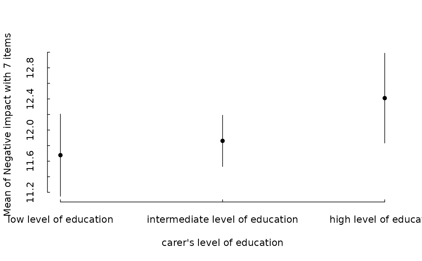
data(efc, package = "modelbased")
efc <- datawizard::to_factor(efc, c("e16sex", "c172code", "e42dep"))
m <- lm(neg_c_7 ~ e16sex + c172code + barthtot, data = efc)
em <- estimate_means(m, "c172code")
tinyplot::plt(em)
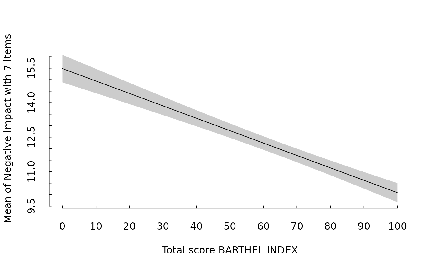
 em <- estimate_means(m, "barthtot")
tinyplot::plt(em)
em <- estimate_means(m, "barthtot")
tinyplot::plt(em)
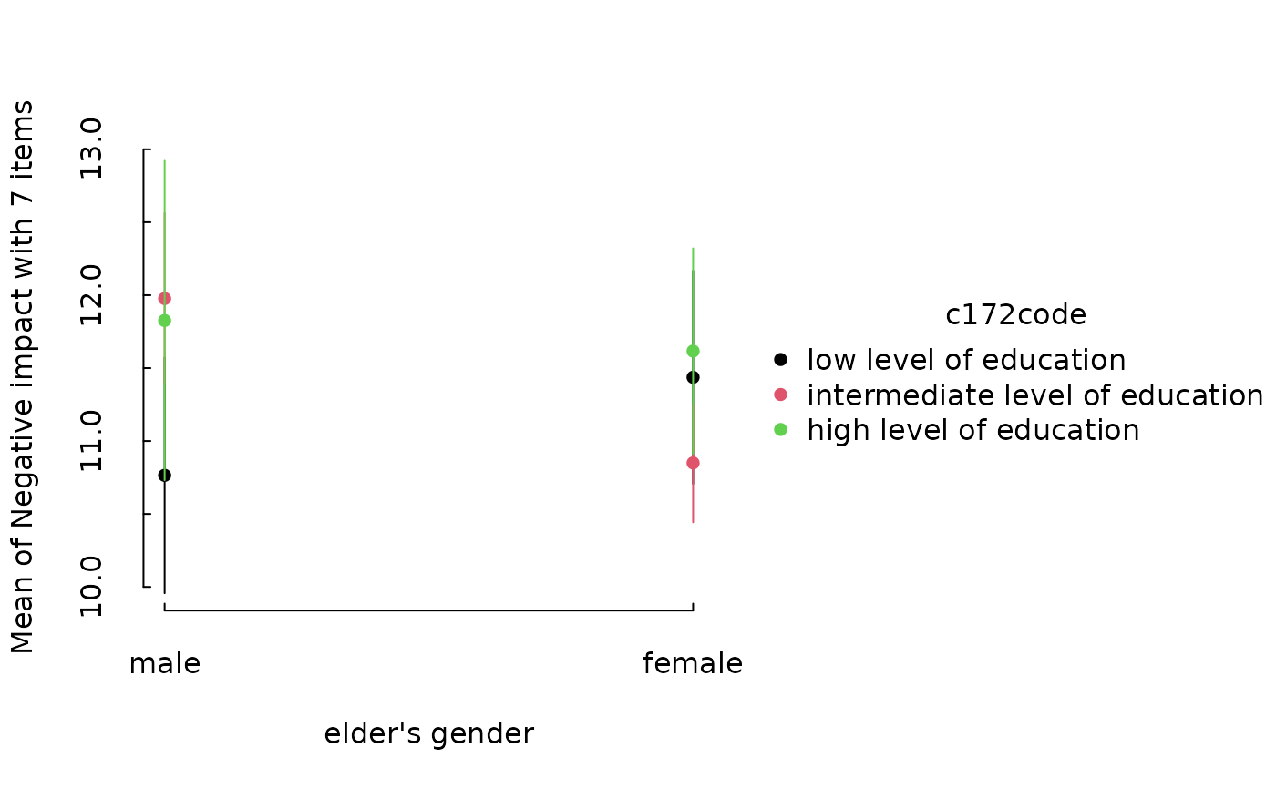
 m <- lm(neg_c_7 ~ e16sex * c172code + e42dep, data = efc)
em <- estimate_means(m, c("e16sex", "c172code"))
tinyplot::plt(em)
m <- lm(neg_c_7 ~ e16sex * c172code + e42dep, data = efc)
em <- estimate_means(m, c("e16sex", "c172code"))
tinyplot::plt(em)
 # }
library(ggplot2)
library(see)
# ==============================================
# estimate_relation, estimate_expectation, ...
# ==============================================
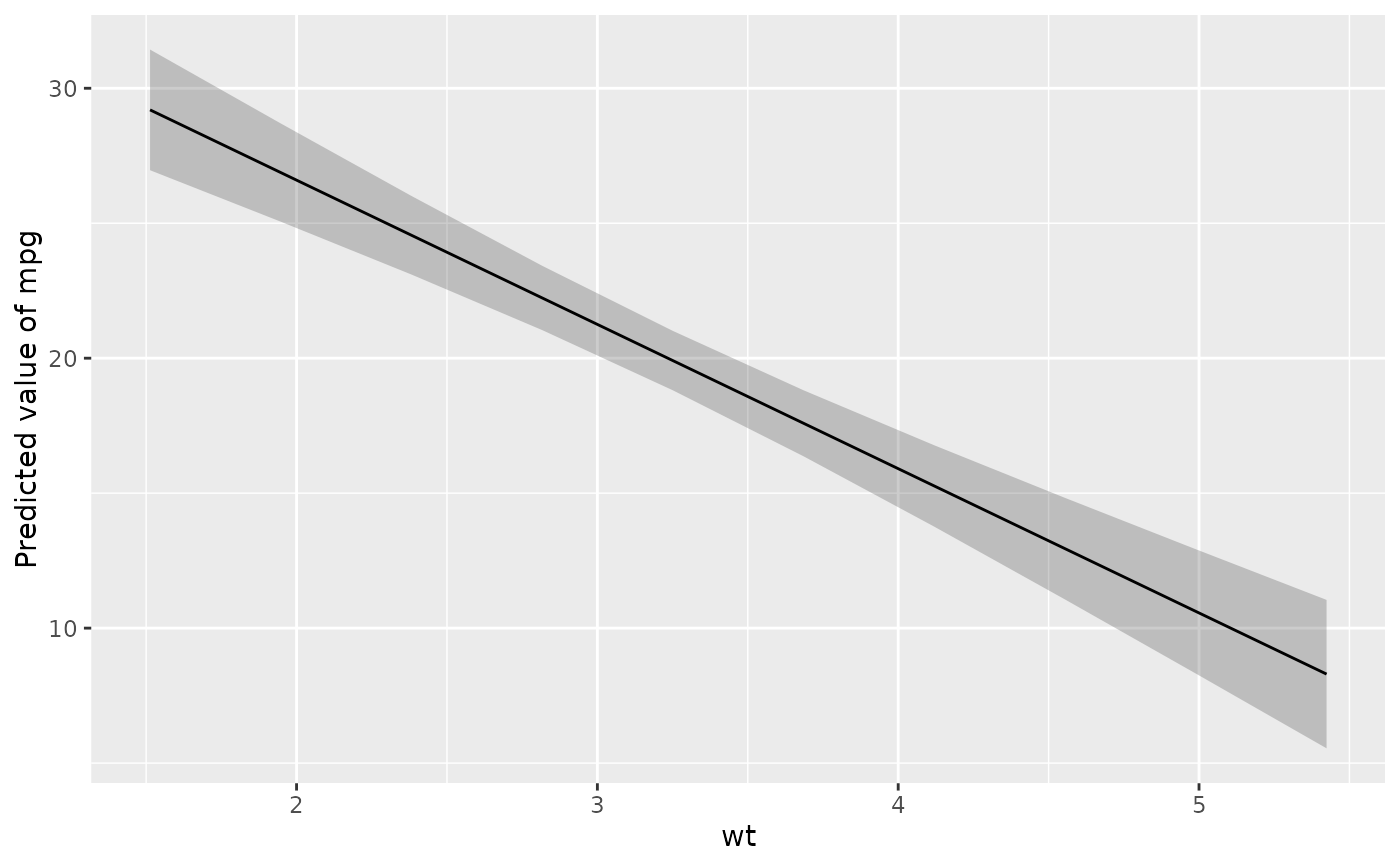
# Simple Model ---------------
x <- estimate_relation(lm(mpg ~ wt, data = mtcars))
layers <- visualisation_recipe(x)
layers
#> Layer 1
#> --------
#> Geom type: ribbon
#> data = [10 x 6]
#> aes_string(
#> y = 'Predicted'
#> x = 'wt'
#> ymin = 'CI_low'
#> ymax = 'CI_high'
#> group = '.group'
#> )
#> alpha = 0.25
#>
#> Layer 2
#> --------
#> Geom type: line
#> data = [10 x 6]
#> aes_string(
#> y = 'Predicted'
#> x = 'wt'
#> group = '.group'
#> )
#>
#> Layer 3
#> --------
#> Geom type: labs
#> y = 'Predicted value of mpg'
#>
plot(layers)
# }
library(ggplot2)
library(see)
# ==============================================
# estimate_relation, estimate_expectation, ...
# ==============================================
# Simple Model ---------------
x <- estimate_relation(lm(mpg ~ wt, data = mtcars))
layers <- visualisation_recipe(x)
layers
#> Layer 1
#> --------
#> Geom type: ribbon
#> data = [10 x 6]
#> aes_string(
#> y = 'Predicted'
#> x = 'wt'
#> ymin = 'CI_low'
#> ymax = 'CI_high'
#> group = '.group'
#> )
#> alpha = 0.25
#>
#> Layer 2
#> --------
#> Geom type: line
#> data = [10 x 6]
#> aes_string(
#> y = 'Predicted'
#> x = 'wt'
#> group = '.group'
#> )
#>
#> Layer 3
#> --------
#> Geom type: labs
#> y = 'Predicted value of mpg'
#>
plot(layers)
 # visualization_recipe() is called implicitly when you call plot()
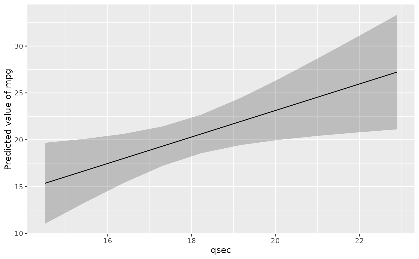
plot(estimate_relation(lm(mpg ~ qsec, data = mtcars)))
# visualization_recipe() is called implicitly when you call plot()
plot(estimate_relation(lm(mpg ~ qsec, data = mtcars)))
 if (FALSE) { # \dontrun{
# It can be used in a pipe workflow
lm(mpg ~ qsec, data = mtcars) |>
estimate_relation(ci = c(0.5, 0.8, 0.9)) |>
plot()
# Customize aesthetics ----------
plot(x,
point = list(color = "red", alpha = 0.6, size = 3),
line = list(color = "blue", size = 3),
ribbon = list(fill = "green", alpha = 0.7)
) +
theme_minimal() +
labs(title = "Relationship between MPG and WT")
# Customize raw data -------------
plot(x, point = list(geom = "density_2d_filled"), line = list(color = "white")) +
scale_x_continuous(expand = c(0, 0)) +
scale_y_continuous(expand = c(0, 0)) +
theme(legend.position = "none")
# Single predictors examples -----------
plot(estimate_relation(lm(Sepal.Length ~ Species, data = iris)))
# 2-ways interaction ------------
# Numeric * numeric
x <- estimate_relation(lm(mpg ~ wt * qsec, data = mtcars))
plot(x)
# Numeric * factor
x <- estimate_relation(lm(Sepal.Width ~ Sepal.Length * Species, data = iris))
plot(x)
# ==============================================
# estimate_means
# ==============================================
# Simple Model ---------------
x <- estimate_means(lm(Sepal.Width ~ Species, data = iris), by = "Species")
layers <- visualisation_recipe(x)
layers
plot(layers)
# Customize aesthetics
layers <- visualisation_recipe(x,
point = list(width = 0.03, color = "red"),
pointrange = list(size = 2, linewidth = 2),
line = list(linetype = "dashed", color = "blue")
)
plot(layers)
# Two levels ---------------
data <- mtcars
data$cyl <- as.factor(data$cyl)
model <- lm(mpg ~ cyl * wt, data = data)
x <- estimate_means(model, by = c("cyl", "wt"))
plot(x)
# GLMs ---------------------
data <- data.frame(vs = mtcars$vs, cyl = as.factor(mtcars$cyl))
x <- estimate_means(glm(vs ~ cyl, data = data, family = "binomial"), by = c("cyl"))
plot(x)
} # }
# ==============================================
# estimate_slopes
# ==============================================
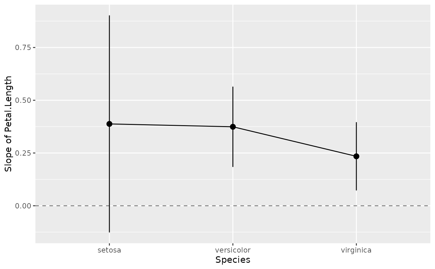
model <- lm(Sepal.Width ~ Species * Petal.Length, data = iris)
x <- estimate_slopes(model, trend = "Petal.Length", by = "Species")
layers <- visualisation_recipe(x)
layers
#> Layer 1
#> --------
#> Geom type: hline
#> yintercept = 0
#> alpha = 0.5
#> linetype = 'dashed'
#>
#> Layer 2
#> --------
#> Geom type: line
#> data = [3 x 9]
#> aes_string(
#> y = 'Slope'
#> x = 'Species'
#> group = '.group'
#> )
#>
#> Layer 3
#> --------
#> Geom type: pointrange
#> data = [3 x 9]
#> aes_string(
#> y = 'Slope'
#> x = 'Species'
#> ymin = 'CI_low'
#> ymax = 'CI_high'
#> group = '.group'
#> )
#>
#> Layer 4
#> --------
#> Geom type: labs
#> y = 'Slope of Petal.Length'
#>
plot(layers)
if (FALSE) { # \dontrun{
# It can be used in a pipe workflow
lm(mpg ~ qsec, data = mtcars) |>
estimate_relation(ci = c(0.5, 0.8, 0.9)) |>
plot()
# Customize aesthetics ----------
plot(x,
point = list(color = "red", alpha = 0.6, size = 3),
line = list(color = "blue", size = 3),
ribbon = list(fill = "green", alpha = 0.7)
) +
theme_minimal() +
labs(title = "Relationship between MPG and WT")
# Customize raw data -------------
plot(x, point = list(geom = "density_2d_filled"), line = list(color = "white")) +
scale_x_continuous(expand = c(0, 0)) +
scale_y_continuous(expand = c(0, 0)) +
theme(legend.position = "none")
# Single predictors examples -----------
plot(estimate_relation(lm(Sepal.Length ~ Species, data = iris)))
# 2-ways interaction ------------
# Numeric * numeric
x <- estimate_relation(lm(mpg ~ wt * qsec, data = mtcars))
plot(x)
# Numeric * factor
x <- estimate_relation(lm(Sepal.Width ~ Sepal.Length * Species, data = iris))
plot(x)
# ==============================================
# estimate_means
# ==============================================
# Simple Model ---------------
x <- estimate_means(lm(Sepal.Width ~ Species, data = iris), by = "Species")
layers <- visualisation_recipe(x)
layers
plot(layers)
# Customize aesthetics
layers <- visualisation_recipe(x,
point = list(width = 0.03, color = "red"),
pointrange = list(size = 2, linewidth = 2),
line = list(linetype = "dashed", color = "blue")
)
plot(layers)
# Two levels ---------------
data <- mtcars
data$cyl <- as.factor(data$cyl)
model <- lm(mpg ~ cyl * wt, data = data)
x <- estimate_means(model, by = c("cyl", "wt"))
plot(x)
# GLMs ---------------------
data <- data.frame(vs = mtcars$vs, cyl = as.factor(mtcars$cyl))
x <- estimate_means(glm(vs ~ cyl, data = data, family = "binomial"), by = c("cyl"))
plot(x)
} # }
# ==============================================
# estimate_slopes
# ==============================================
model <- lm(Sepal.Width ~ Species * Petal.Length, data = iris)
x <- estimate_slopes(model, trend = "Petal.Length", by = "Species")
layers <- visualisation_recipe(x)
layers
#> Layer 1
#> --------
#> Geom type: hline
#> yintercept = 0
#> alpha = 0.5
#> linetype = 'dashed'
#>
#> Layer 2
#> --------
#> Geom type: line
#> data = [3 x 9]
#> aes_string(
#> y = 'Slope'
#> x = 'Species'
#> group = '.group'
#> )
#>
#> Layer 3
#> --------
#> Geom type: pointrange
#> data = [3 x 9]
#> aes_string(
#> y = 'Slope'
#> x = 'Species'
#> ymin = 'CI_low'
#> ymax = 'CI_high'
#> group = '.group'
#> )
#>
#> Layer 4
#> --------
#> Geom type: labs
#> y = 'Slope of Petal.Length'
#>
plot(layers)
 if (FALSE) { # \dontrun{
# Customize aesthetics and add horizontal line and theme
layers <- visualisation_recipe(x, pointrange = list(size = 2, linewidth = 2))
plot(layers) +
geom_hline(yintercept = 0, linetype = "dashed", color = "red") +
theme_minimal() +
labs(y = "Effect of Petal.Length", title = "Marginal Effects")
model <- lm(Petal.Length ~ poly(Sepal.Width, 4), data = iris)
x <- estimate_slopes(model, trend = "Sepal.Width", by = "Sepal.Width", length = 20)
plot(visualisation_recipe(x))
model <- lm(Petal.Length ~ Species * poly(Sepal.Width, 3), data = iris)
x <- estimate_slopes(model, trend = "Sepal.Width", by = c("Sepal.Width", "Species"))
plot(visualisation_recipe(x))
} # }
# ==============================================
# estimate_grouplevel
# ==============================================
if (FALSE) { # \dontrun{
data <- lme4::sleepstudy
data <- rbind(data, data)
data$Newfactor <- rep(c("A", "B", "C", "D"))
# 1 random intercept
model <- lme4::lmer(Reaction ~ Days + (1 | Subject), data = data)
x <- estimate_grouplevel(model)
layers <- visualisation_recipe(x)
layers
plot(layers)
# 2 random intercepts
model <- lme4::lmer(Reaction ~ Days + (1 | Subject) + (1 | Newfactor), data = data)
x <- estimate_grouplevel(model)
plot(x) +
geom_hline(yintercept = 0, linetype = "dashed") +
theme_minimal()
# Note: we need to use hline instead of vline because the axes is flipped
model <- lme4::lmer(Reaction ~ Days + (1 + Days | Subject) + (1 | Newfactor), data = data)
x <- estimate_grouplevel(model)
plot(x)
} # }
if (FALSE) { # \dontrun{
# Customize aesthetics and add horizontal line and theme
layers <- visualisation_recipe(x, pointrange = list(size = 2, linewidth = 2))
plot(layers) +
geom_hline(yintercept = 0, linetype = "dashed", color = "red") +
theme_minimal() +
labs(y = "Effect of Petal.Length", title = "Marginal Effects")
model <- lm(Petal.Length ~ poly(Sepal.Width, 4), data = iris)
x <- estimate_slopes(model, trend = "Sepal.Width", by = "Sepal.Width", length = 20)
plot(visualisation_recipe(x))
model <- lm(Petal.Length ~ Species * poly(Sepal.Width, 3), data = iris)
x <- estimate_slopes(model, trend = "Sepal.Width", by = c("Sepal.Width", "Species"))
plot(visualisation_recipe(x))
} # }
# ==============================================
# estimate_grouplevel
# ==============================================
if (FALSE) { # \dontrun{
data <- lme4::sleepstudy
data <- rbind(data, data)
data$Newfactor <- rep(c("A", "B", "C", "D"))
# 1 random intercept
model <- lme4::lmer(Reaction ~ Days + (1 | Subject), data = data)
x <- estimate_grouplevel(model)
layers <- visualisation_recipe(x)
layers
plot(layers)
# 2 random intercepts
model <- lme4::lmer(Reaction ~ Days + (1 | Subject) + (1 | Newfactor), data = data)
x <- estimate_grouplevel(model)
plot(x) +
geom_hline(yintercept = 0, linetype = "dashed") +
theme_minimal()
# Note: we need to use hline instead of vline because the axes is flipped
model <- lme4::lmer(Reaction ~ Days + (1 + Days | Subject) + (1 | Newfactor), data = data)
x <- estimate_grouplevel(model)
plot(x)
} # }