Plot Likert-type items with gglikert()
Joseph Larmarange
Source:vignettes/gglikert.Rmd
gglikert.Rmd
library(ggstats)
library(dplyr)
#>
#> Attaching package: 'dplyr'
#> The following objects are masked from 'package:stats':
#>
#>     filter, lag
#> The following objects are masked from 'package:base':
#>
#>     intersect, setdiff, setequal, union
library(ggplot2)
The purpose of gglikert() is to generate a centered bar plot comparing the answers of several questions sharing a common Likert-type scale.
Generating an example dataset
likert_levels <- c(
  "Strongly disagree",
  "Disagree",
  "Neither agree nor disagree",
  "Agree",
  "Strongly agree"
)
set.seed(42)
df <-
  tibble(
    q1 = sample(likert_levels, 150, replace = TRUE),
    q2 = sample(likert_levels, 150, replace = TRUE, prob = 5:1),
    q3 = sample(likert_levels, 150, replace = TRUE, prob = 1:5),
    q4 = sample(likert_levels, 150, replace = TRUE, prob = 1:5),
    q5 = sample(c(likert_levels, NA), 150, replace = TRUE),
    q6 = sample(likert_levels, 150, replace = TRUE, prob = c(1, 0, 1, 1, 0))
  ) |>
  mutate(across(everything(), ~ factor(.x, levels = likert_levels)))

likert_levels_dk <- c(
  "Strongly disagree",
  "Disagree",
  "Neither agree nor disagree",
  "Agree",
  "Strongly agree",
  "Don't know"
)
df_dk <-
  tibble(
    q1 = sample(likert_levels_dk, 150, replace = TRUE),
    q2 = sample(likert_levels_dk, 150, replace = TRUE, prob = 6:1),
    q3 = sample(likert_levels_dk, 150, replace = TRUE, prob = 1:6),
    q4 = sample(likert_levels_dk, 150, replace = TRUE, prob = 1:6),
    q5 = sample(c(likert_levels_dk, NA), 150, replace = TRUE),
    q6 = sample(
      likert_levels_dk, 150,
      replace = TRUE, prob = c(1, 0, 1, 1, 0, 1)
    )
  ) |>
  mutate(across(everything(), ~ factor(.x, levels = likert_levels_dk)))
Quick plot
Simply call gglikert().
gglikert(df)
The list of variables to plot (all by default) could by specify with include. This argument accepts tidy-select syntax.
gglikert(df, include = q1:q3)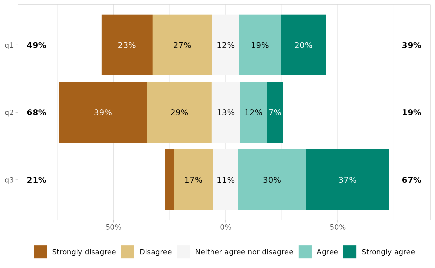
Customizing the plot
The generated plot is a standard ggplot2 object. You can therefore use ggplot2 functions to custom many aspects.
gglikert(df) +
  ggtitle("A Likert-type items plot", subtitle = "generated with gglikert()") +
  scale_fill_brewer(palette = "RdYlBu")
#> Scale for fill is already present.
#> Adding another scale for fill, which will replace the existing scale.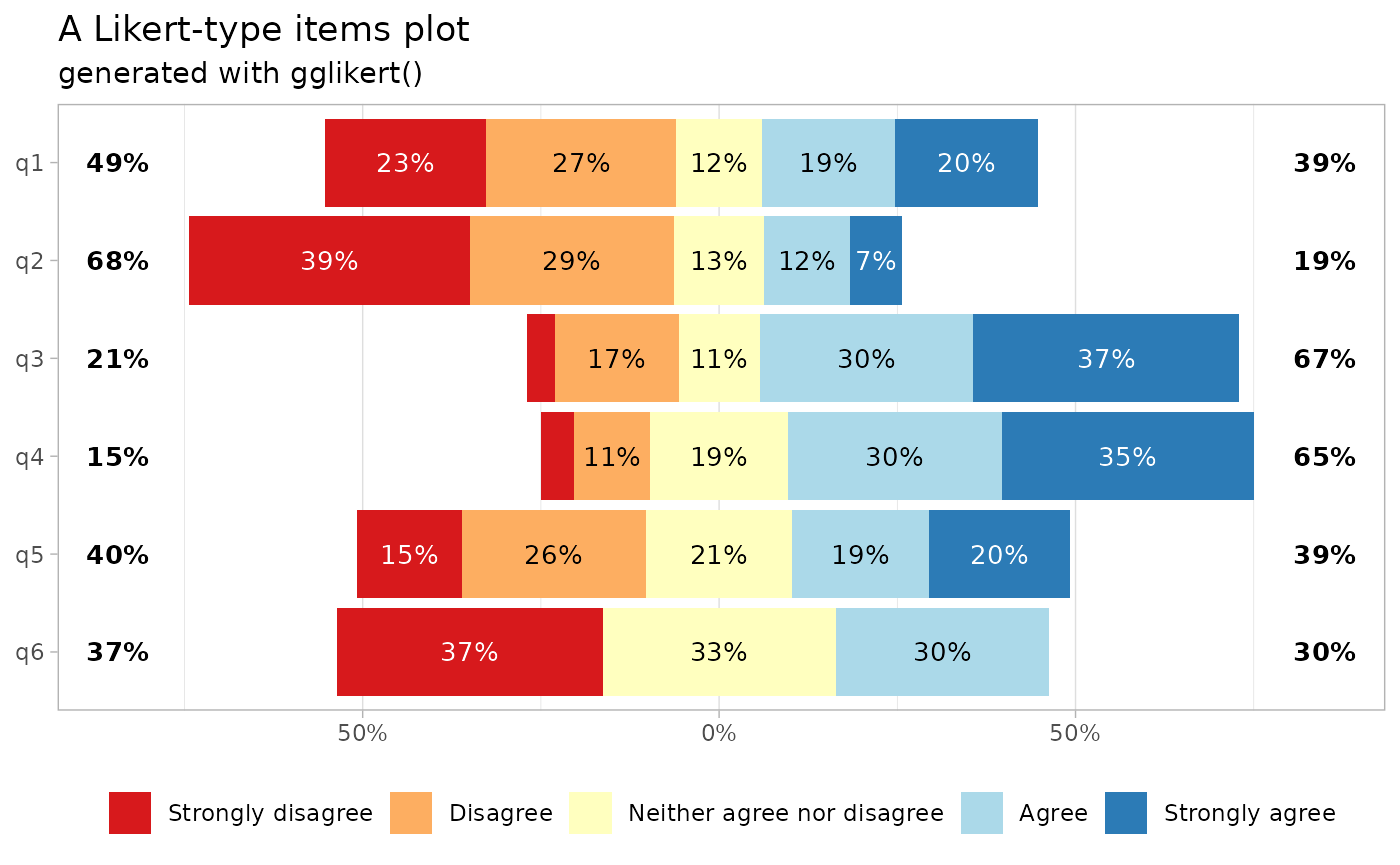
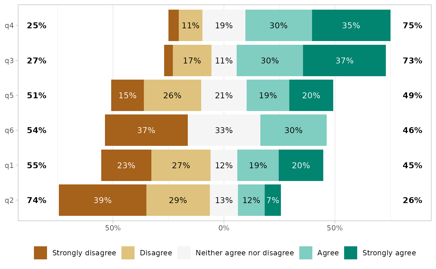
Sorting the questions
You can sort the plot with sort.
gglikert(df, sort = "ascending")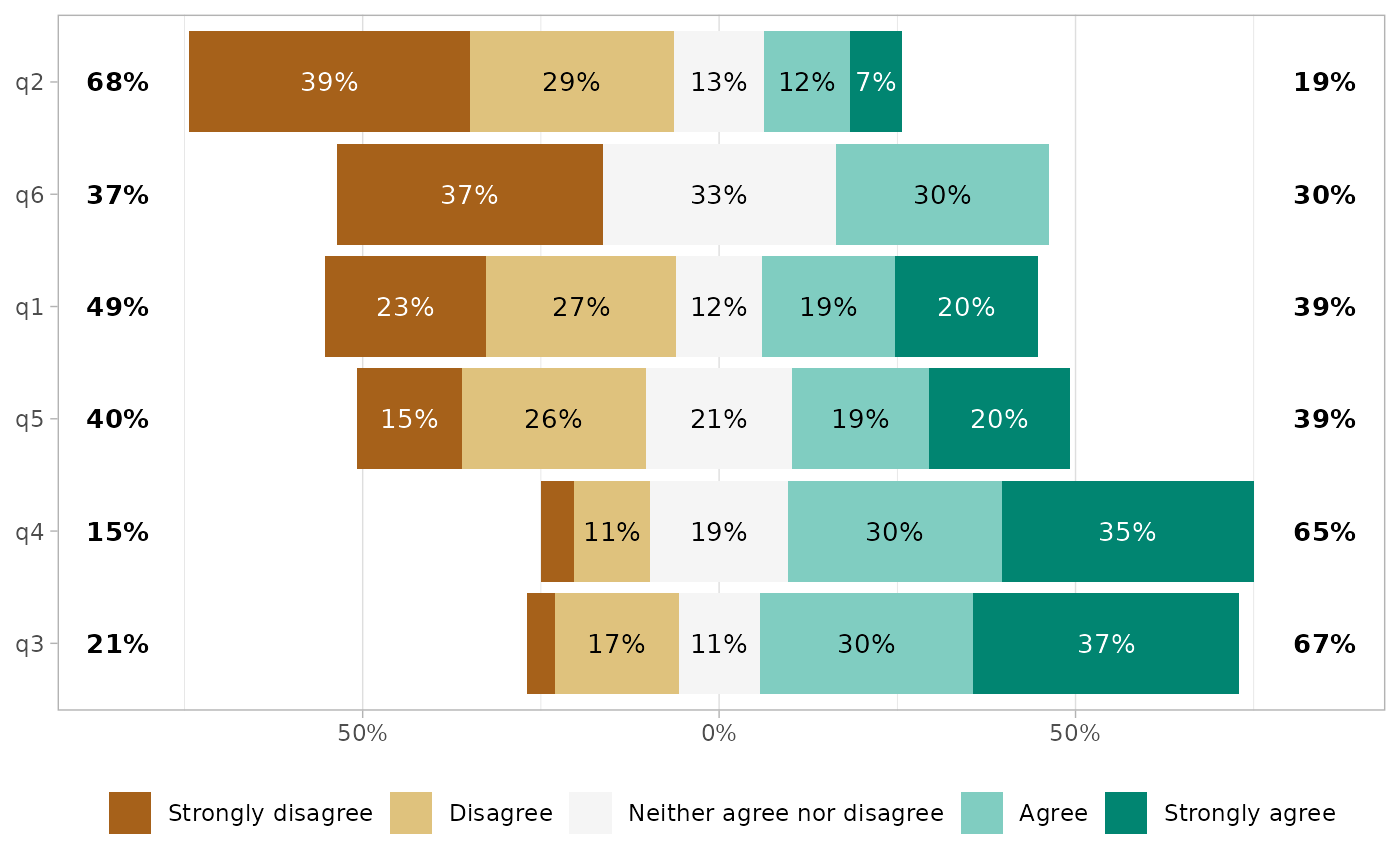
By default, the plot is sorted based on the proportion being higher than the center level, i.e. in this case the proportion of answers equal to “Agree” or “Strongly Agree”. Alternatively, the questions could be transformed into a score and sorted accorded to their mean.
gglikert(df, sort = "ascending", sort_method = "mean")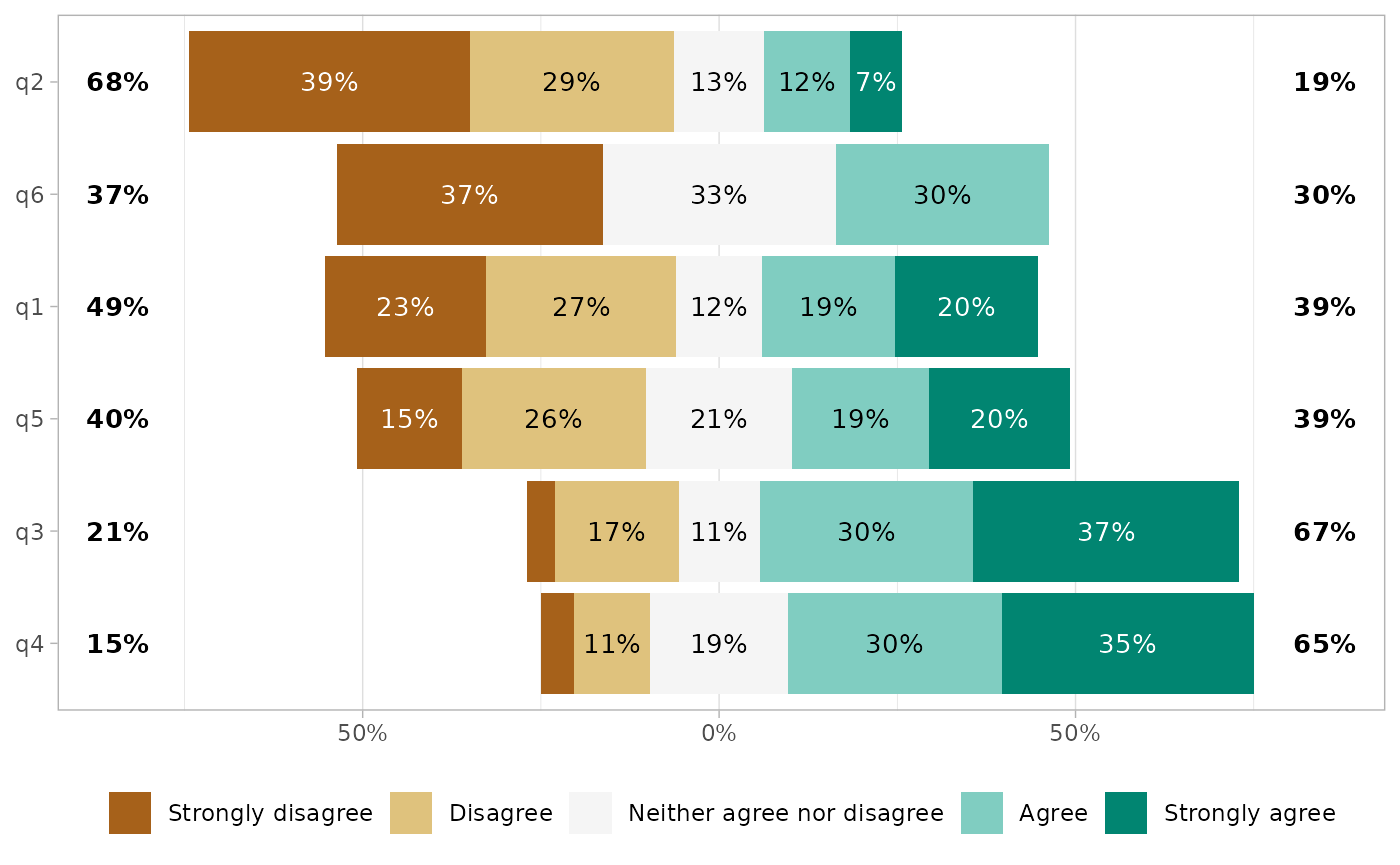
Sorting the answers
You can reverse the order of the answers with reverse_likert.
gglikert(df, reverse_likert = TRUE)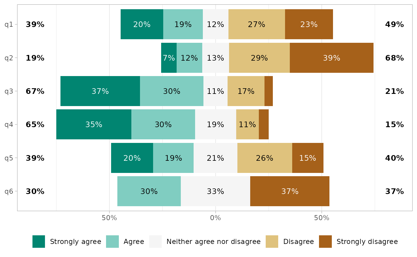
Proportion labels
Proportion labels could be removed with add_labels = FALSE.
gglikert(df, add_labels = FALSE)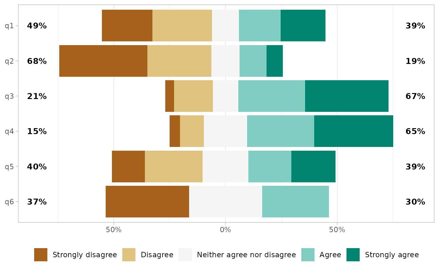
or customized.
gglikert(
  df,
  labels_size = 3,
  labels_accuracy = .1,
  labels_hide_below = .2,
  labels_color = "white"
)
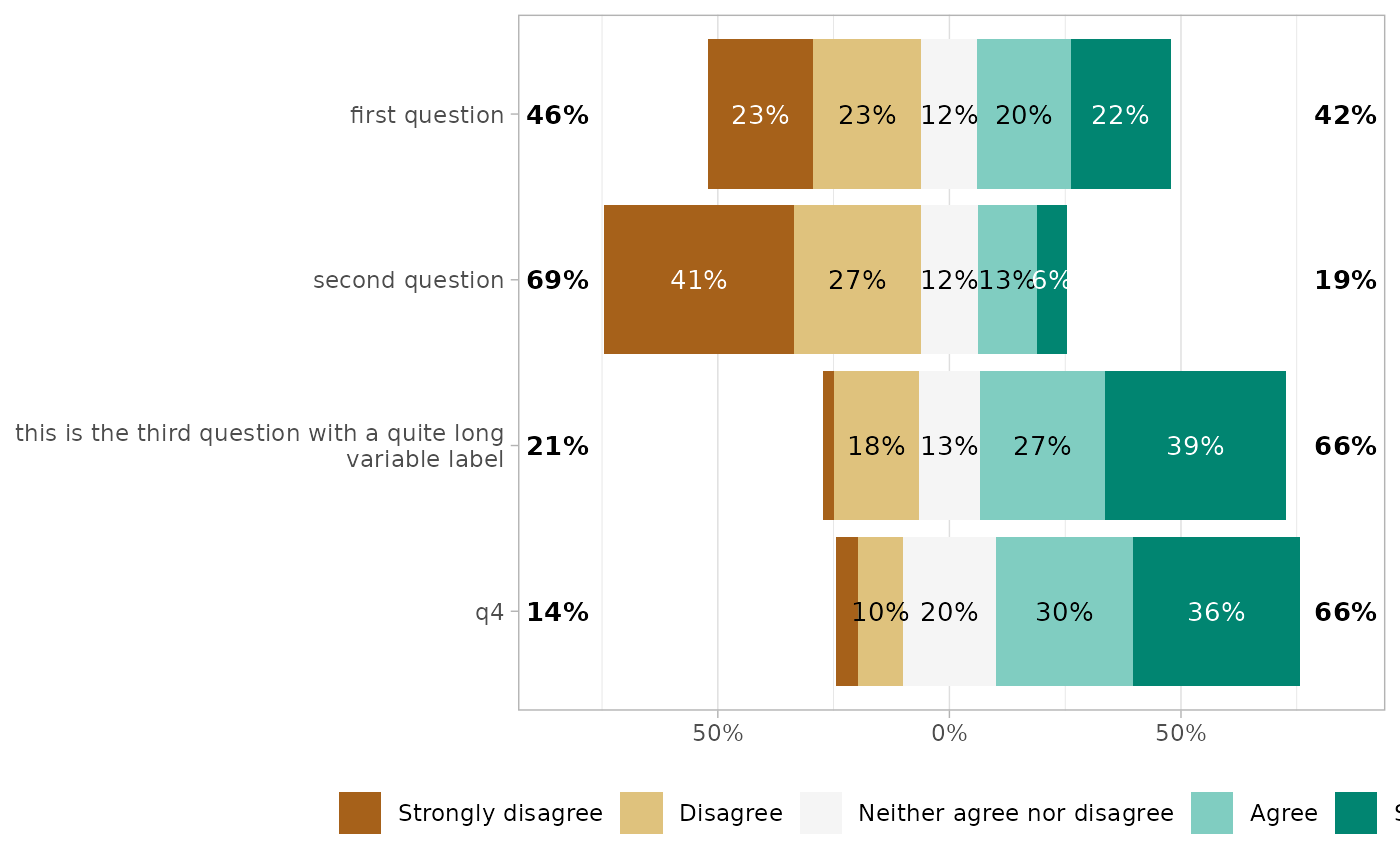
Totals on each side
By default, totals are added on each side of the plot. In case of an uneven number of answer levels, the central level is not taken into account for computing totals. With totals_include_center = TRUE, half of the proportion of the central level will be added on each side.
gglikert(
  df,
  totals_include_center = TRUE,
  sort = "descending",
  sort_prop_include_center = TRUE
)
Totals could be customized.
gglikert(
  df,
  totals_size = 4,
  totals_color = "blue",
  totals_fontface = "italic",
  totals_hjust = .20
)
Or removed.
gglikert(df, add_totals = FALSE)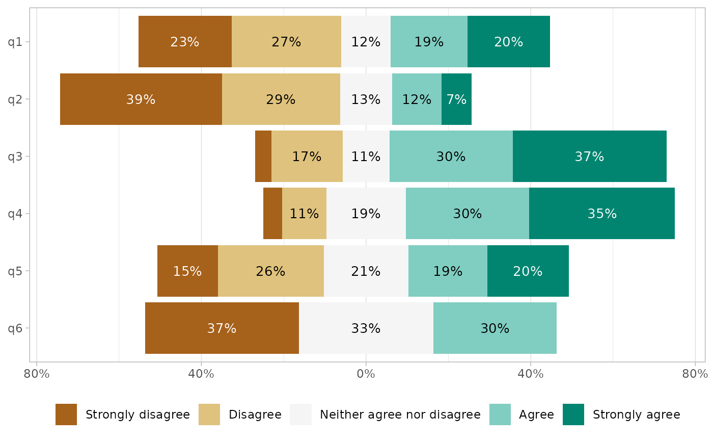
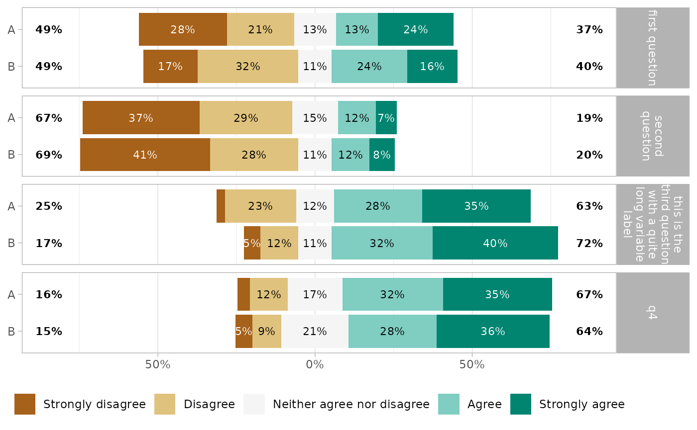
Variable labels
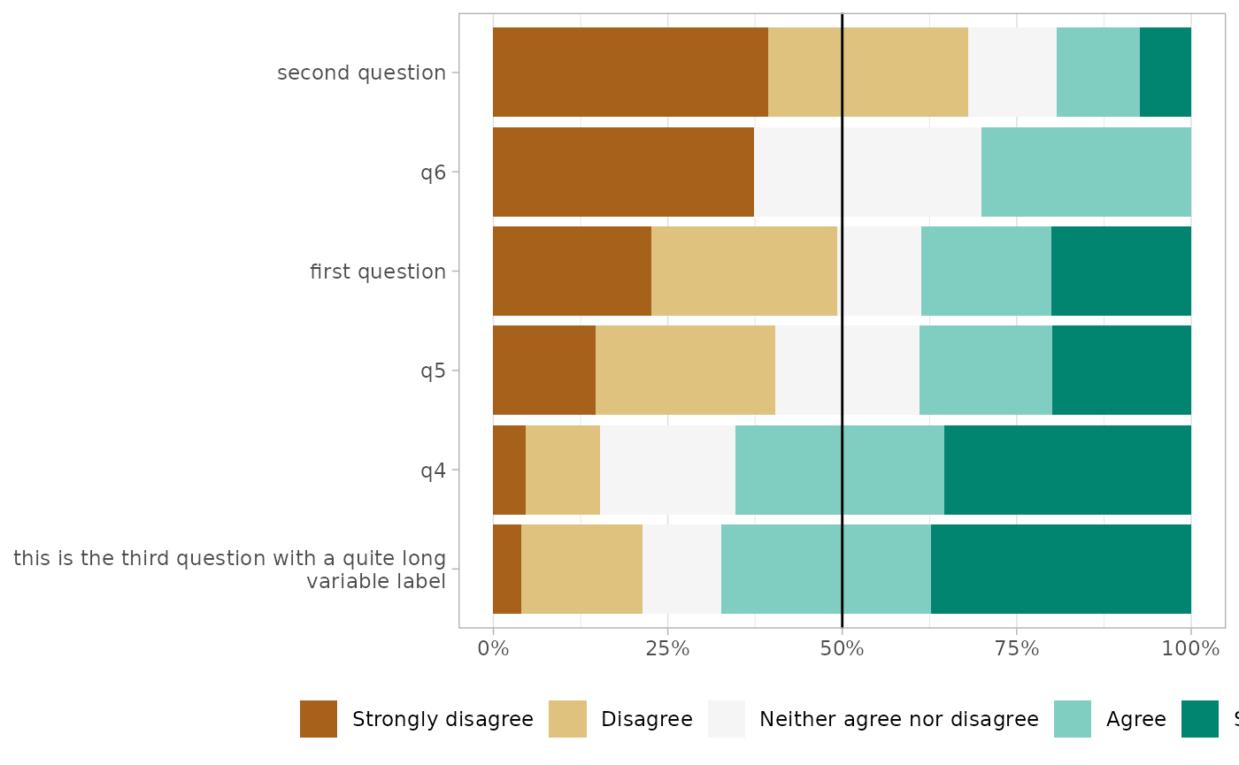
If you are using variable labels (see labelled::set_variable_labels()), they will be taken automatically into account by gglikert().
if (require(labelled)) {
  df <- df |>
    set_variable_labels(
      q1 = "first question",
      q2 = "second question",
      q3 = "this is the third question with a quite long variable label"
    )
}
#> Loading required package: labelled
gglikert(df)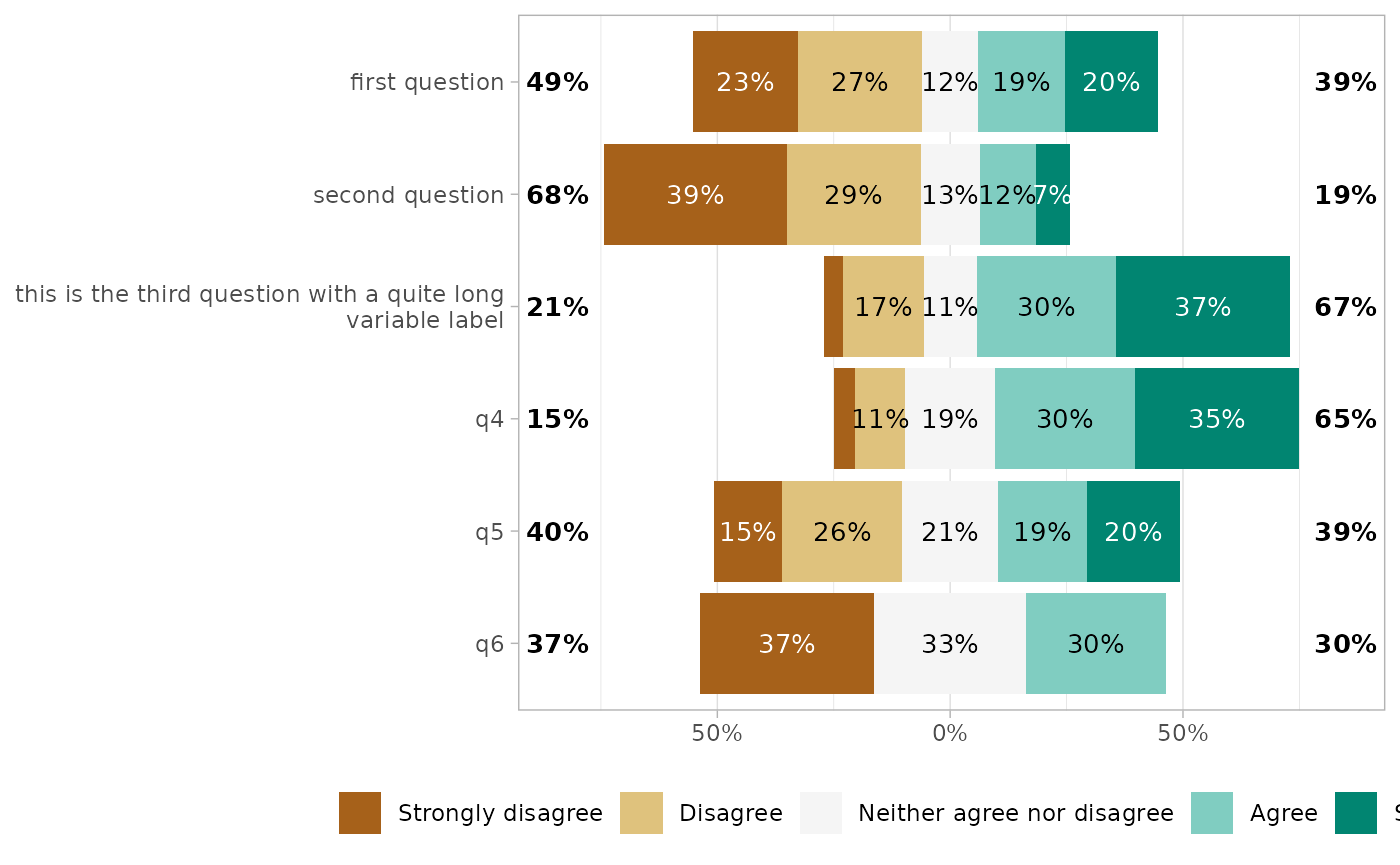
You can also provide custom variable labels with variable_labels.
gglikert(
  df,
  variable_labels = c(
    q1 = "alternative label for the first question",
    q6 = "another custom label"
  )
)
You can control how variable labels are wrapped with y_label_wrap.
gglikert(df, y_label_wrap = 20)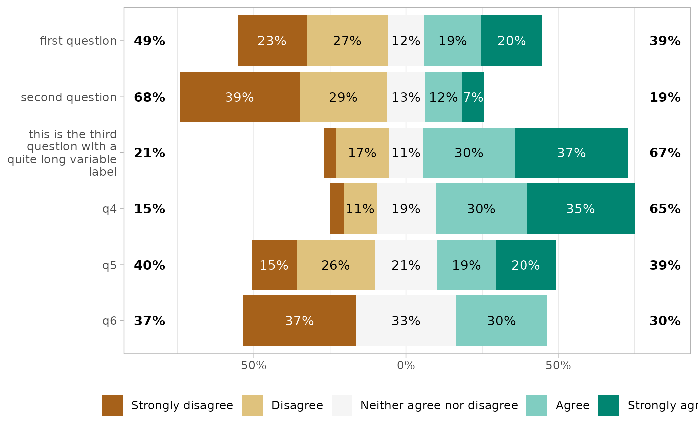
gglikert(df, y_label_wrap = 200)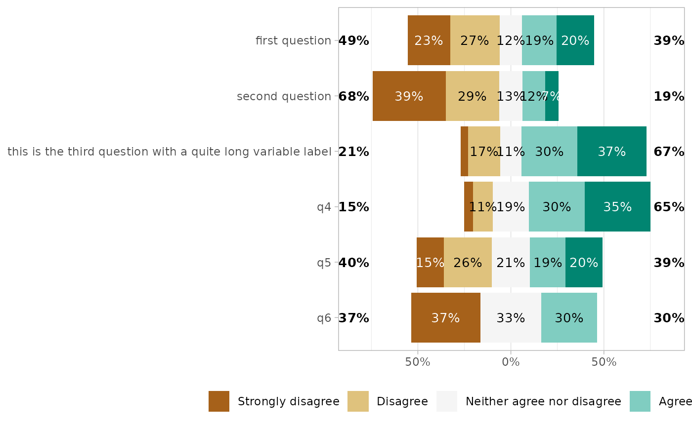
Custom center
By default, Likert plots will be centered, i.e. displaying the same number of categories on each side on the graph. When the number of categories is odd, half of the “central” category is displayed negatively and half positively.
It is possible to control where to center the graph, using the cutoff argument, representing the number of categories to be displayed negatively: 2 to display the two first categories negatively and the others positively; 2.25 to display the two first categories and a quarter of the third negatively.
gglikert(df, cutoff = 0)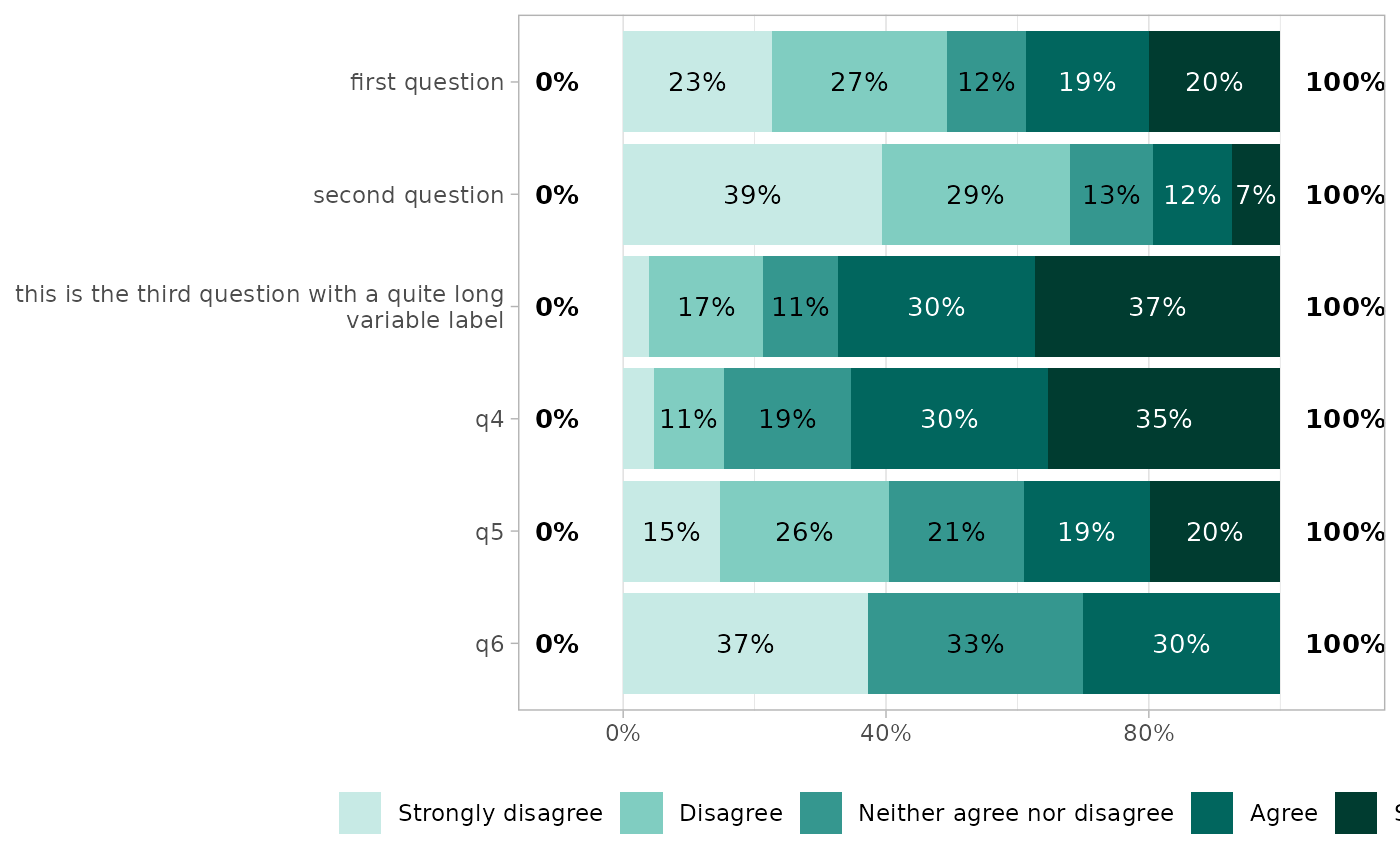
gglikert(df, cutoff = 1)
gglikert(df, cutoff = 1.25)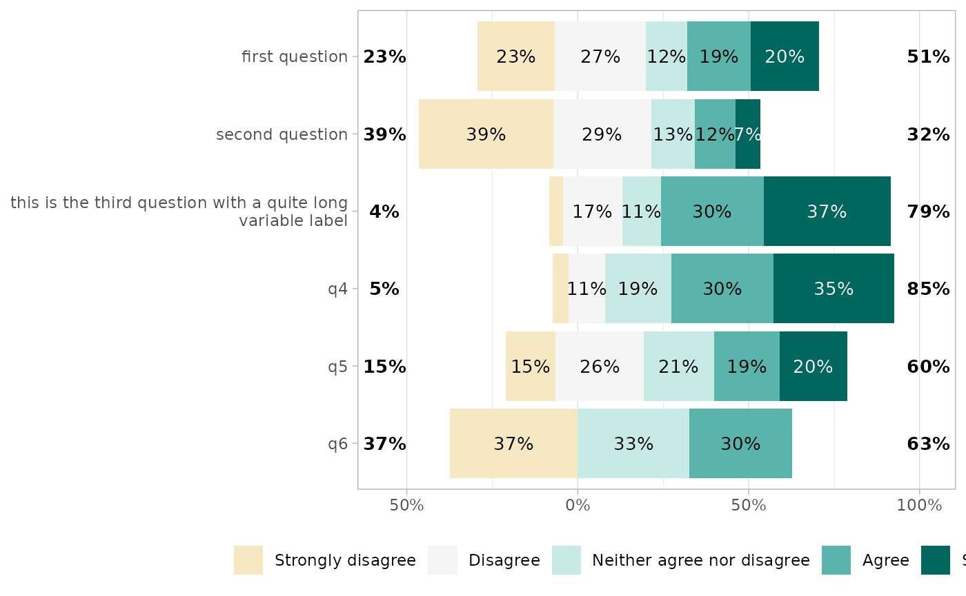
gglikert(df, cutoff = 1.75)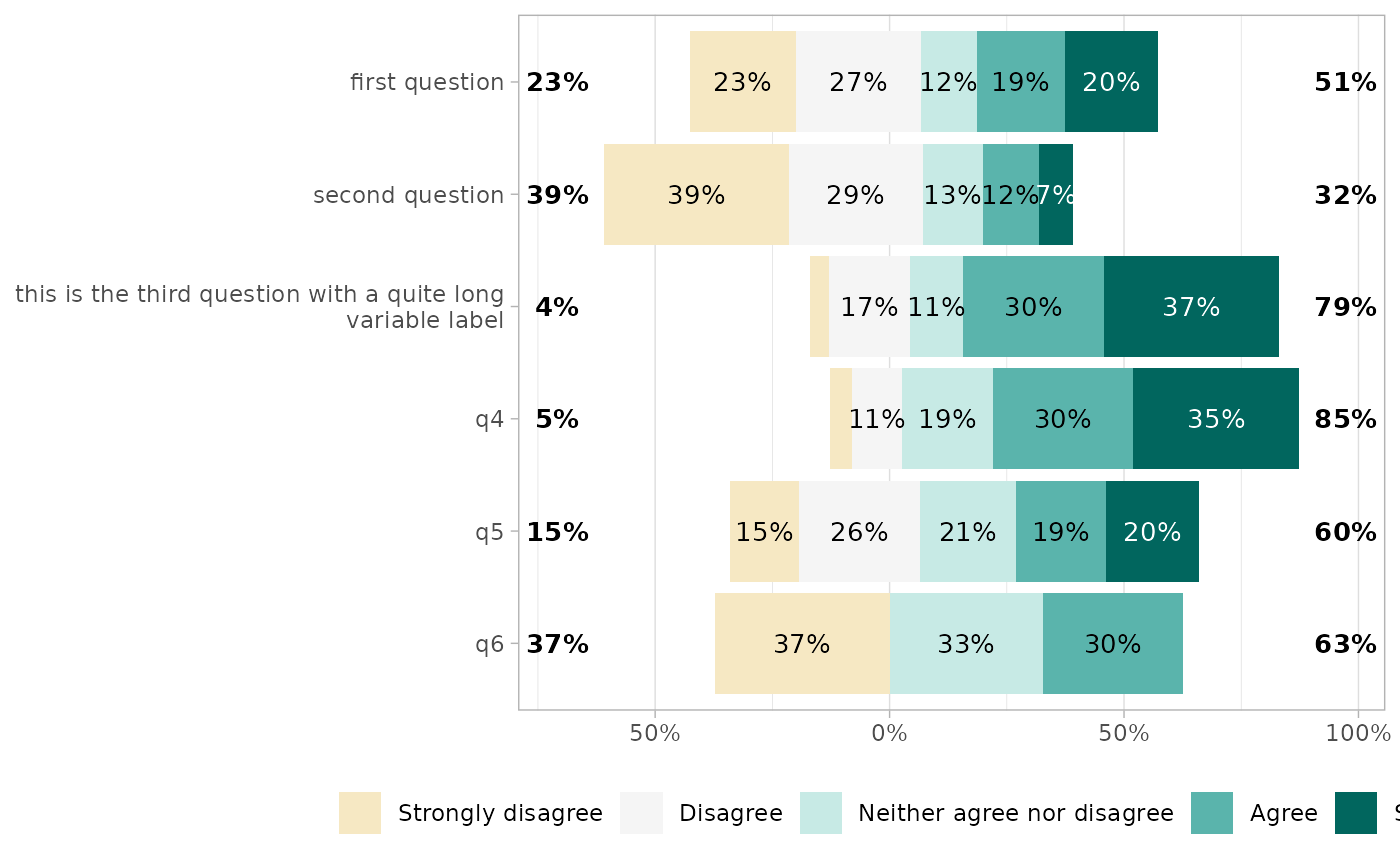
gglikert(df, cutoff = 2)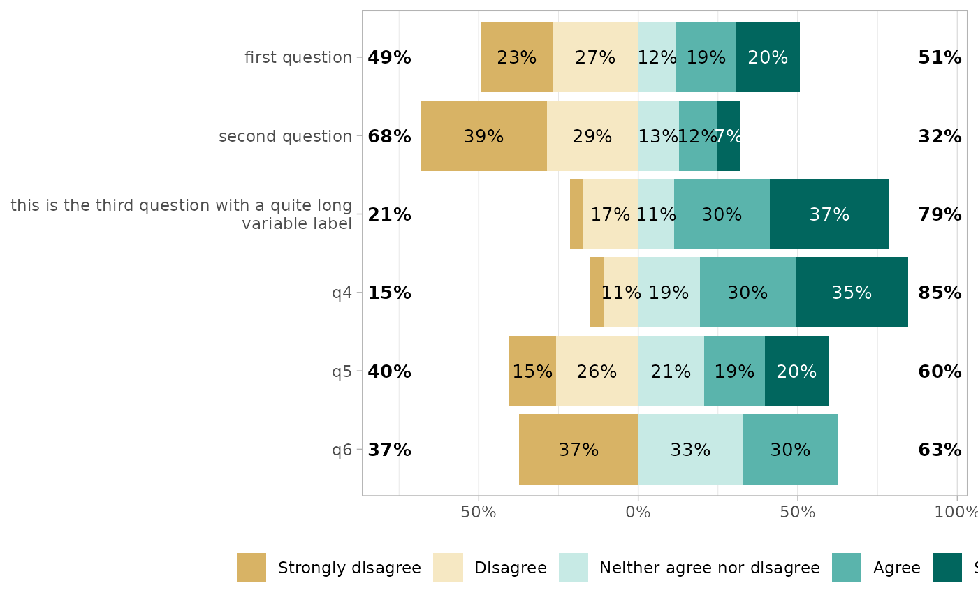
gglikert(df, cutoff = NULL)
gglikert(df, cutoff = 4)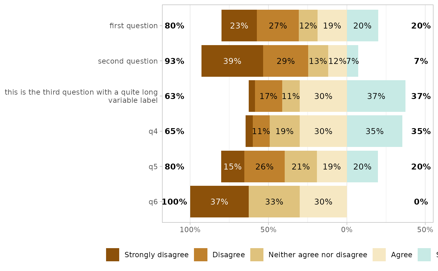
gglikert(df, cutoff = 5)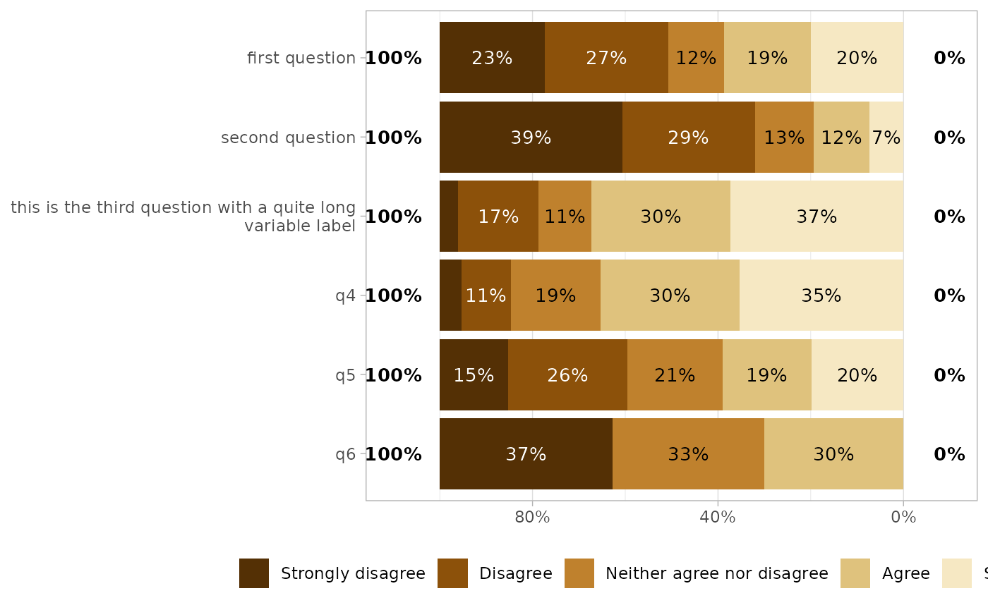
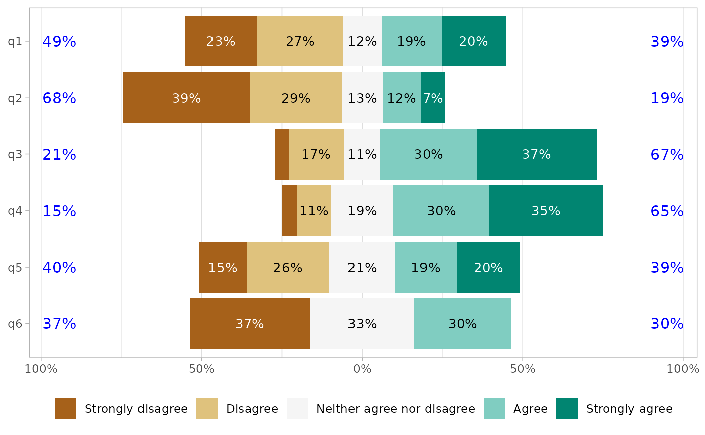
Symmetric x-axis
Simply specify symmetric = TRUE.
gglikert(df, cutoff = 1)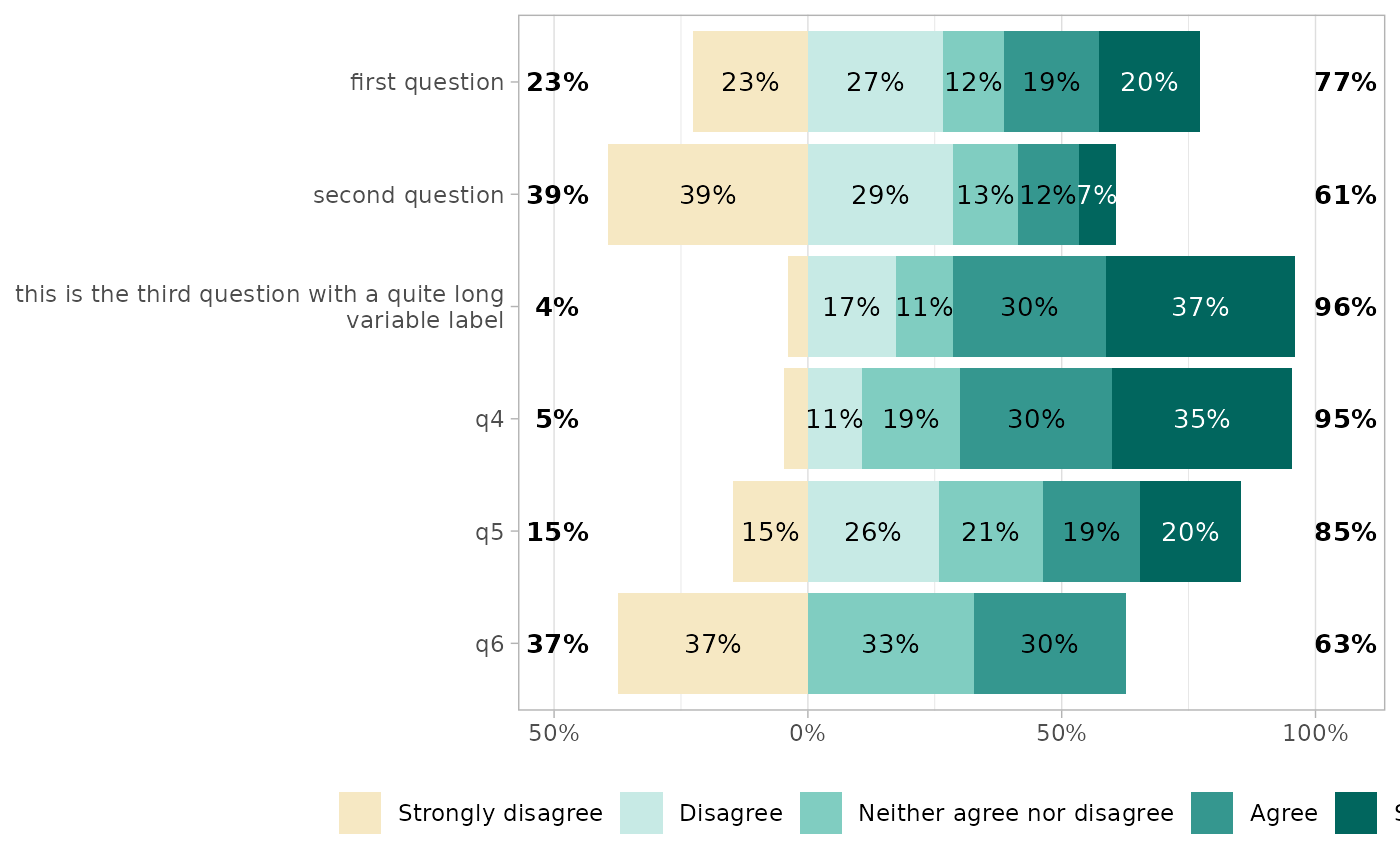
gglikert(df, cutoff = 1, symmetric = TRUE)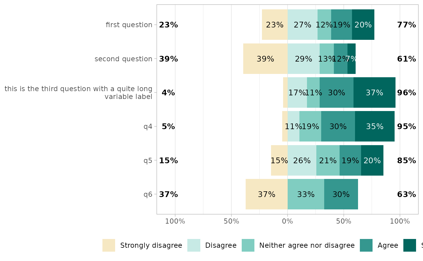
Removing certain values
Sometimes, the dataset could contain certain values that you should not be displayed.
gglikert(df_dk)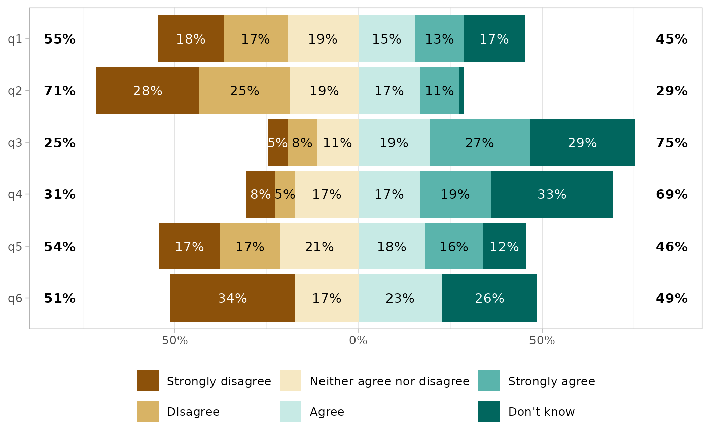
A first option could be to convert the don’t knows into NA. In such case, the proportions will be computed on non missing.
df_dk |>
  mutate(across(everything(), ~ factor(.x, levels = likert_levels))) |>
  gglikert()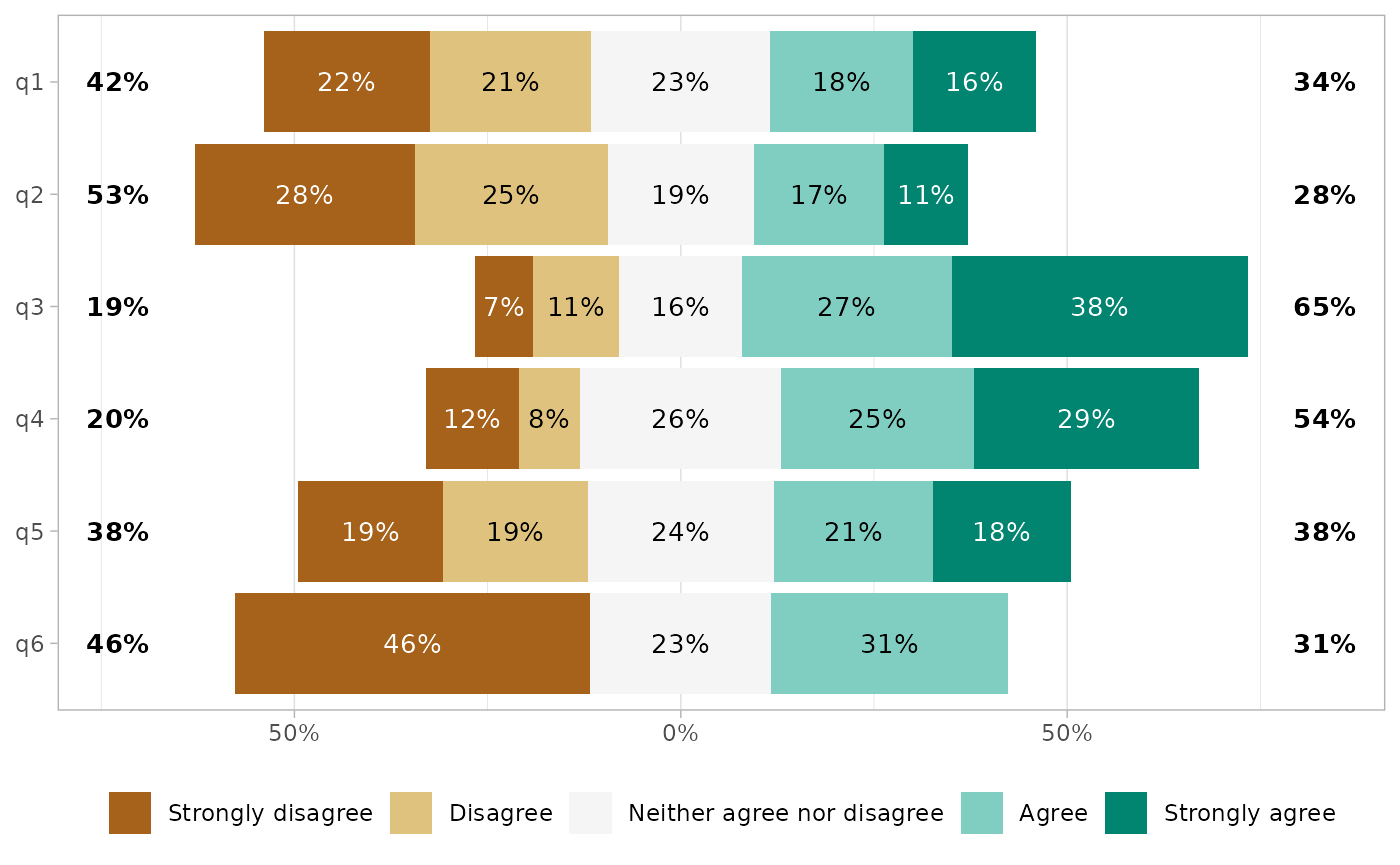
Or, you could use exclude_fill_values to not display specific values, but still counting them in the denominator for computing proportions.
df_dk |> gglikert(exclude_fill_values = "Don't know")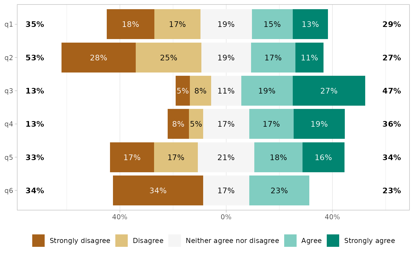
Facets
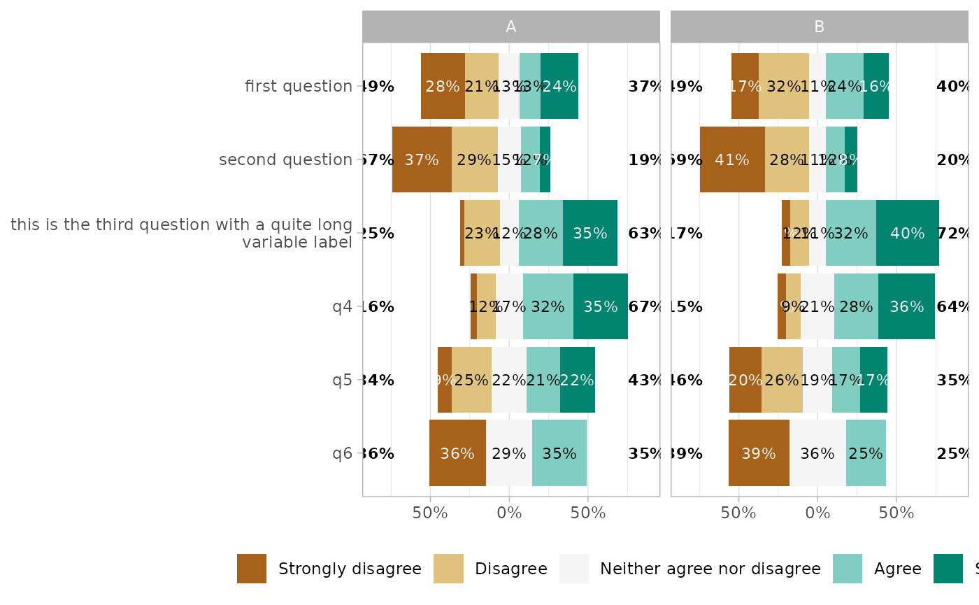
To define facets, use facet_rows and/or facet_cols.
df_group <- df
df_group$group1 <- sample(c("A", "B"), 150, replace = TRUE)
df_group$group2 <- sample(c("a", "b", "c"), 150, replace = TRUE)

gglikert(df_group,
  q1:q6,
  facet_cols = vars(group1),
  labels_size = 3
)
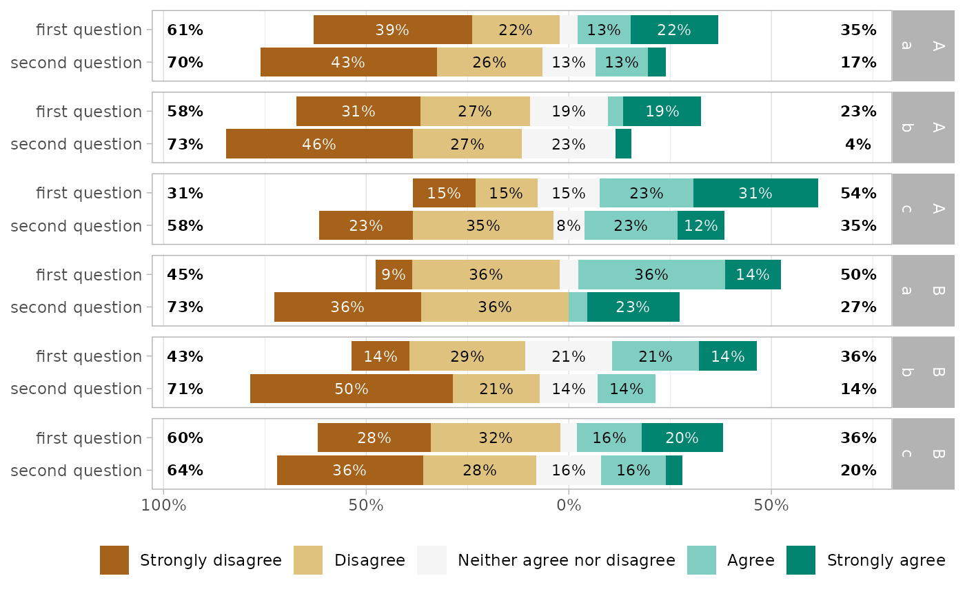
gglikert(df_group,
  q3:q6,
  facet_cols = vars(group1),
  facet_rows = vars(group2),
  labels_size = 3
) +
  scale_x_continuous(
    labels = label_percent_abs(),
    expand = expansion(0, .2)
  )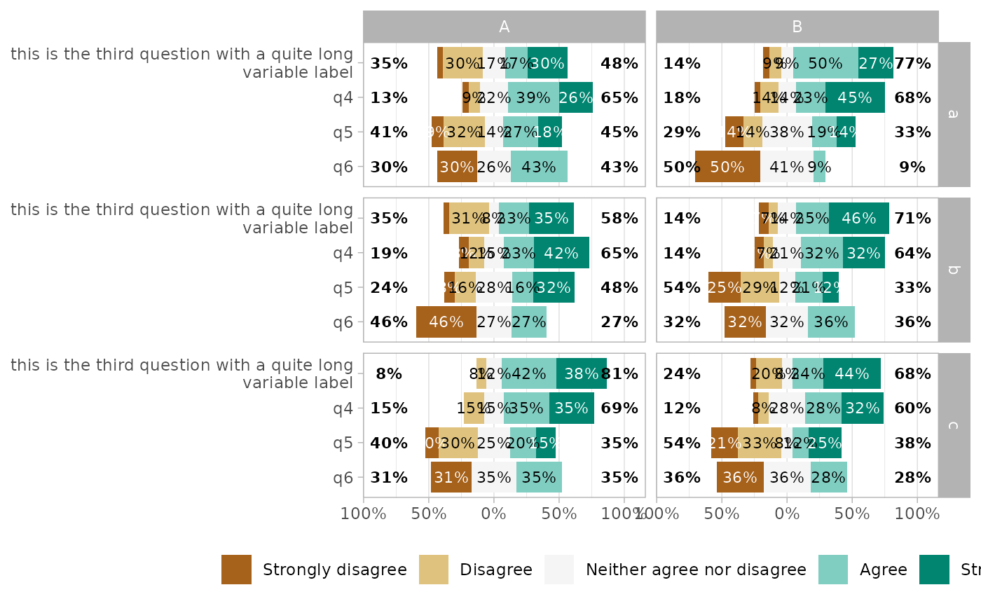
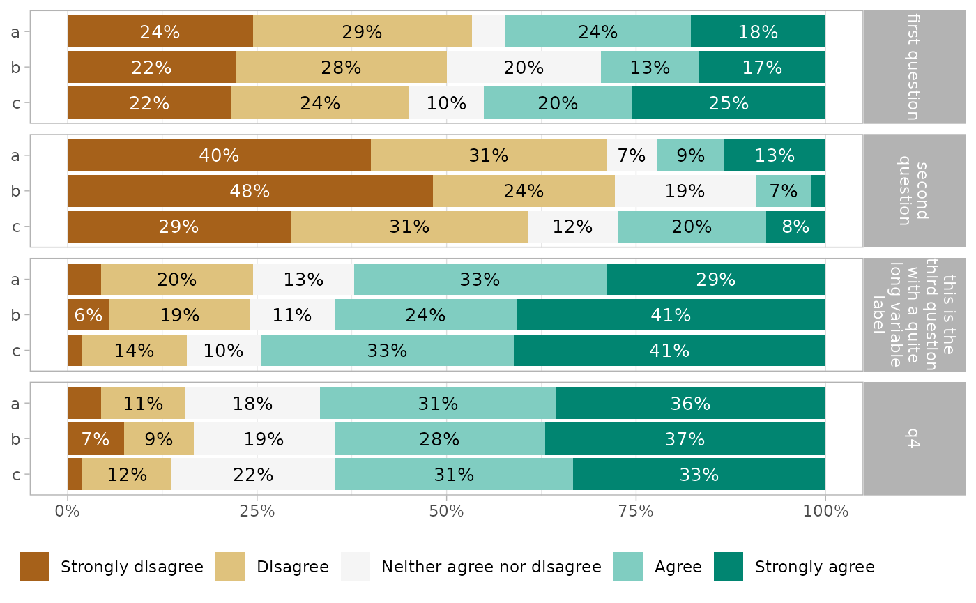
To compare answers by subgroup, you can alternatively map .question to facets, and define a grouping variable for y.
gglikert(df_group,
  q1:q4,
  y = "group1",
  facet_rows = vars(.question),
  labels_size = 3,
  facet_label_wrap = 15
)
Stacked plot
For a more classical stacked bar plot, you can use gglikert_stacked().
gglikert_stacked(df)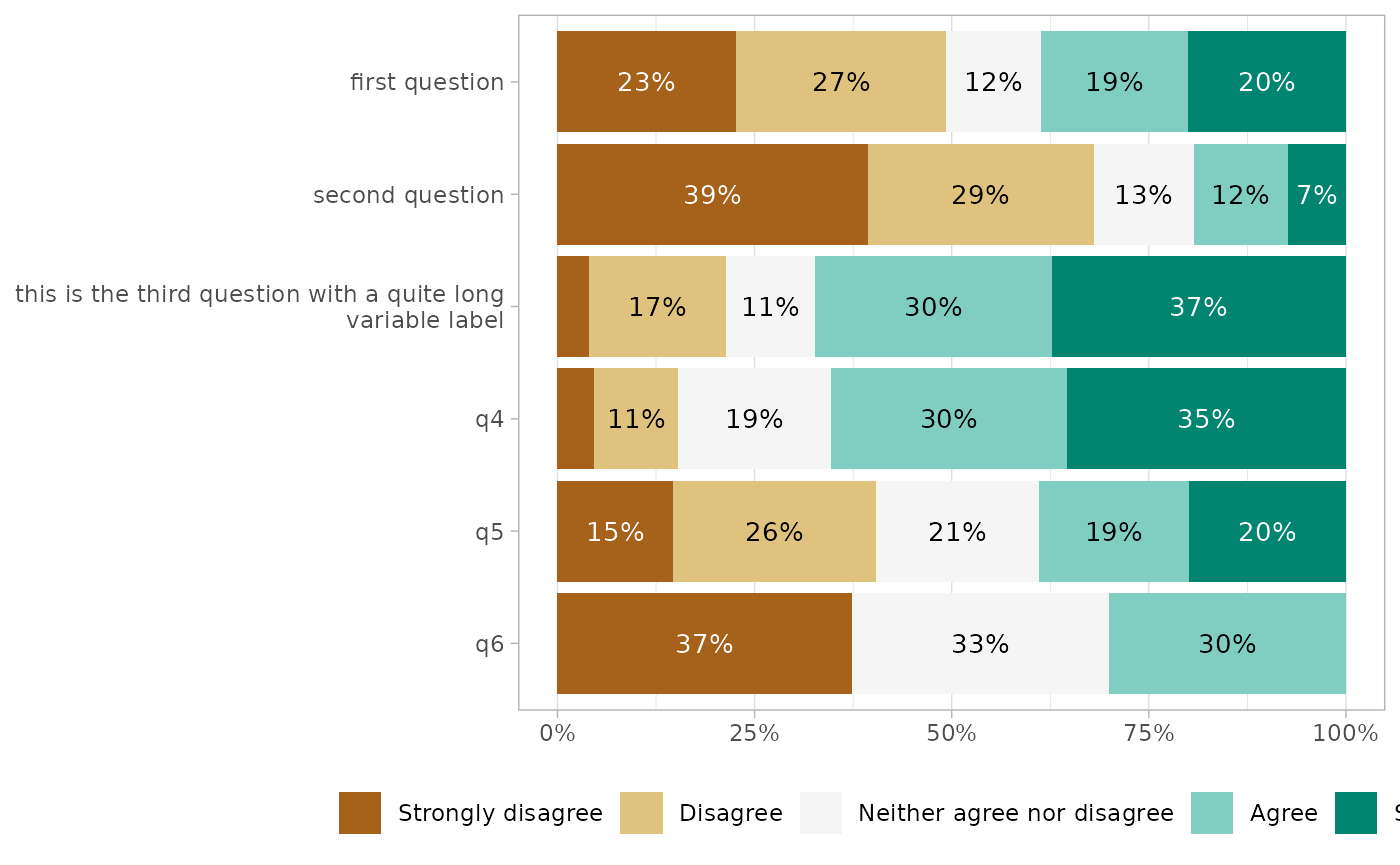
gglikert_stacked(
  df,
  sort = "asc",
  add_median_line = TRUE,
  add_labels = FALSE
)
gglikert_stacked(
  df_group,
  include = q1:q4,
  y = "group2"
) +
  facet_grid(
    rows = vars(.question),
    labeller = label_wrap_gen(15)
  )
Long format dataset
Internally, gglikert() is calling gglikert_data() to generate a long format dataset combining all questions into two columns, .question and .answer.
gglikert_data(df) |>
  head()
#> # A tibble: 6 × 3
#>   .weights .question                                                   .answer
#>      <dbl> <fct>                                                       <fct>
#> 1        1 first question                                              Strongly…
#> 2        1 second question                                             Disagree
#> 3        1 this is the third question with a quite long variable label Agree
#> 4        1 q4                                                          Disagree
#> 5        1 q5                                                          Strongly…
#> 6        1 q6                                                          Strongly…
Such dataset could be useful for other types of plot, for example for a classic stacked bar plot.
ggplot(gglikert_data(df)) +
  aes(y = .question, fill = .answer) +
  geom_bar(position = "fill")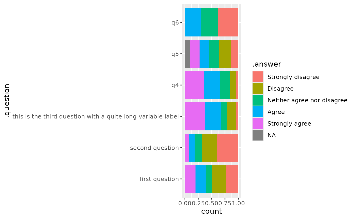
Weighted data
gglikert(), gglikert_stacked() and gglikert_data() accepts a weights argument, allowing to specify statistical weights.
See also
The function position_likert() used to center bars.