Trellis displays on Maps a.k.a. Choropleth maps
mapplot.RdProduces Trellis displays of numeric (and eventually categorical) data on a map. This is largely meant as a demonstration, and users looking for serious map drawing capabilities should look elsewhere (see below).
mapplot(x, data, ...)

# S3 method for class 'formula'
mapplot(x, data, map, outer = TRUE,
        prepanel = prepanel.mapplot,
        panel = panel.mapplot,
        aspect = "iso",
        legend = NULL,
        breaks, cuts = 30,
        colramp = colorRampPalette(hcl.colors(n = 11, palette = "Spectral")),
        colorkey = TRUE,
        ...)

prepanel.mapplot(x, y, map, ...)
panel.mapplot(x, y, map, breaks, colramp, exact = FALSE, lwd = 0.5, ...)
Arguments
- x, y
For
mapplot, an object on which method dispatch is carried out. For the formula method, a formula of the formy ~ x, with additional conditioning variables as desired. The extended form of conditioning usingy ~ x1 + x2etc. is also allowed. The formula might be interpreted as in a dot plot, except thatyis taken to be the names of geographical units inmap.Suitable subsets (packets) of
xandyare passed to the prepanel and panel functions.- data
A data source where names in the formula are evaluated
- map
An object of class
"map"(packagemaps), containing boundary information. The names of the geographical units must match theyvariable in the formula.
The remaining arguments are standard lattice arguments, relevant here mostly because they have different defaults than usual:
- outer
Logical flag specifying how variables separated by
+in the formula are interpreted. It is not advisable to change the default.- prepanel
The prepanel function.
- panel
The panel function.
- aspect
The aspect ratio.
- breaks, cuts, colramp
controls conversion of numeric
xvalues to a false color.colrampshould be a function that produces colors (such ascm.colors). If it isNULL, colors are taken fromtrellis.par.get("regions").- exact
the default
exact = FALSEallows the givenyvalues to match sub-regions ofmap, i.e. region names with a qualifier following":", like"michigan:north", "michigan:south". These will both match ayvalue of"Michigan".- legend, colorkey
controls legends; usually just a color key giving the association between numeric values of
xand color.- lwd
line width
- ...
Further arguments passed on to the underlying engine. See
xyplotfor details.
Value
An object of class "trellis".
References
Note
This function is meant to demonstrate how maps can be incorporated in a Trellis display. Users seriously interested in geographical data should consider using software written by people who know what they are doing.
See also
Examples
## Requires the 'maps' and 'mapproj' packages:
if (require(maps) && require(mapproj)) {
## Note: Alaska, Hawaii and others are not included in county map;
## this generates warnings with both USCancerRates and ancestry.
data(USCancerRates)
suppressWarnings(print(
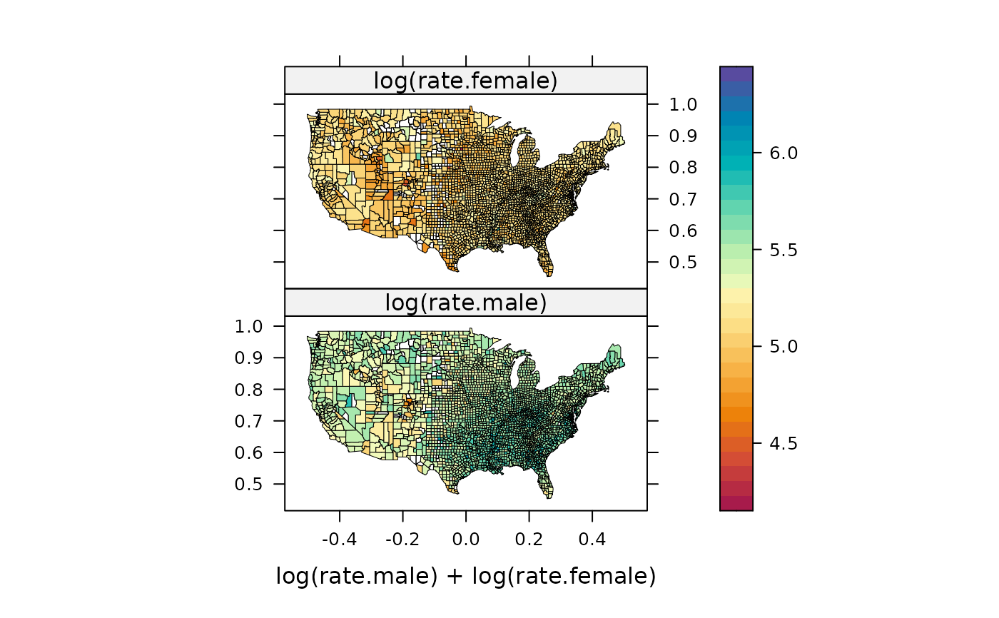
mapplot(rownames(USCancerRates) ~ log(rate.male) + log(rate.female),
data = USCancerRates,
map = map("county", plot = FALSE, fill = TRUE,
projection = "mercator"))
))
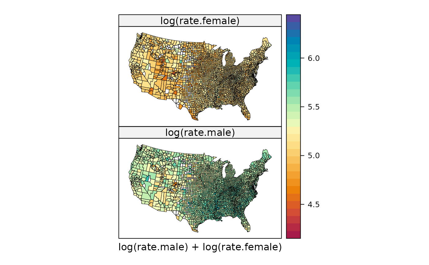
suppressWarnings(print(
mapplot(rownames(USCancerRates) ~ log(rate.male) + log(rate.female),
data = USCancerRates,
map = map("county", plot = FALSE, fill = TRUE,
projection = "tetra"),
scales = list(draw = FALSE))
))
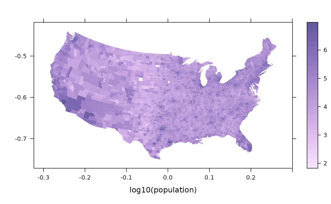
data(ancestry)
county.map <-
map('county', plot = FALSE, fill = TRUE,
projection = "azequalarea")
## set a sequential color palette as current theme, and use it
opar <- trellis.par.get()
trellis.par.set(custom.theme(region = rev(hcl.colors(9, "Purp")),
alpha.line = 0.5))
suppressWarnings(print(
mapplot(county ~ log10(population), ancestry, map = county.map,
colramp = NULL, border = "transparent")
))
trellis.par.set(opar)
}
#> Loading required package: mapproj
 if (FALSE) { # \dontrun{
## this may take a while (should get better area records)
if (require(maps) && require(mapproj)) {
county.areas <-
area.map(county.map, regions = county.map$names, sqmi = FALSE)
ancestry$density <-
with(ancestry, population / county.areas[as.character(county)])
mapplot(county ~ log(density), ancestry,
map = county.map, border = NA,
colramp = colorRampPalette(c("white", "black")))
}
} # }
if (FALSE) { # \dontrun{
## this may take a while (should get better area records)
if (require(maps) && require(mapproj)) {
county.areas <-
area.map(county.map, regions = county.map$names, sqmi = FALSE)
ancestry$density <-
with(ancestry, population / county.areas[as.character(county)])
mapplot(county ~ log(density), ancestry,
map = county.map, border = NA,
colramp = colorRampPalette(c("white", "black")))
}
} # }