Plot contiguous blocks along x axis.
panel.xblocks.RdPlot contiguous blocks along x axis. A typical use would be to highlight events or periods of missing data.
panel.xblocks(x, ...)

# Default S3 method
panel.xblocks(x, y, ..., col = NULL, border = NA,
              height = unit(1, "npc"),
              block.y = unit(0, "npc"), vjust = 0,
              name = "xblocks", gaps = FALSE,
              last.step = median(diff(tail(x))))

# S3 method for class 'ts'
panel.xblocks(x, y = x, ...)
# S3 method for class 'zoo'
panel.xblocks(x, y = x, ...)
Arguments
- x, y
In the default method,
xgives the ordinates along the x axis and must be in increasing order.ygives the color values to plot as contiguous blocks. Ifyis numeric, data coverage is plotted, by converting it into a logical (!is.na(y)). Finally, ifyis a function, it is applied tox(time(x)in the time series methods).If
yhas character (or factor) values, these are interpreted as colors – and should therefore be color names or hex codes. Missing values inyare not plotted. The default color is taken from the current theme:trellis.par.get("plot.line")$col. Ifcolis given, this over-rides the block colors.The
tsandzoomethods plot theyvalues against the time indextime(x).- ...
In the default method, further arguments are graphical parameters passed on to
gpar.- col
if
colis specified, it determines the colors of the blocks defined byy. If multiple colors are specified they will be repeated to cover the total number of blocks.- border
border color.
- height
height of blocks, defaulting to the full panel height. Numeric values are interpreted as native units.
- block.y
y axis position of the blocks. Numeric values are interpreted as native units.
- vjust
vertical justification of the blocks relative to
block.y. SeerectGrob.- name
a name for the grob (grid object).
- gaps
Deprecated. Use
panel.xblocks(time(z), is.na(z))instead.- last.step
width (in native units) of the final block. Defaults to the median of the last 5 time steps (assuming steps are regular).
Details
Blocks are drawn forward in "time" from the specified x locations,
up until the following value. Contiguous blocks are calculated using
rle.
See also
xyplot.ts,
panel.rect,
grid.rect
Examples
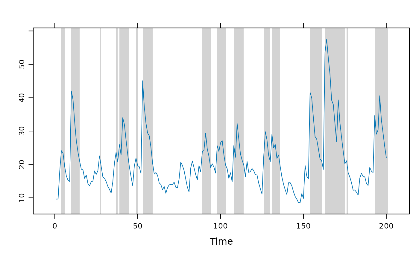
## Example of highlighting peaks in a time series.
set.seed(0)
flow <- ts(filter(rlnorm(200, mean = 1), 0.8, method = "r"))
## using an explicit panel function
xyplot(flow, panel = function(x, y, ...) {
panel.xblocks(x, y > mean(y), col = "lightgray")
panel.xyplot(x, y, ...)
})
 ## using layers; this is the `ts` method because `>` keeps it as ts.
xyplot(flow) +
layer_(panel.xblocks(flow > mean(flow), col = "lightgray"))
## using layers; this is the `ts` method because `>` keeps it as ts.
xyplot(flow) +
layer_(panel.xblocks(flow > mean(flow), col = "lightgray"))
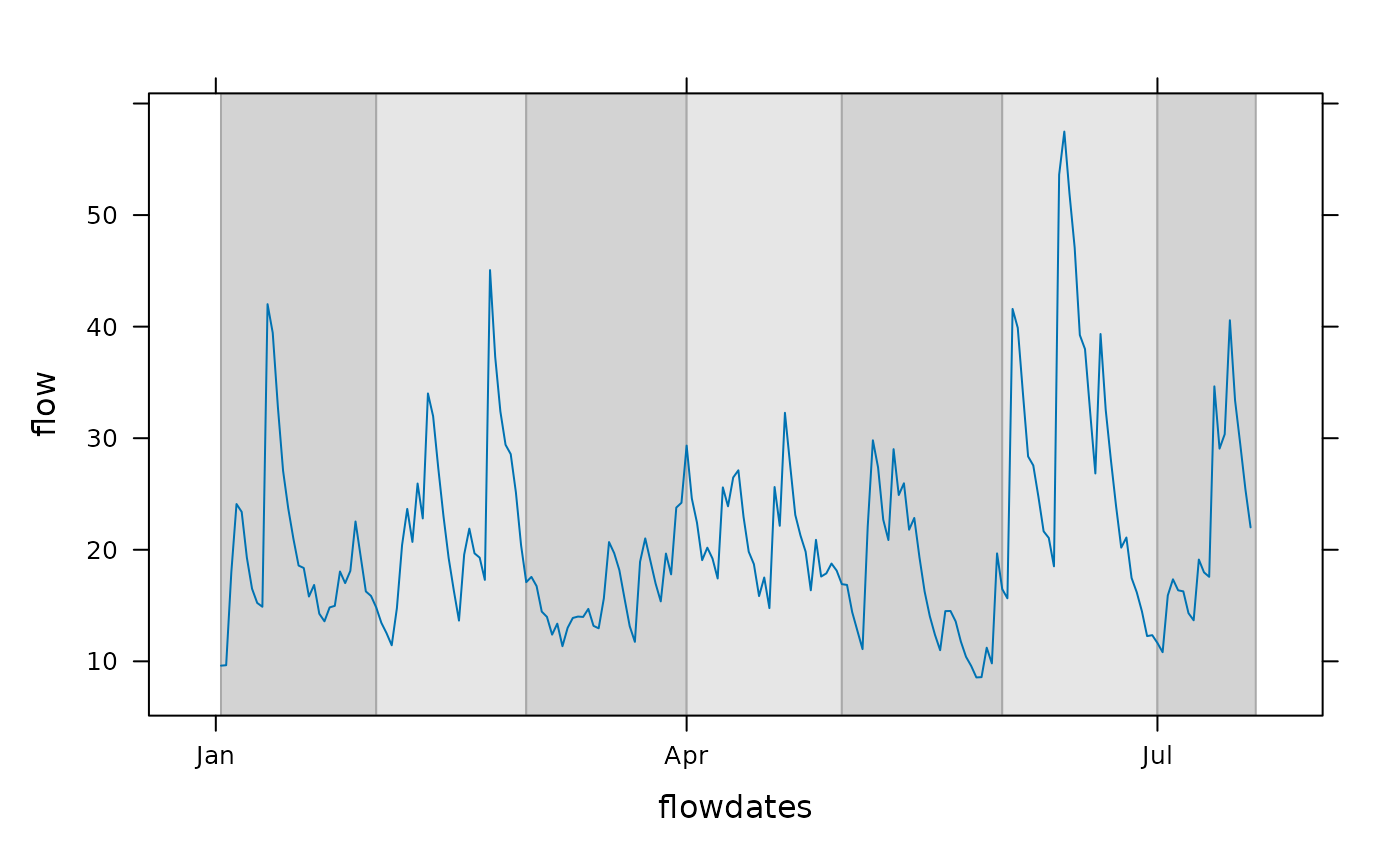
 ## Example of alternating colors, here showing calendar months
flowdates <- as.Date("2000-01-01") + as.numeric(time(flow))
xyplot(flow ~ flowdates, type = "l") +
layer_(panel.xblocks(x, months,
col = c("lightgray", "#e6e6e6"), border = "darkgray"))
## Example of alternating colors, here showing calendar months
flowdates <- as.Date("2000-01-01") + as.numeric(time(flow))
xyplot(flow ~ flowdates, type = "l") +
layer_(panel.xblocks(x, months,
col = c("lightgray", "#e6e6e6"), border = "darkgray"))
 ## highlight values above and below thresholds.
## blue, gray, red colors:
bgr <- hcl(c(0, 0, 260), c = c(100, 0, 100), l = c(90, 90, 90))
dflow <- cut(flow, c(0,15,30,Inf), labels = bgr)
xyplot(flow) + layer_(panel.xblocks(time(flow), dflow))
## highlight values above and below thresholds.
## blue, gray, red colors:
bgr <- hcl(c(0, 0, 260), c = c(100, 0, 100), l = c(90, 90, 90))
dflow <- cut(flow, c(0,15,30,Inf), labels = bgr)
xyplot(flow) + layer_(panel.xblocks(time(flow), dflow))
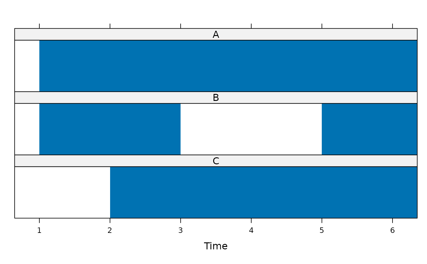
 ## Example of highlighting gaps (NAs) in time series.
## set up example data
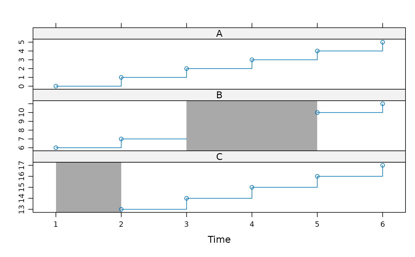
z <- ts(cbind(A = 0:5, B = c(6:7, NA, NA, 10:11), C = c(NA, 13:17)))
## show data coverage only (highlighting gaps)
xyplot(z, panel = panel.xblocks,
scales = list(y = list(draw = FALSE)))
## Example of highlighting gaps (NAs) in time series.
## set up example data
z <- ts(cbind(A = 0:5, B = c(6:7, NA, NA, 10:11), C = c(NA, 13:17)))
## show data coverage only (highlighting gaps)
xyplot(z, panel = panel.xblocks,
scales = list(y = list(draw = FALSE)))
 ## draw gaps in darkgray
xyplot(z, type = c("p","s")) +
layer_(panel.xblocks(x, is.na(y), col = "darkgray"))
## draw gaps in darkgray
xyplot(z, type = c("p","s")) +
layer_(panel.xblocks(x, is.na(y), col = "darkgray"))
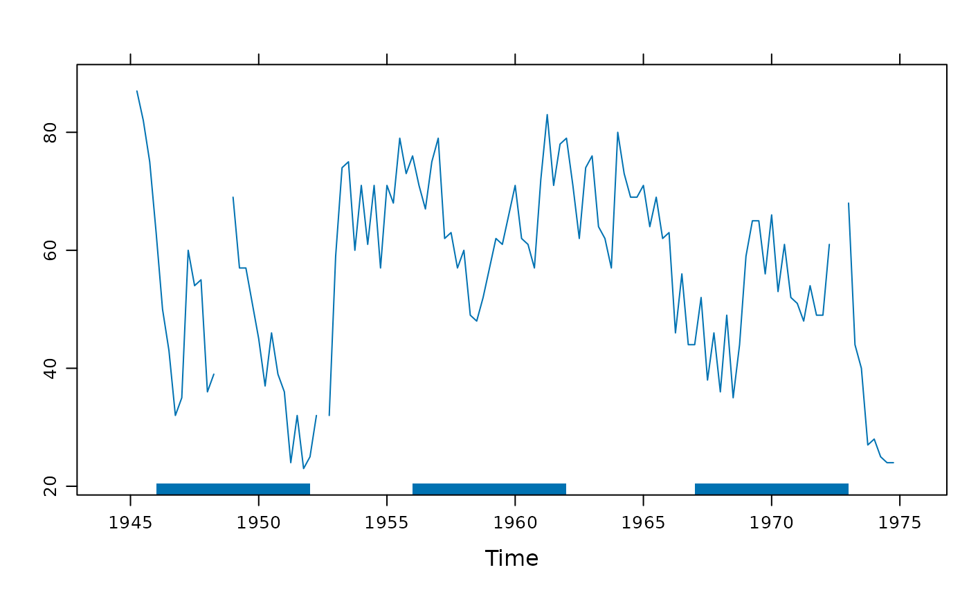
 ## Example of overlaying blocks from a different series.
## Are US presidential approval ratings linked to sunspot activity?
## Set block height, default justification is along the bottom.
xyplot(presidents) + layer(panel.xblocks(sunspot.year > 50, height = 2))
## Example of overlaying blocks from a different series.
## Are US presidential approval ratings linked to sunspot activity?
## Set block height, default justification is along the bottom.
xyplot(presidents) + layer(panel.xblocks(sunspot.year > 50, height = 2))