Draw pairs of bargraphs based on two groups
bi.bars.RdWhen showing e.g., age or education distributions for two groups, it is convenient to plot them back to back. bi.bars will do so.
bi.bars(x,var=NULL,grp=NULL,horiz,color,label=NULL,zero=FALSE,xlab,ylab,...)Arguments
- x
The data frame or matrix from which we specify the data
- var
The variable to plot
- grp
a grouping variable.
- horiz
horizontal (default) or vertical bars
- color
colors for the two groups – defaults to blue and red
- label
If specified, labels for the dependent axis
- zero
If TRUE, subtract the minimum value to make the numbers range from 0 to max -min. This is useful if showing heights
- xlab
xaxis label if appropriate
- ylab
y axis label otherwise
- ...
Further parameters to pass to the graphing program
Details
A trivial, if useful, function to draw back to back histograms/barplots. One for each group.
Value
a graphic
See also
describe, describeBy and statsBy for descriptive statistics and error.bars error.bars.by and densityBy violinBy for graphic displays
Examples
#data(bfi)
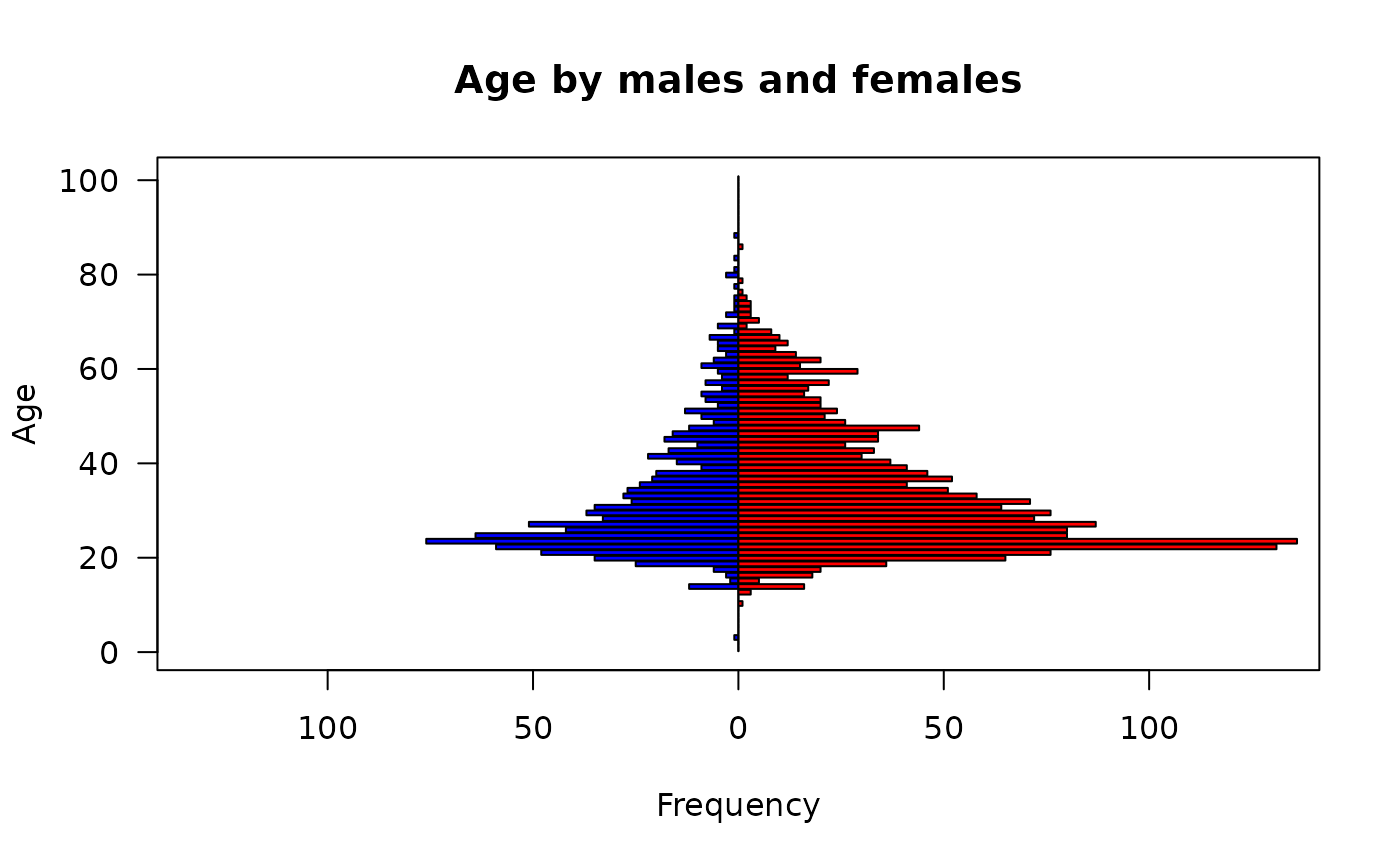
bi.bars(bfi,"age","gender" ,ylab="Age",main="Age by males and females")
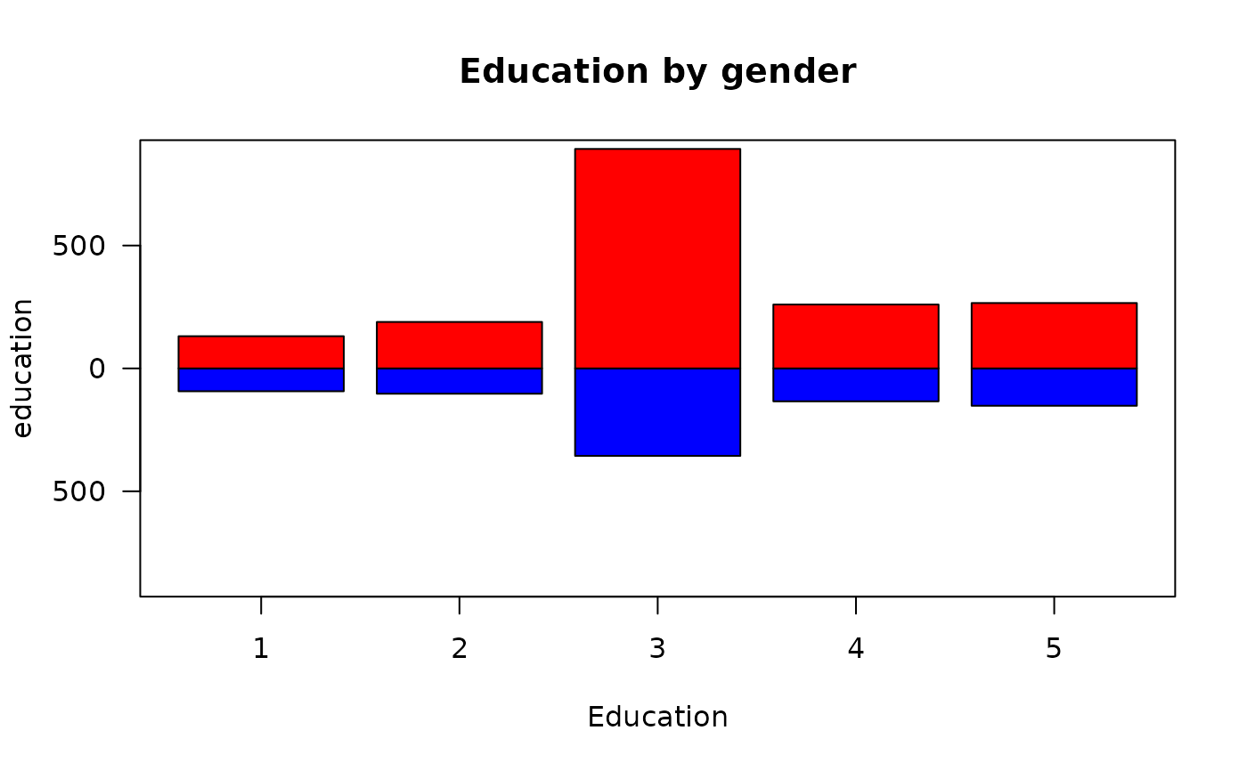
 bi.bars(bfi,"education","gender",xlab="Education",
main="Education by gender",horiz=FALSE)
bi.bars(bfi,"education","gender",xlab="Education",
main="Education by gender",horiz=FALSE)