![[Stable]](figures/lifecycle-stable.svg)
Based on the STEP results, creates a ggplot graph showing the estimated HR or OR
along the continuous biomarker value subgroups.
Arguments
- df
(
tibble)
result oftidy.step().- use_percentile
(
flag)
whether to use percentiles for the x axis or actual biomarker values.- est
(named
list)colandltysettings for estimate line.- ci_ribbon
(named
listorNULL)fillandalphasettings for the confidence interval ribbon area, orNULLto not plot a CI ribbon.- col
(
character)
color(s).
Value
A ggplot STEP graph.
See also
Custom tidy method tidy.step().
Examples
library(survival)
lung$sex <- factor(lung$sex)
# Survival example.
vars <- list(
time = "time",
event = "status",
arm = "sex",
biomarker = "age"
)
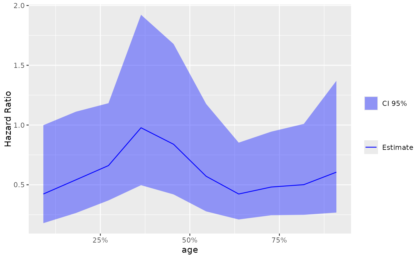
step_matrix <- fit_survival_step(
variables = vars,
data = lung,
control = c(control_coxph(), control_step(num_points = 10, degree = 2))
)
step_data <- broom::tidy(step_matrix)
# Default plot.
g_step(step_data)
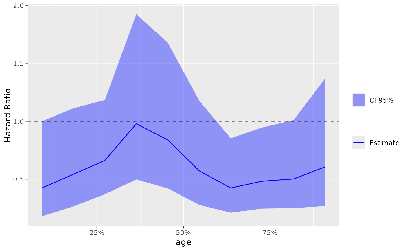
 # Add the reference 1 horizontal line.
library(ggplot2)
g_step(step_data) +
ggplot2::geom_hline(ggplot2::aes(yintercept = 1), linetype = 2)
# Add the reference 1 horizontal line.
library(ggplot2)
g_step(step_data) +
ggplot2::geom_hline(ggplot2::aes(yintercept = 1), linetype = 2)
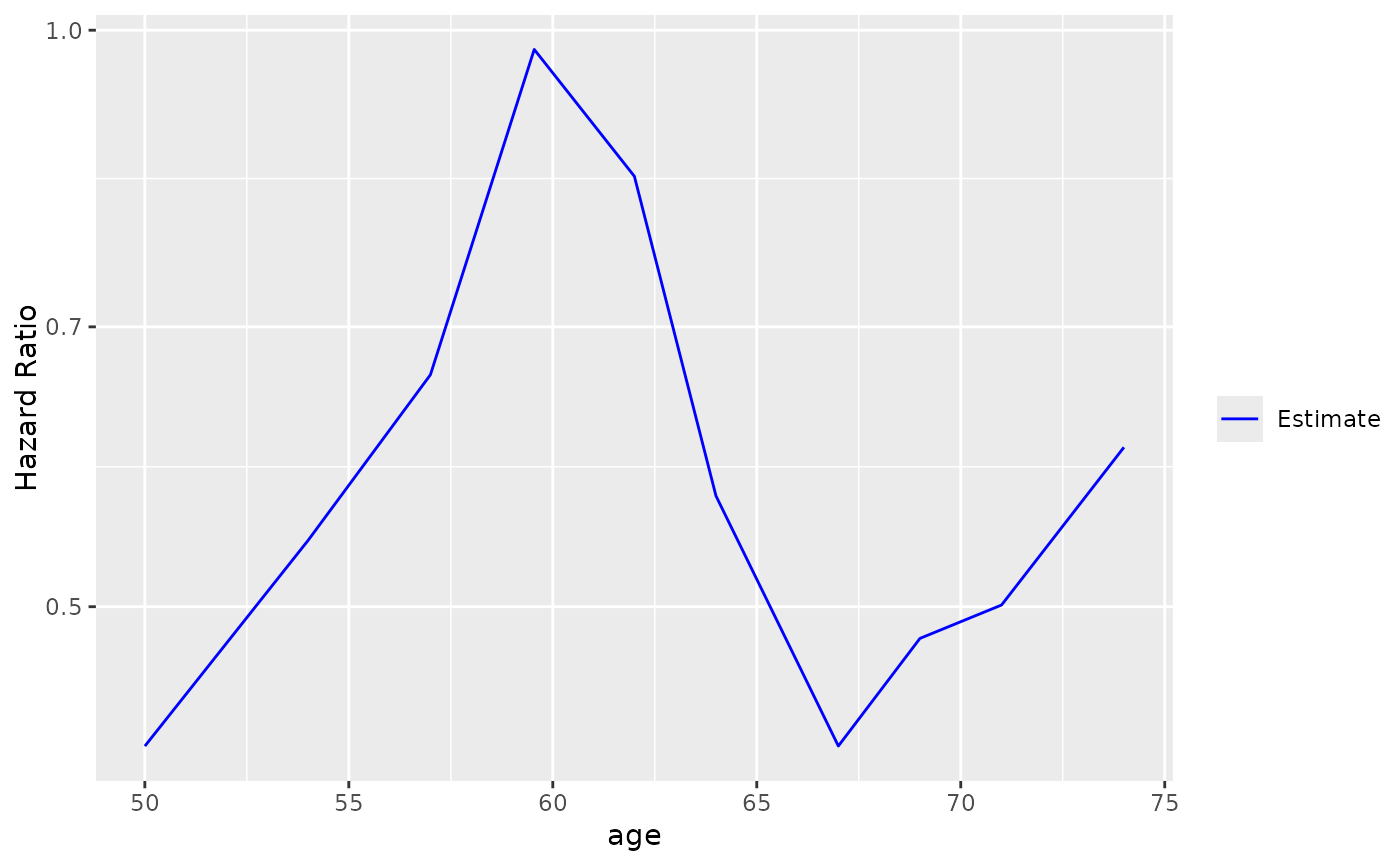
 # Use actual values instead of percentiles, different color for estimate and no CI,
# use log scale for y axis.
g_step(
step_data,
use_percentile = FALSE,
est = list(col = "blue", lty = 1),
ci_ribbon = NULL
) + scale_y_log10()
# Use actual values instead of percentiles, different color for estimate and no CI,
# use log scale for y axis.
g_step(
step_data,
use_percentile = FALSE,
est = list(col = "blue", lty = 1),
ci_ribbon = NULL
) + scale_y_log10()
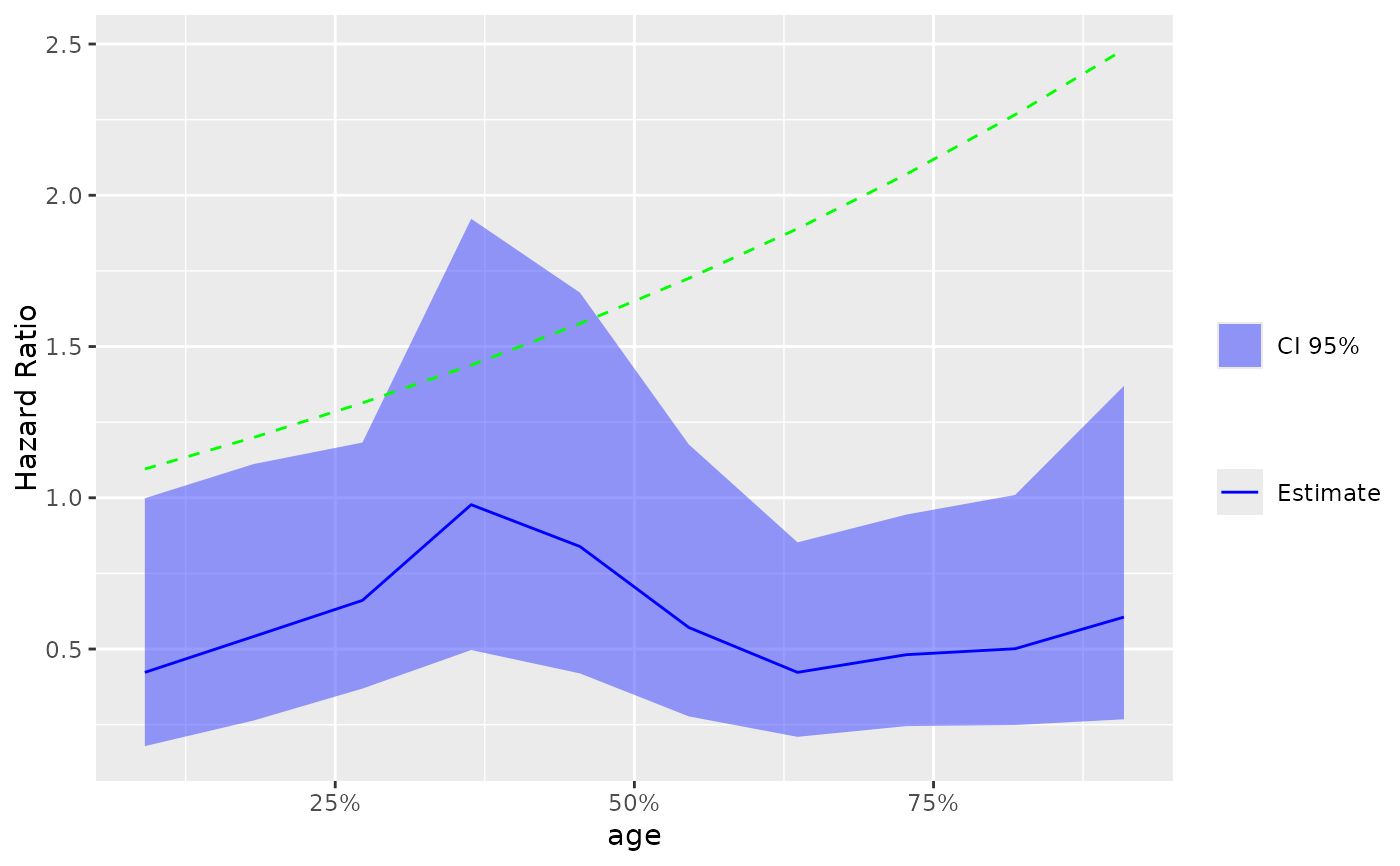
 # Adding another curve based on additional column.
step_data$extra <- exp(step_data$`Percentile Center`)
g_step(step_data) +
ggplot2::geom_line(ggplot2::aes(y = extra), linetype = 2, color = "green")
# Adding another curve based on additional column.
step_data$extra <- exp(step_data$`Percentile Center`)
g_step(step_data) +
ggplot2::geom_line(ggplot2::aes(y = extra), linetype = 2, color = "green")
 # Response example.
vars <- list(
response = "status",
arm = "sex",
biomarker = "age"
)
step_matrix <- fit_rsp_step(
variables = vars,
data = lung,
control = c(
control_logistic(response_definition = "I(response == 2)"),
control_step()
)
)
step_data <- broom::tidy(step_matrix)
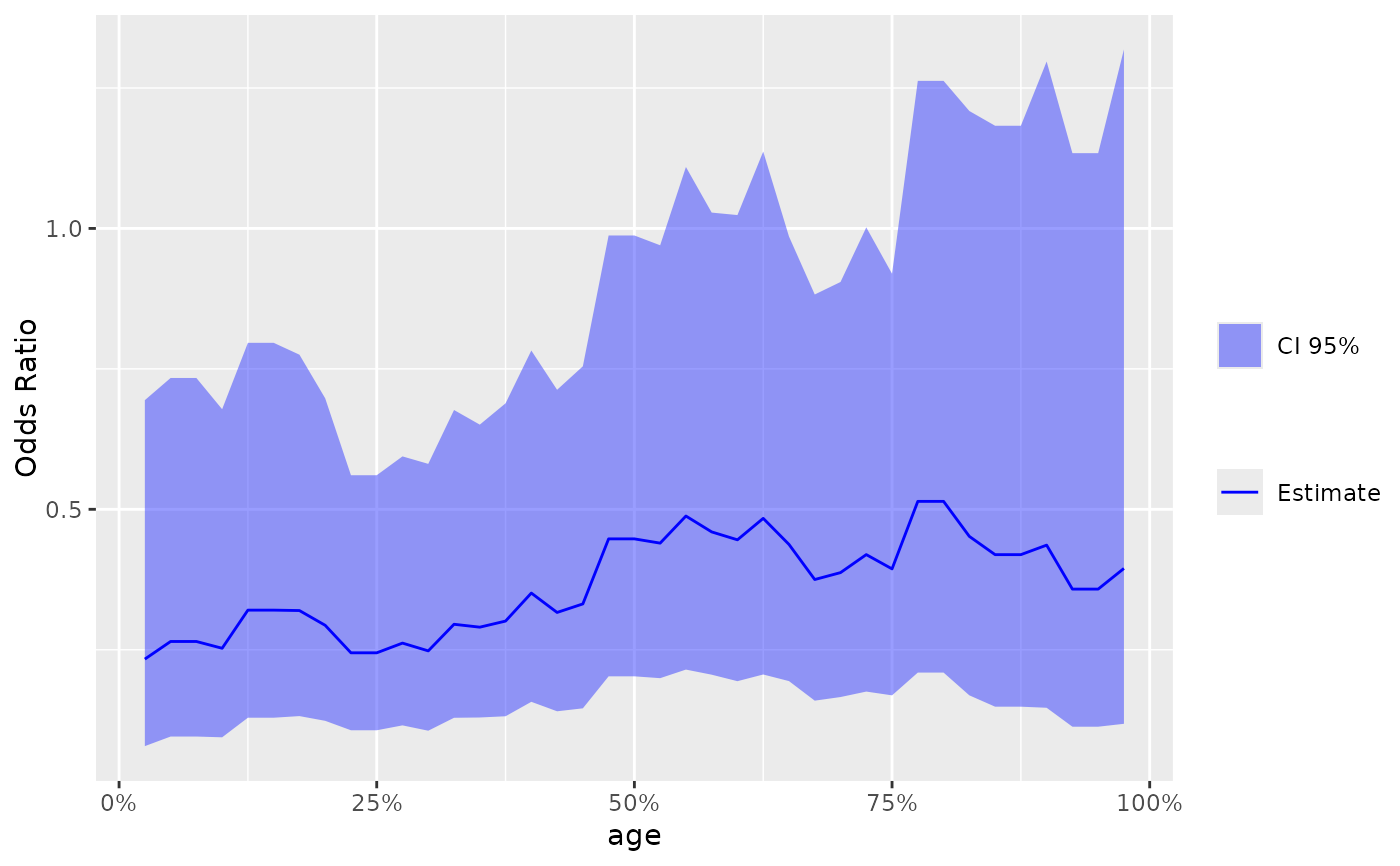
g_step(step_data)
# Response example.
vars <- list(
response = "status",
arm = "sex",
biomarker = "age"
)
step_matrix <- fit_rsp_step(
variables = vars,
data = lung,
control = c(
control_logistic(response_definition = "I(response == 2)"),
control_step()
)
)
step_data <- broom::tidy(step_matrix)
g_step(step_data)