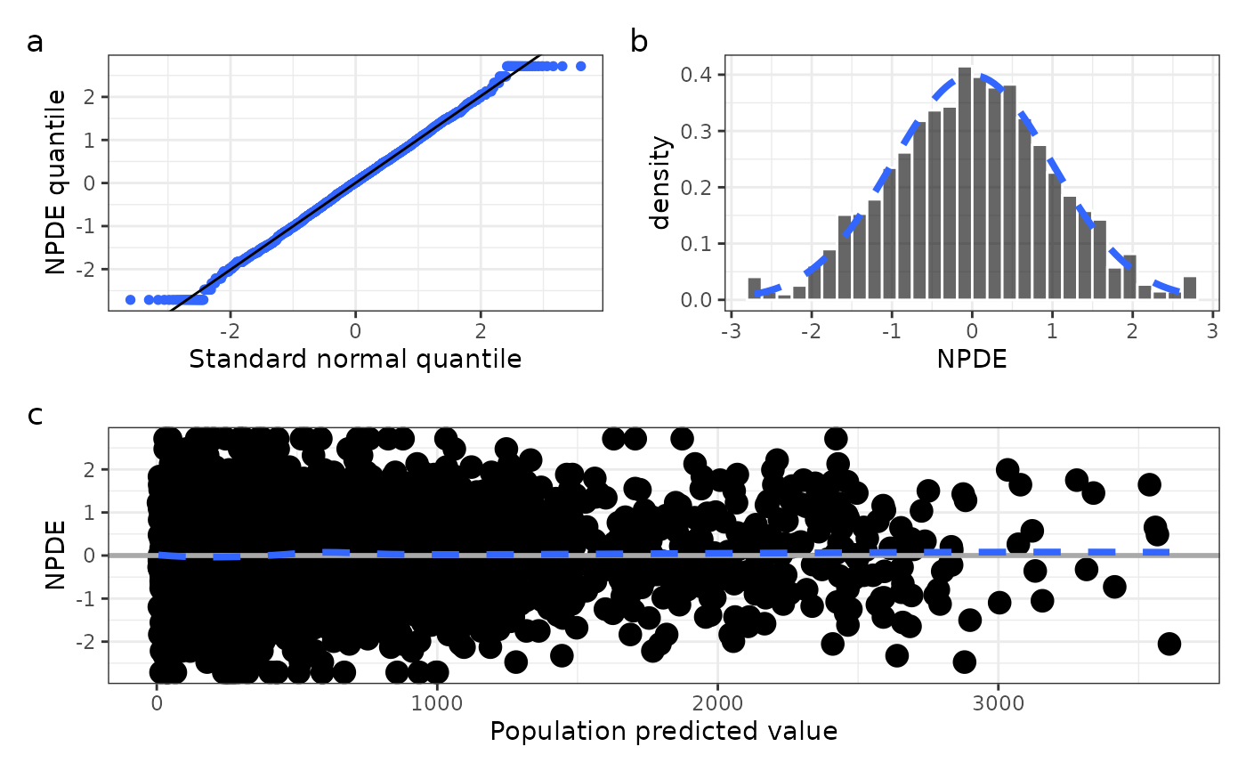
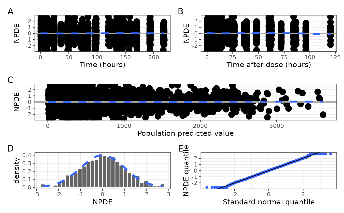
Get a single graphic of basic NPDE diagnostics (npde_panel()) or get the
component plots in a list that can be arranged by the user
(npde_panel_list()) . See npde_covariate() for plotting NPDE versus
covariates.
Usage
npde_panel(
  df,
  xname = "value",
  unit_time = "hours",
  unit_tad = "hours",
  xby_time = NULL,
  xby_tad = NULL,
  tag_levels = NULL
)

npde_panel_list(
  df,
  xname = "value",
  unit_time = "hours",
  unit_tad = "hours",
  xby_time = NULL,
  xby_tad = NULL
)
Arguments
- df
a data frame to plot.
- xname
passed to
npde_pred().- unit_time
passed to
npde_tad()asxunit.- unit_tad
passed to
npde_time()asxunit.- xby_time
passed to
npde_time()asxby.- xby_tad
passed to
npde_tad()asxby.- tag_levels
passed to
patchwork::plot_annotation().
Value
npde_panel() returns a single graphic as a patchwork object with the
following panels:
NPDEversusTIMEvianpde_time()NPDEversusTADvianpde_tad()NPDEversusPREDvianpde_pred()NPDEhistogram vianpde_hist()NPDEquantile-quantile plot vianpde_q()
npde_panel_list() returns a list of the individual plots that are
incorporated into the npde_panel() output. Each element of the list
is named for the plot in that position: time, tad, pred, hist
q. See Examples for how you can work with that list.
Examples
data <- pmplots_data_obs()
npde_panel(data, tag_levels = "A")
#> `geom_smooth()` using formula = 'y ~ x'
#> `geom_smooth()` using formula = 'y ~ x'
#> `geom_smooth()` using formula = 'y ~ x'
#> `stat_bin()` using `bins = 30`. Pick better value `binwidth`.
 l <- npde_panel_list(data)
names(l)
#> [1] "time" "tad" "hist" "q" "pred"
with(l, (q+hist) / pred, tag_levels = "a")
#> `stat_bin()` using `bins = 30`. Pick better value `binwidth`.
#> `geom_smooth()` using formula = 'y ~ x'
l <- npde_panel_list(data)
names(l)
#> [1] "time" "tad" "hist" "q" "pred"
with(l, (q+hist) / pred, tag_levels = "a")
#> `stat_bin()` using `bins = 30`. Pick better value `binwidth`.
#> `geom_smooth()` using formula = 'y ~ x'