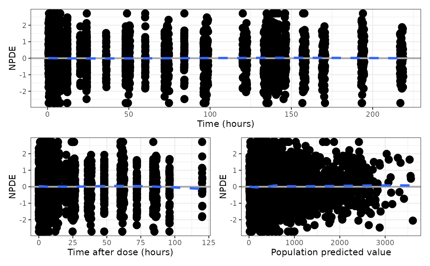
Get a single graphic of NPDE or CWRES diagnostics versus TIME,
TAD and PRED. Output can be in either long or compact format.
Usage
npde_scatter(
  df,
  xname = "value",
  unit_time = "hours",
  unit_tad = "hours",
  xby_time = NULL,
  xby_tad = NULL,
  tag_levels = NULL,
  compact = FALSE
)

cwres_scatter(
  df,
  xname = "value",
  unit_time = "hours",
  unit_tad = "hours",
  xby_time = NULL,
  xby_tad = NULL,
  tag_levels = NULL,
  compact = FALSE
)
Arguments
- df
a data frame to plot.
- xname
passed to
npde_pred().- unit_time
passed to
npde_tad()asxunit.- unit_tad
passed to
npde_time()asxunit.- xby_time
passed to
npde_time()asxby.- xby_tad
passed to
npde_tad()asxby.- tag_levels
passed to
patchwork::plot_annotation().- compact
use
compact = TRUEto get a more compact display; see Examples.
Value
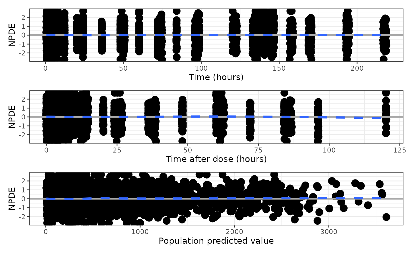
A single graphic with three panels (NPDE or CWRES versus TIME, TAD
and PRED) as a patchwork object. The default behavior is to create a
graphic with three panels in three rows, filling a portrait page.
Use compact = TRUE for a single graphic in two rows, with the TIME
plot on the top and the TAD and PRED plots on the bottom.
Examples
data <- pmplots_data_obs()
npde_scatter(data)
#> `geom_smooth()` using formula = 'y ~ x'
#> `geom_smooth()` using formula = 'y ~ x'
#> `geom_smooth()` using formula = 'y ~ x'
 npde_scatter(data, compact = TRUE)
#> `geom_smooth()` using formula = 'y ~ x'
#> `geom_smooth()` using formula = 'y ~ x'
#> `geom_smooth()` using formula = 'y ~ x'
npde_scatter(data, compact = TRUE)
#> `geom_smooth()` using formula = 'y ~ x'
#> `geom_smooth()` using formula = 'y ~ x'
#> `geom_smooth()` using formula = 'y ~ x'