This vignette will demonstrate pmxhelpr functions for
exploratory data analysis.
First, we will load the required packages.
options(scipen = 999, rmarkdown.html_vignette.check_title = FALSE)
library(pmxhelpr)
library(dplyr, warn.conflicts =  FALSE)
library(ggplot2, warn.conflicts =  FALSE)
library(Hmisc, warn.conflicts = FALSE)
library(patchwork, warn.conflicts = FALSE)
For this vignette, we will peform exploratory data analysis on the
data_sad dataset internal to pmxhelpr. We can
take a quick look at the dataset using glimpse() from the
dplyr package.
glimpse(data_sad)
#> Rows: 720
#> Columns: 23
#> $ LINE    <dbl> 1, 2, 3, 4, 5, 6, 7, 8, 9, 10, 11, 12, 13, 14, 15, 16, 17, 18,…
#> $ ID      <dbl> 1, 1, 1, 1, 1, 1, 1, 1, 1, 1, 1, 1, 1, 1, 1, 1, 1, 1, 1, 1, 2,…
#> $ TIME    <dbl> 0.00, 0.00, 0.48, 0.81, 1.49, 2.11, 3.05, 4.14, 5.14, 7.81, 12…
#> $ NTIME   <dbl> 0.0, 0.0, 0.5, 1.0, 1.5, 2.0, 3.0, 4.0, 5.0, 8.0, 12.0, 16.0, …
#> $ NDAY    <dbl> 1, 1, 1, 1, 1, 1, 1, 1, 1, 1, 1, 1, 2, 2, 3, 4, 5, 6, 7, 8, 1,…
#> $ DOSE    <dbl> 10, 10, 10, 10, 10, 10, 10, 10, 10, 10, 10, 10, 10, 10, 10, 10…
#> $ AMT     <dbl> NA, 10, NA, NA, NA, NA, NA, NA, NA, NA, NA, NA, NA, NA, NA, NA…
#> $ EVID    <dbl> 0, 1, 0, 0, 0, 0, 0, 0, 0, 0, 0, 0, 0, 0, 0, 0, 0, 0, 0, 0, 0,…
#> $ ODV     <dbl> NA, NA, NA, 2.02, 4.02, 3.50, 7.18, 9.31, 12.46, 13.43, 12.11,…
#> $ LDV     <dbl> NA, NA, NA, 0.7031, 1.3913, 1.2528, 1.9713, 2.2311, 2.5225, 2.…
#> $ CMT     <dbl> 2, 1, 2, 2, 2, 2, 2, 2, 2, 2, 2, 2, 2, 2, 2, 2, 2, 2, 2, 2, 2,…
#> $ MDV     <dbl> 1, NA, 1, 0, 0, 0, 0, 0, 0, 0, 0, 0, 0, 0, 1, 1, 1, 1, 1, 1, 1…
#> $ BLQ     <dbl> -1, NA, 1, 0, 0, 0, 0, 0, 0, 0, 0, 0, 0, 0, 1, 1, 1, 1, 1, 1, …
#> $ LLOQ    <dbl> 1, NA, 1, 1, 1, 1, 1, 1, 1, 1, 1, 1, 1, 1, 1, 1, 1, 1, 1, 1, 1…
#> $ FOOD    <dbl> 0, 0, 0, 0, 0, 0, 0, 0, 0, 0, 0, 0, 0, 0, 0, 0, 0, 0, 0, 0, 0,…
#> $ SEXF    <dbl> 1, 1, 1, 1, 1, 1, 1, 1, 1, 1, 1, 1, 1, 1, 1, 1, 1, 1, 1, 1, 1,…
#> $ RACE    <dbl> 2, 2, 2, 2, 2, 2, 2, 2, 2, 2, 2, 2, 2, 2, 2, 2, 2, 2, 2, 2, 1,…
#> $ AGEBL   <int> 25, 25, 25, 25, 25, 25, 25, 25, 25, 25, 25, 25, 25, 25, 25, 25…
#> $ WTBL    <dbl> 82.1, 82.1, 82.1, 82.1, 82.1, 82.1, 82.1, 82.1, 82.1, 82.1, 82…
#> $ SCRBL   <dbl> 0.87, 0.87, 0.87, 0.87, 0.87, 0.87, 0.87, 0.87, 0.87, 0.87, 0.…
#> $ CRCLBL  <dbl> 128, 128, 128, 128, 128, 128, 128, 128, 128, 128, 128, 128, 12…
#> $ USUBJID <chr> "STUDYNUM-SITENUM-1", "STUDYNUM-SITENUM-1", "STUDYNUM-SITENUM-…
#> $ PART    <chr> "Part 1-SAD", "Part 1-SAD", "Part 1-SAD", "Part 1-SAD", "Part …
We can see that this dataset is already formatted for modeling. It contains NONMEM reserved variables (e.g., ID, TIME, AMT, EVID, MDV), as well as, dependent variables of drug concentration in original units (ODV) and natural logarithm transformed units (LDV). In addition to the numeric variables, there are two character variables: USUBJID and PART.
PART specifies the two study cohorts:
- Single Ascending Dose (SAD)
- Food Effect (FE).
unique(data_sad$PART)
#> [1] "Part 1-SAD" "Part 2-FE"
This dataset also contains an exact binning variable:
- Nominal Time (NTIME).
This variable represents the nominal time of sample collection relative to first dose per study protocol whereas Actual Time (TIME) represents the actual time the sample was collected.
##Unique values of NTIME
ntimes <- unique(data_sad$NTIME)
ntimes
#>  [1]   0.0   0.5   1.0   1.5   2.0   3.0   4.0   5.0   8.0  12.0  16.0  24.0
#> [13]  36.0  48.0  72.0  96.0 120.0 144.0 168.0

##Comparison of number of unique values of NTIME and TIME
length(unique(data_sad$NTIME))
#> [1] 19
length(unique(data_sad$TIME))
#> [1] 449
Population Concentration-time plots
Overview of plot_dvtime
Let’s visualize the data. Let’s visualize the data. For this
visualization, we will leverage the functionality of
plot_dvtime to visualize our data. First, we will filter to
observation records only and derive some factor variables, which can be
passed to the color aesthetic.
plot_data <- data_sad %>%
  filter(EVID == 0) %>%
  mutate(`Dose (mg)` = factor(DOSE, levels = c(10, 50, 100, 200, 400)),
         `Food Status` = factor(FOOD, levels = c(0, 1), labels = c("Fasted", "Fed")))
Now let’s visualize the concentration-time data.
pmxhelpr includes a function for common visualizations of
observed concentration-time data in exploratory data analysis:
plot_dvtime
In our visualizations, we will leverage the following dataset variables:
-
ODV: the original dependent variable (drug concentration) in untransformed units (ng/mL) -
TIME: actual time since first dose (hours) -
NTIME: nominal time since first dose (hours) -
LLOQ: lower limit of quantification for drug concentration
plot_dvtime requires a dependent variable (specified as
named vector using dv_var argument) and time variable
(specifed as named vector using the time_vars). The
dependent variable in data_sad is named "ODV",
so we must specify the name using dv_var. The default names
for the time_vars are "TIME" and
"NTIME". The color aesthetic is specified using the
col_var argument. The cent argument specifies
which central tendency measure is plotted.
plot_dvtime(data = plot_data, dv_var = c(DV = "ODV"), col_var = "Dose (mg)", cent = "mean",
ylab = "Concentration (ng/mL)") 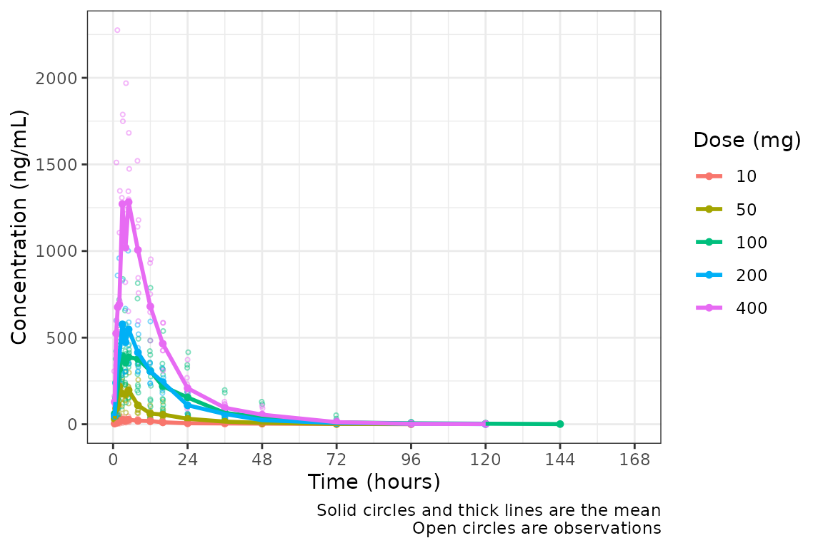
Not a bad plot with minimal arguments! We can see the mean for each
dose as a colored thick line and observed data points as colored open
circles with some alpha added. A caption also prints by default
indicating what the plot elements depict. The caption can be removed by
specifying show_caption = FALSE.
plot_dvtime(data = plot_data, dv_var = c(DV = "ODV"), col_var = "Dose (mg)", cent = "mean",
ylab = "Concentration (ng/mL)", show_caption = FALSE) 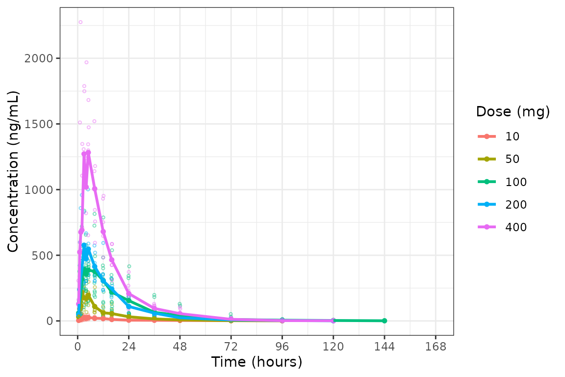
Adjusting Time Breaks
plot_dvtime includes uses a helper function
(breaks_time) to automatically determine x-axis breaks
based on the units of the time variable! Two arguments in
plot_dvtime are passed to breaks_time:
-
timeucharacter string specifying time units. Options include:- “hours” (default)
- “days”
- “weeks”
- “months”
n_breaksnumber breaks requested from the algorithm. Default = 10.
Let’s pass the vector of nominal times we defined earlier into the
breaks_time function and see what we get!
breaks_time(ntimes, unit = "hours", n = 5)
#> [1]   0  48  96 144
breaks_time(ntimes, unit = "hours", n = 10)
#> [1]   0  24  48  72  96 120 144 168
breaks_time(ntimes, unit = "hours", n = length(ntimes))
#>  [1]   0.0   9.6  19.2  28.8  38.4  48.0  57.6  67.2  76.8  86.4  96.0 105.6
#> [13] 115.2 124.8 134.4 144.0 153.6 163.2
We can see that the default of n = 10 gives an optimal number of
breaks in this case whereas reducing the number of breaks gives a less
optimal distribution of values. Requesting breaks equal to the length of
the vector of unique NTIMES will generally produce too many
breaks. The default axes breaks behavior can always be overwritten by
specifying the axis breaks manually using
scale_x_continuous().
The default n_breaks = 10 is a good value for our
dataset, and data_sad uses the default time units
("hours"); therefore, explicit specification of the
n_breaks and timeu arguments are not
required.
plot_dvtime(data = plot_data, dv_var = c(DV = "ODV"), col_var = "Dose (mg)", cent = "mean",
ylab = "Concentration (ng/mL)") 
However, perhaps someone on the team would prefer the x-axis breaks
in units of days. The x-axis breaks will transform to the
new units automatically as long as we specify the new time unit with
timeu = "days".
plot_data_days <- plot_data %>%
  mutate(TIME = TIME/24,
         NTIME = NTIME/24)

plot_dvtime(data = plot_data_days, dv_var = c(DV = "ODV"), col_var = "Dose (mg)", cent = "mean",
ylab = "Concentration (ng/mL)", timeu = "days") 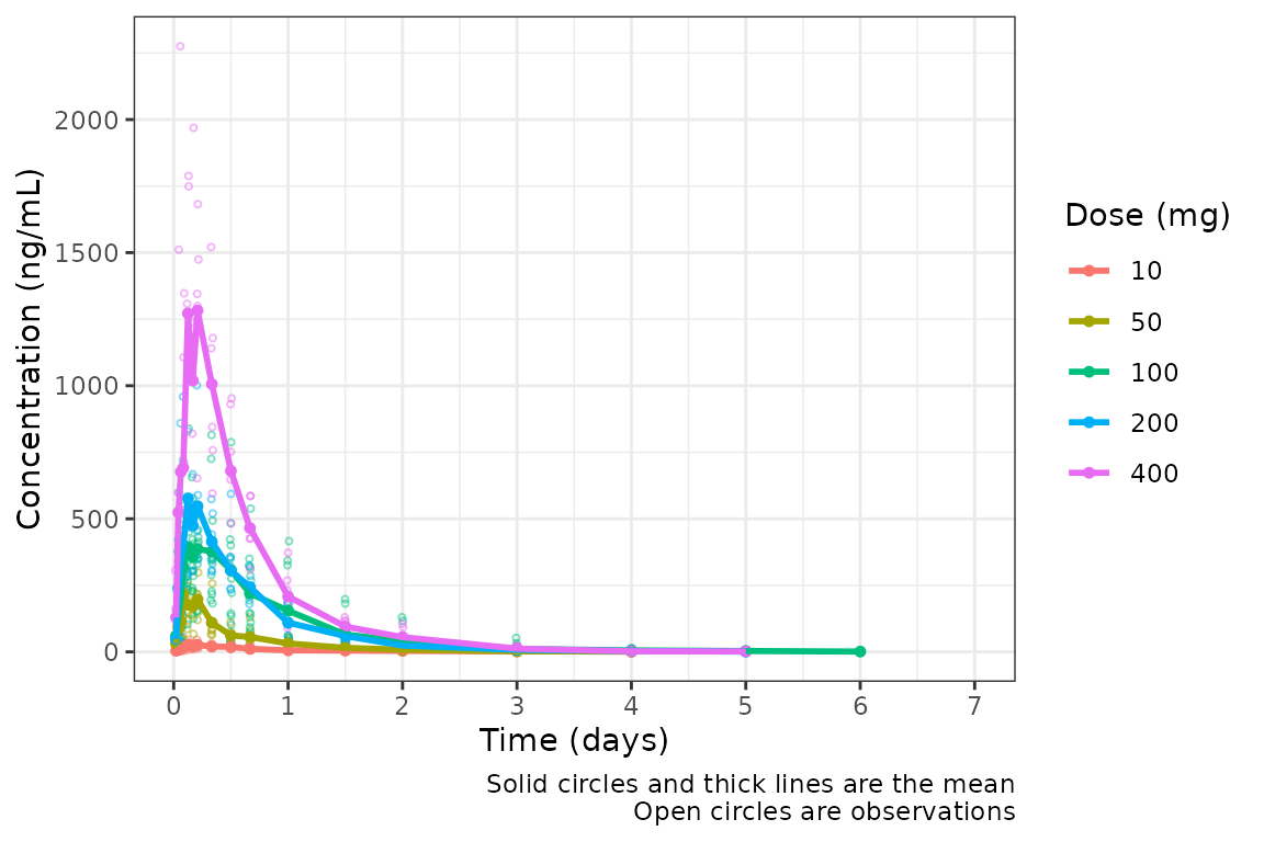
Nice! However, someone else on the team would prefer to see the first
24 hours of treatment in greater detail to visualize the absorption
phase. If we can either truncate the x-axis range using
scale_x_continuous(), or filter the input data and allow
the x-axis breaks to adjust automatically with the new time range in the
data!
plot_data_24 <- plot_data %>%
  filter(NTIME <= 24)

plot_dvtime(data = plot_data_24, dv_var = c(DV = "ODV"), col_var = "Dose (mg)", cent = "mean",
ylab = "Concentration (ng/mL)") 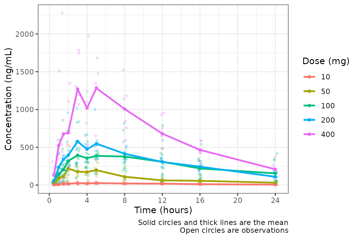
Specifying the Central Tendency
Much better! However, these data are probably best visualized on a
log-scale y-axis to better visualize the terminal phase profile.
plot_dvtime includes an argument log_y which
performs this operation with one added benefit over adding in a layer
with scale_y_log10 when using automatically generated plot
captions with show_captions = TRUE.
plot_dvtime uses the stat_summary function
from ggplot2 to calculate and plot the central tendency
measures and error bars. An often overlooked feature of
stat_summary, is that it calculates the summary statistics
after any transformations to the data performed by changing the
scales. This means that when scale_y_log10() is applied to
the plot, the data are log-transformed for plotting and the central
tendency measure returned when requesting "mean" from
stat_summary is the geometric mean. If the
log_y argument is used to generate semi-log plots along
with show_captions = TRUE, then the caption will clearly
delineate where arithmetic and gemoetric means are being returned.
plot_dvtime(data = plot_data, dv_var = c(DV = "ODV"), col_var = "Dose (mg)", cent = "mean",
ylab = "Concentration (ng/mL)", log_y = TRUE) 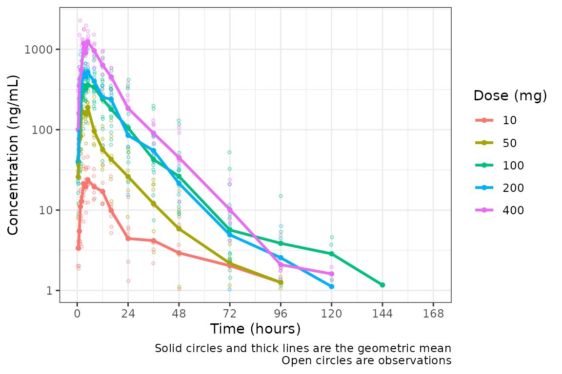
But wait…this plot is potentially misleading! The food effect portion of the study is being pooled together with the fasted data within the 100 mg dose!
Luckily, plot_dvtime returns a ggplot
object which we can modify like any other ggplot!
Therefore, we can facet by PART by simply adding in another layer to our
ggplot object.
plot_dvtime(data = plot_data, dv_var = c(DV = "ODV"), col_var = "Dose (mg)", cent = "mean",
            ylab = "Concentration (ng/mL)", log_y = TRUE) +
  facet_wrap(~PART)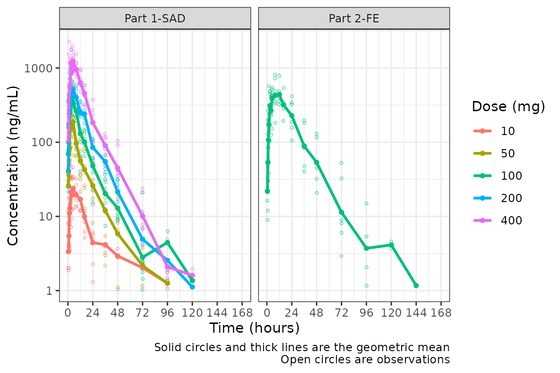
The clinical team would like a simpler plot that clearly displays the
central tendency. We can use the argument cent = "mean_sdl"
to plot the mean with error bars and remove the observed points by
specifying obs_dv = FALSE.
plot_dvtime(data = plot_data, dv_var = c(DV = "ODV"), col_var = "Dose (mg)", cent = "mean_sdl",
            ylab = "Concentration (ng/mL)", log_y = TRUE,
            obs_dv = FALSE) +
  facet_wrap(~PART)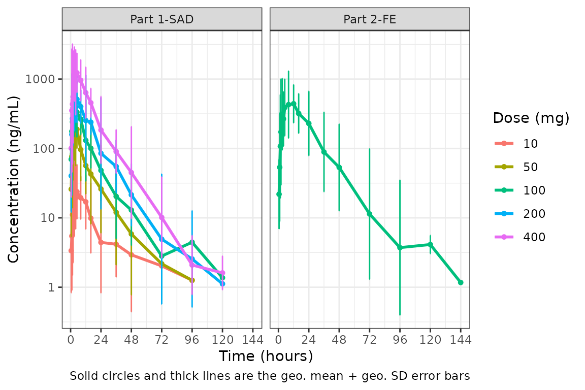
We could also plot these data as median + interquartile range (IQR) using the same approach, if we do not feel the sample size is sufficient for parametric summary statistics.
plot_dvtime(data = plot_data, dv_var = c(DV = "ODV"), col_var = "Dose (mg)", cent = "median_iqr",
            ylab = "Concentration (ng/mL)", log_y = TRUE,
            obs_dv = FALSE) +
  facet_wrap(~PART)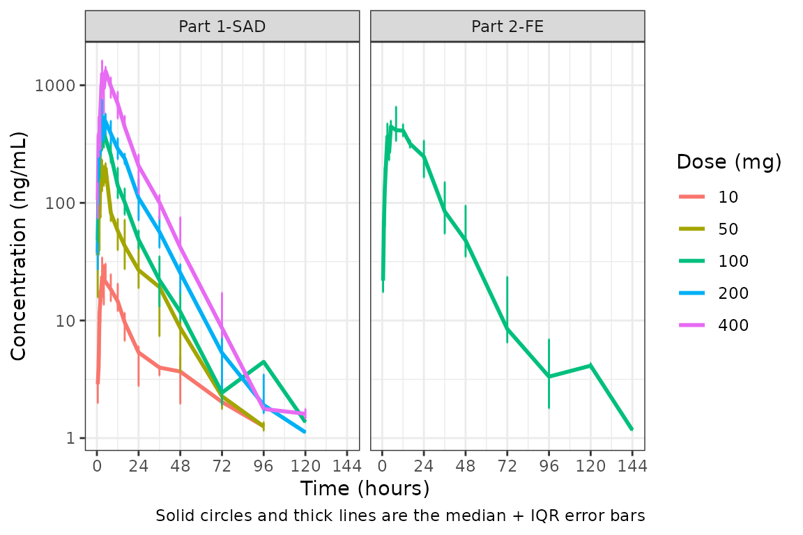
Hmm…there is some noise at the late terminal phase. This is likely artifact introduced by censoring of data at the assay LLOQ; however, let’s confirm there are no weird individual subject profiles by connecting observed data points longitudinally within a subject - in other words, make a spaghetti plot.
We will change the central tendency measure to the median and add the
spaghetti lines. Data points within an individual value of
grp_var will be connected by a narrow line when
grp_dv = TRUE. The default is
grp_var = "ID".
plot_dvtime(data = plot_data, dv_var = c(DV = "ODV"), col_var = "Dose (mg)", cent = "median",
            ylab = "Concentration (ng/mL)", log_y = TRUE,
            grp_dv = TRUE) +
  facet_wrap(~PART)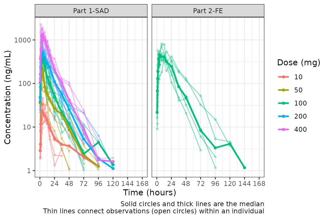
It does not seem like there are outlier individuals driving the noise in the late terminal phase; therefore, this is almost certainly artifact introduced by data missing due to assay sensitivity and censoring at the lower limit of quantification (LLOQ).
Defining imputations for BLQ data
Let’s use imputation to assess the potential impact of the data
missing due to assay sensitivity. plot_dvtime includes some
functionality to do this imputation for us using the loq
and loq_method arguments.
The loq_method argument species how BLQ imputation
should be performed. Options are:
-
0: No handling. Plot input datasetDVvsTIMEas is. (default) -
1: Impute all BLQ data atTIME<= 0 to 0 and all BLQ data atTIME> 0 to 1/2 xloq. Useful for plotting concentration-time data with some data BLQ on the linear scale -
2: Impute all BLQ data atTIME<= 0 to 1/2 xloqand all BLQ data atTIME> 0 to 1/2 xloq.
The loq argument species the value of the LLOQ. The
loq argument must be specified when loq_method
is 1 or 2, but can be NULL
if the variable LLOQ is present in the dataset. In
our case, LLOQ is a variable in plot_data, so
we do not need to specify the loq argument (default is
loq = NULL).
plot_dvtime(plot_data, dv_var = c(DV = "ODV"), col_var = "Dose (mg)", cent = "mean",
            ylab = "Concentration (ng/mL)", log_y = TRUE,
            loq_method = 2) +
  facet_wrap(~PART)
The same plot is obtained by specifying loq = 1
plot_dvtime(plot_data, dv_var = c(DV = "ODV"), col_var = "Dose (mg)", cent = "mean",
            ylab = "Concentration (ng/mL)",  log_y = TRUE,
            loq_method = 2, loq = 1) +
  facet_wrap(~PART)
A reference line is drawn to denote the LLOQ and all observations
with EVID=0 and MDV=1 are imputated as LLOQ/2.
Imputing post-dose concentrations below the lower limit of
quantification as 1/2 x LLOQ normalizes the late terminal phase of the
concentration-time profile. This is confirmatory evidence for our
hypothesis that the noise in the late terminal phase is due to censoring
of observations below the LLOQ.
Dose-normalization
We can also generate dose-normalized concentration-time plots by
specifying dosenorm = TRUE.
plot_dvtime(plot_data, dv_var = c(DV = "ODV"), col_var = "Dose (mg)", cent = "mean",
            ylab = "Dose-normalized Conc. (ng/mL per mg Drug)", log_y = TRUE,
            dosenorm = TRUE) +
  facet_wrap(~PART)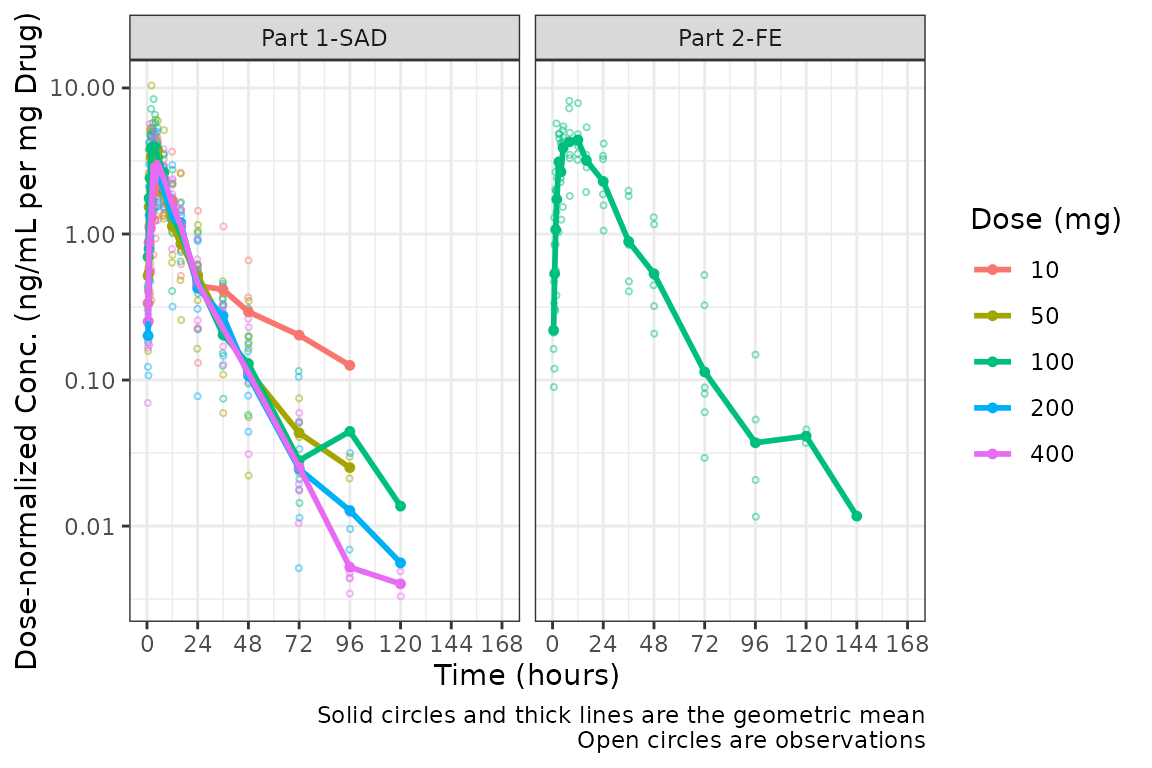
When dosenorm = TRUE, the variable DOSE
needs to be present in the input dataset data. If
DOSE is not present in data, the function will
return an Error with an informative error message.
plot_dvtime(select(plot_data, -DOSE),
            dv_var = c(DV = "ODV"), col_var = "Dose (mg)", cent = "mean",
            ylab = "Dose-normalized Conc. (ng/mL per mg Drug)", log_y = TRUE,
            dosenorm = TRUE) +
  facet_wrap(~PART)
#> Error in `check_varsindf()`:
#> ! argument `"DOSE"` must be variables in `data`
Dose-normalization is performed AFTER BLQ imputation in the case in which both options are requested. The reference line for the LLOQ will not be plotted when dose-normalized concentration is the dependent variable.
plot_dvtime(plot_data, dv_var = c(DV = "ODV"), col_var = "Dose (mg)", cent = "mean",
            ylab = "Dose-normalized Conc. (ng/mL per mg Drug)", log_y = TRUE,
            loq_method = 2, dosenorm = TRUE) +
  facet_wrap(~PART)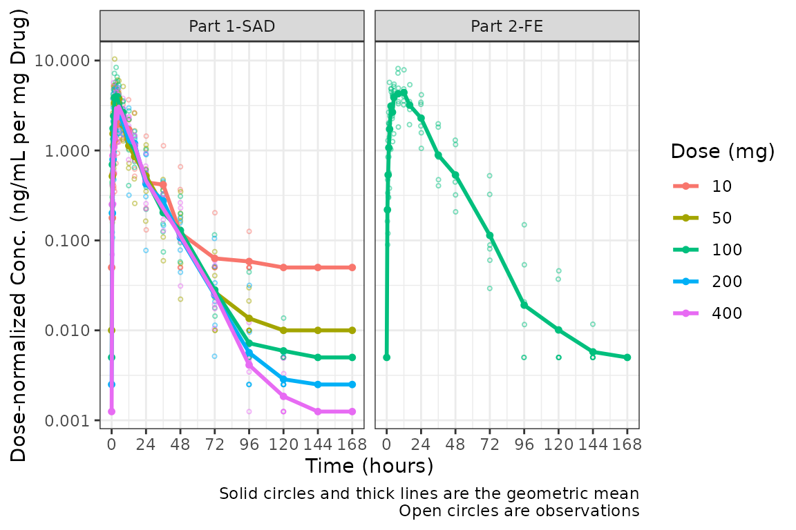
Adjusting the Color and Group Aesthetics
Only a single variable can be passed to the col_var
argument of plot_dvtime. Suppose we want to look at the
interaction between two variables in the color aesthetic. This can be
accomplished in ggplot2 using the interaction
function, which computes an unordered factor representing the
interaction between the two variables. Let’s visualize the interaction
between the factor versions of the variables DOSE and
FOOD.
ggplot(plot_data, aes(x = TIME, y = ODV, col = interaction(`Dose (mg)`, `Food Status`))) +
  geom_point()+
  stat_summary(data = plot_data, aes(x = NTIME, y = ODV, col = interaction(`Dose (mg)`, `Food Status`)),
               fun.y = "mean", geom = "line") +
  scale_x_continuous(breaks = seq(0,168,24)) +
  scale_y_log10()+
  theme_bw() +
  labs(y = "Concentration (ng/mL)", x = "Time (hours)")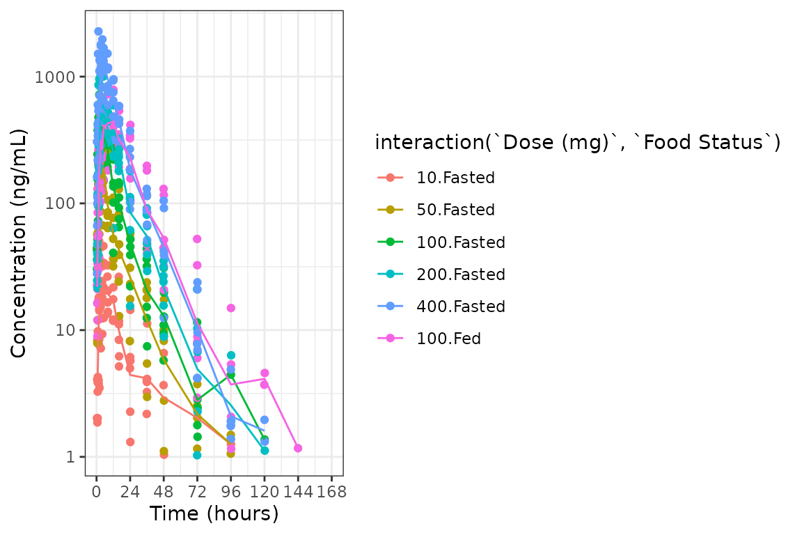
The functionality of interaction() cannot be used within
plot_dvtime; however, we can reproduce it by formally
creating a variable for the interaction we want to visualize. This also
affords us the opportunity to define the factor labels, levels, and
order formally, which will affect how the interaction is displayed on
the plot.
plot_data_int <- plot_data %>%
  mutate(`Dose (mg) and Food` = ifelse(FOOD == 0, paste(DOSE, "mg", "Fasted"), paste(DOSE, "mg", "Fed")),
         `Dose (mg) and Food` = factor(`Dose (mg) and Food`, levels = c("10 mg Fasted",
                                                                         "50 mg Fasted",
                                                                         "100 mg Fasted",
                                                                         "100 mg Fed",
                                                                         "200 mg Fasted",
                                                                         "400 mg Fasted")))

plot_dvtime(plot_data_int, dv_var = c(DV = "ODV"), col_var = "Dose (mg) and Food", cent = "mean",
            ylab = "Concentration (ng/mL)", log_y = TRUE,
            loq_method = 2)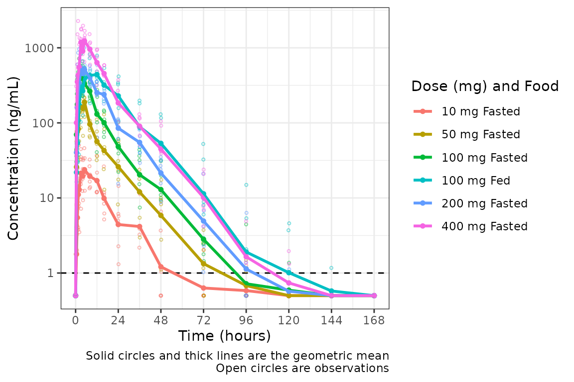
This looks pretty nice! The legend is formatted cleanly and the
colors are assigned to each unique condition of the interaction.
However, we can actually take this one step further, and define our
interaction variable as an ordered factor, which results
ggplot2 applying the viridis color scale from the
viridisLite package.
plot_data_int_ordered <- plot_data %>%
  mutate(`Dose (mg) and Food` = ifelse(FOOD == 0, paste(DOSE, "mg", "Fasted"), paste(DOSE, "mg", "Fed")),
         `Dose (mg) and Food` = factor(`Dose (mg) and Food`, levels = c("10 mg Fasted",
                                                                         "50 mg Fasted",
                                                                         "100 mg Fasted",
                                                                         "100 mg Fed",
                                                                         "200 mg Fasted",
                                                                         "400 mg Fasted"),
                                       ordered = TRUE))

plot_dvtime(plot_data_int_ordered, dv_var = c(DV = "ODV"), col_var = "Dose (mg) and Food", cent = "mean",
            ylab = "Concentration (ng/mL)", log_y = TRUE,
            loq_method = 2)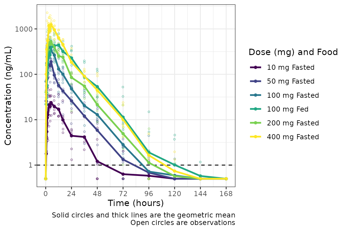
The same approach can be used to define an interaction variable to be
assigned to the group aesthetic using the grp_var argument
to plot_dvtime. Such an approach may be used if we wanted
to visualize the data for a cross-over study condition separately for
each period within an individual. In this case, the default
grp_var = "ID" would connect all data points within an
individual across both periods whereas we want to visualize points
connected within the individual "ID" separately by
cross-over period.
To explore this, we will modify data_sad such that the
same subjects are included in "PART1-SAD" and
"PART2-FE (e.g., modify from a parallel group to a
crossover design).
plot_data_crossover <- plot_data %>%
  mutate(ID = ifelse(FOOD == 1, ID - 6, ID))

plot_data_crossover %>%
  select(ID, DOSE, FOOD) %>%
  distinct() %>%
  group_by(ID) %>%
  filter(max(FOOD) == 1) %>%
  arrange(ID, FOOD)
#> # A tibble: 12 × 3
#> # Groups:   ID [6]
#>       ID  DOSE  FOOD
#>    <dbl> <dbl> <dbl>
#>  1    13   100     0
#>  2    13   100     1
#>  3    14   100     0
#>  4    14   100     1
#>  5    15   100     0
#>  6    15   100     1
#>  7    16   100     0
#>  8    16   100     1
#>  9    17   100     0
#> 10    17   100     1
#> 11    18   100     0
#> 12    18   100     1
Now we have a dataset with a cross-over design for the Food Effect
Part. We can define a factor (or food) ID variable that is the
interaction between "ID" and "FOOD". Now when
we visualize the data, the data points will be connected within the
group defined by both variables.
plot_data_crossover_fid <- plot_data_crossover %>%
  mutate(FID = interaction(ID, FOOD),
         `Dose (mg) and Food` = ifelse(FOOD == 0, paste(DOSE, "mg", "Fasted"), paste(DOSE, "mg", "Fed")),
         `Dose (mg) and Food` = factor(`Dose (mg) and Food`, levels = c("10 mg Fasted",
                                                                         "50 mg Fasted",
                                                                         "100 mg Fasted",
                                                                         "100 mg Fed",
                                                                         "200 mg Fasted",
                                                                         "400 mg Fasted"),
                                       ordered = TRUE))

plot_dvtime(plot_data_crossover_fid, dv_var = c(DV = "ODV"), col_var = "Dose (mg) and Food", cent = "mean",
            grp_var = "FID", grp_dv = TRUE,
            ylab = "Concentration (ng/mL)", log_y = TRUE,
            loq_method = 2)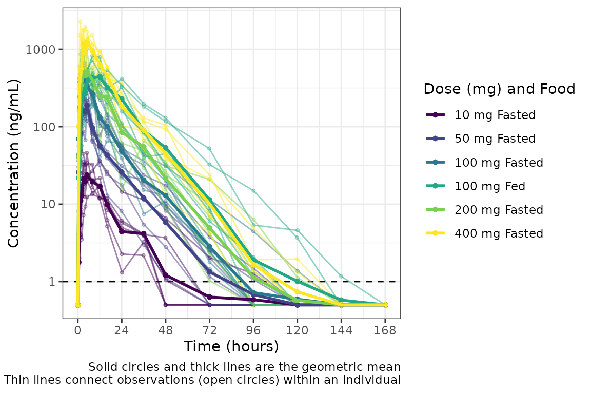
Individual Concentration-time plots
The previous section provides an overview of how to generate
population concentration-time profiles by dose using
plot_dvtime; however, we can also use
plot_dvtime to generate subject-level visualizations with a
little pre-processing of the input dataset.
We can specify cent = "none" to remove the central
tendency layer when plotting individual subject data.
plot_dvtime(plot_data, dv_var = c(DV = "ODV"), col_var = "Dose (mg)", cent = "none",
            ylab = "Concentration (ng/mL)", log_y = TRUE,
            grp_dv = TRUE,
            loq_method = 2, loq = 1) +
  facet_wrap(~PART)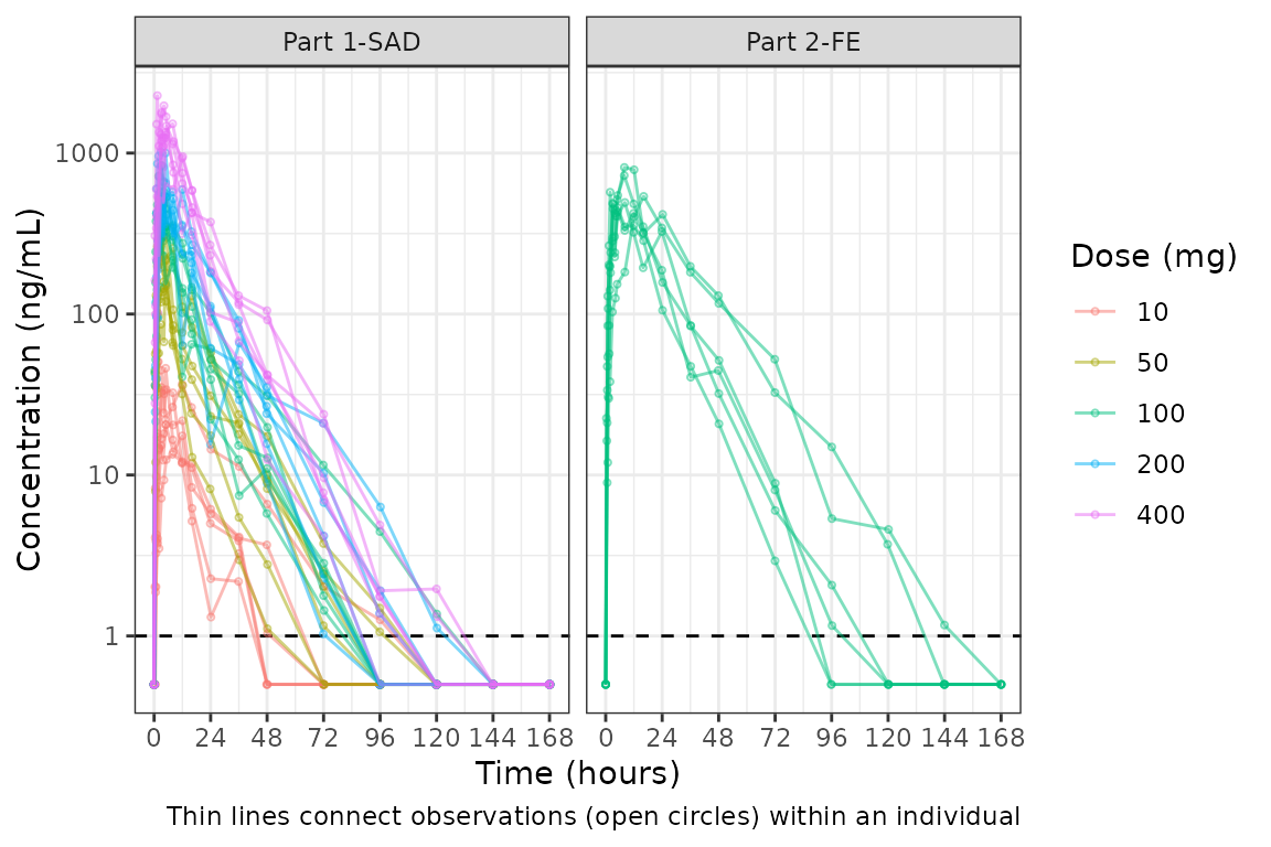
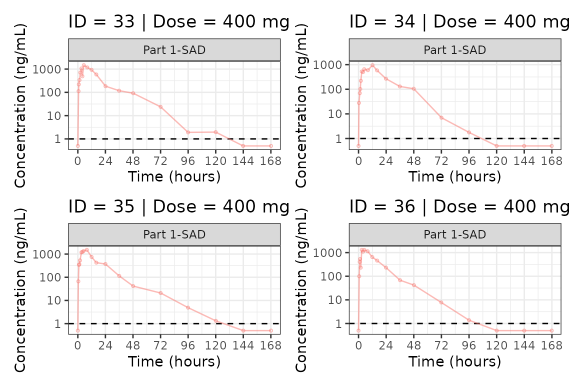
We can plot an individual subject by filtering the input dataset.
This could be extended generate plots for all individuals using
for loops, purrr::map() functions, or other
vectorized methods.
ids <- sort(unique(plot_data$ID))
plist<- list()
for(i in 1:length(ids)){
  plist[[i]] <- plot_dvtime(filter(plot_data, ID == ids[i]),
                               dv_var = c(DV = "ODV"), col_var = "Dose (mg)", cent = "none",
            ylab = "Concentration (ng/mL)", log_y = TRUE,
            grp_dv = TRUE,
            loq_method = 2, loq = 1, show_caption = FALSE) +
  facet_wrap(~PART)+
  labs(title = paste0("ID = ", ids[i], " | Dose = ", unique(plot_data$DOSE[plot_data$ID==ids[i]]), " mg"))+
  theme(legend.position="none")
}


groups <- length(plist)/4
grpplist <- list()
for(grp in 1:groups){
  i <- (grp-1)*4+1
  j <- grp*4
  tmplist <- plist[i:j]
  grpplist[[grp]] <- wrap_plots(tmplist)
}

grpplist
#> [[1]]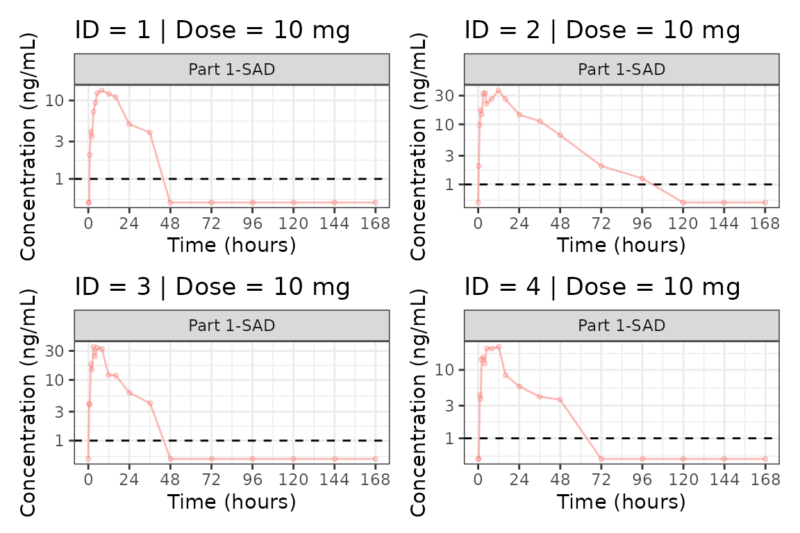
#>
#> [[2]]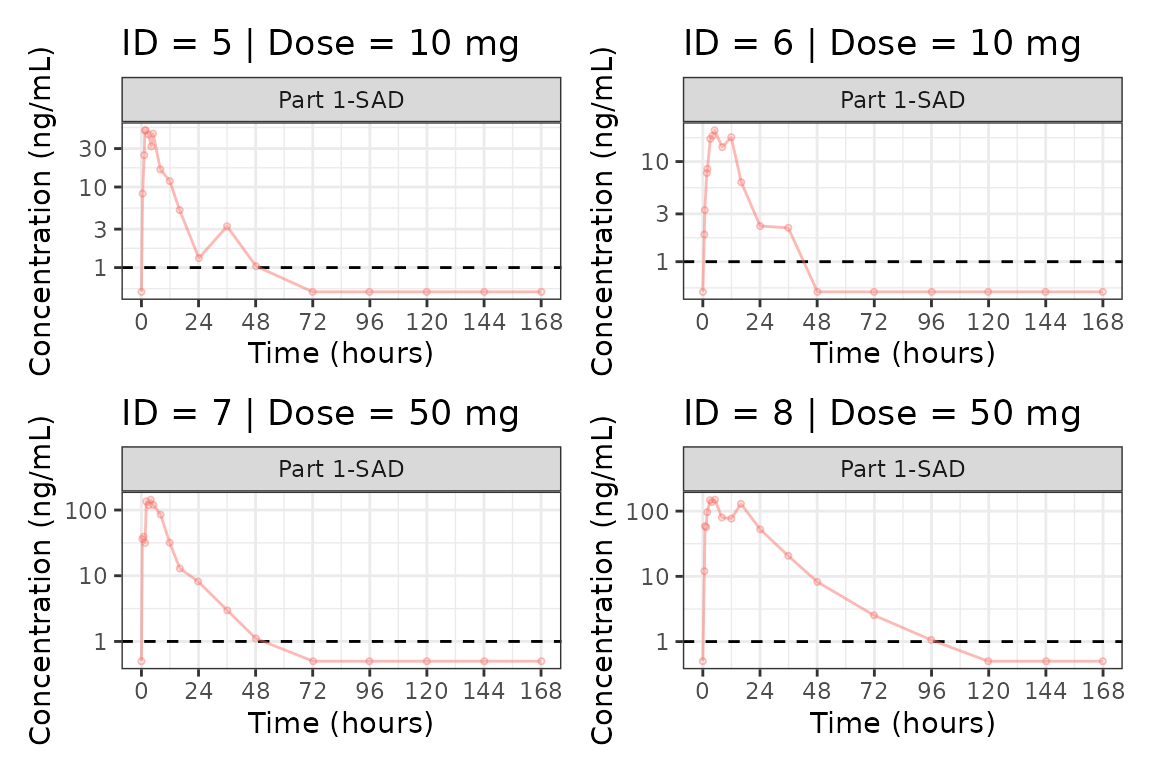
#>
#> [[3]]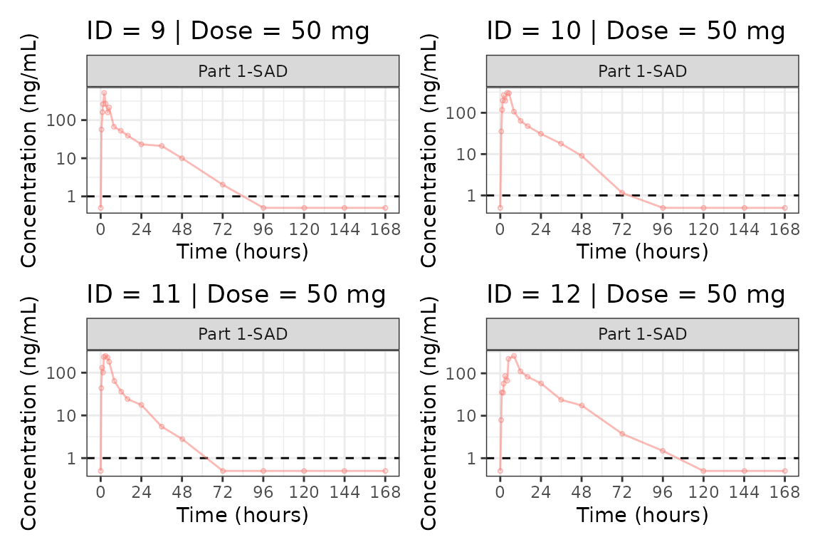
#>
#> [[4]]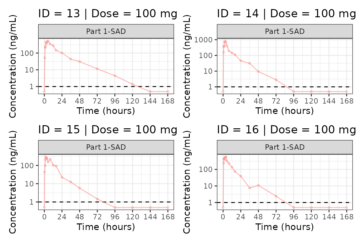
#>
#> [[5]]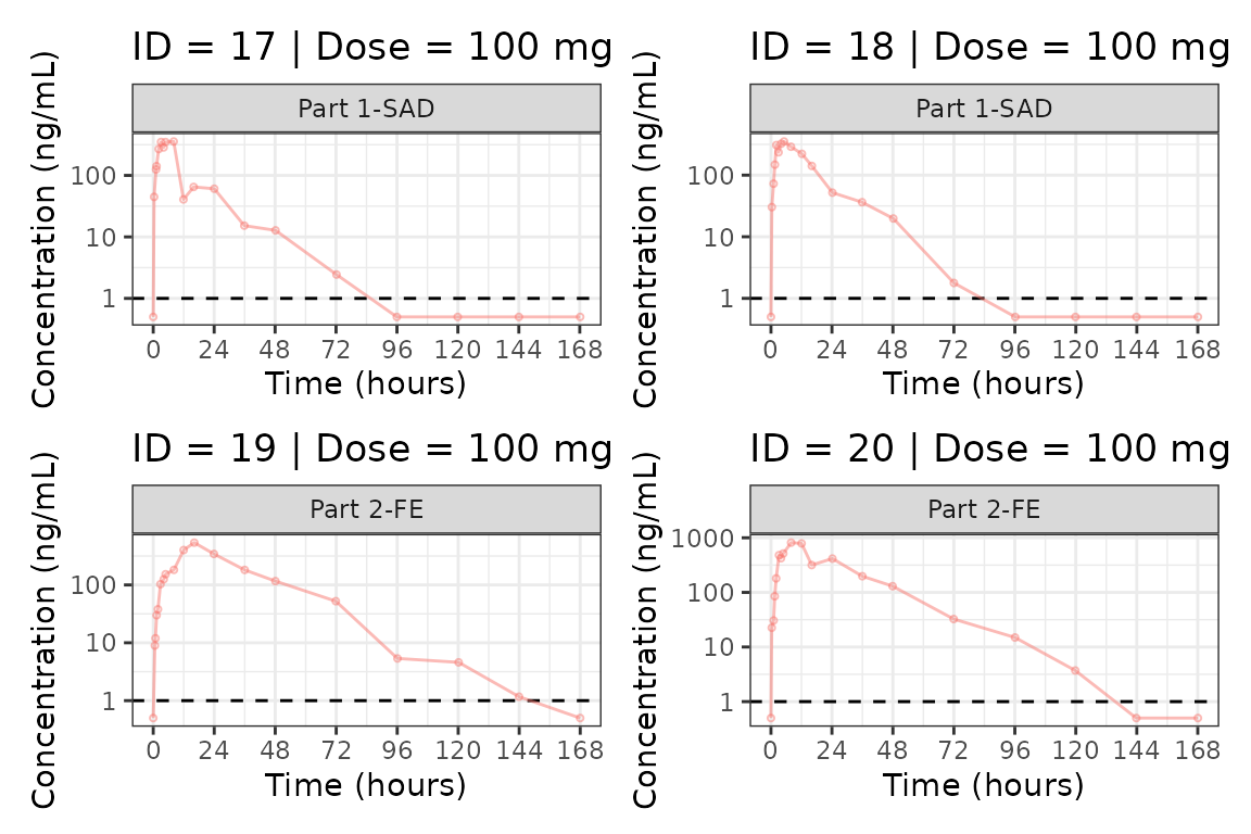
#>
#> [[6]]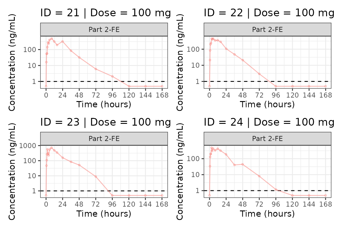
#>
#> [[7]]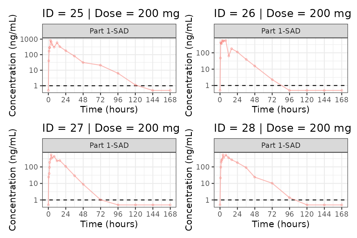
#>
#> [[8]]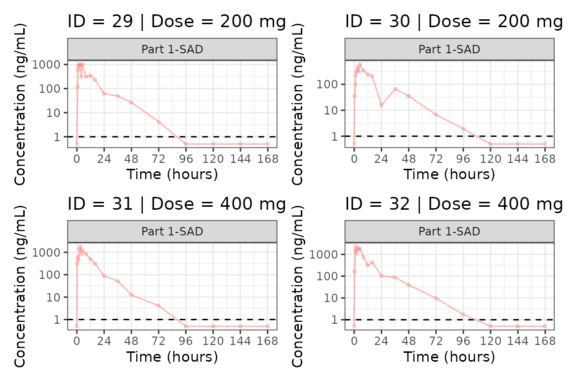
#>
#> [[9]]