Generate plots with style like The Economist.
theEconomist.theme.RdUses colors, drawing styles, axis settings, etc, to produce plots inspired by those in The Economist magazine. (https://www.economist.com/).
theEconomist.theme(win.fontfamily = NULL,
    with.bg = FALSE, box = "black", ...)

theEconomist.opts()

asTheEconomist(x, ...,
    type = "l",
    ylab = expression(NULL),
    xlab = expression(NULL),
    par.settings =
      theEconomist.theme(with.bg = with.bg, box = "transparent"),
    with.bg = FALSE,
    par.strip.text = list(font = 2))
Arguments
- win.fontfamily
on Windows systems, sets the font by name.
- with.bg
if
TRUE, uses a light blue background and a few other corresponding changes; otherwise white.- box
color for panel boxes, strip outlines, and axis ticks.
- ...
further arguments passed to
simpleThemeand used to modify the theme.- x
a
trellisobject, i.e. the result of a high-level plot function in the Lattice framework.- type
plot type, relevant for
xyplots, seepanel.xyplot.- ylab, xlab
axis labels, blank by default.
- par.settings
style settings, defaulting to
theEconomist.theme.- par.strip.text
see
xyplot.
Details
You can just use par.settings = theEconomist.theme(), which
gives you some colors and styles, but it does not do the
grid lines or axis settings.
References
https://www.economist.com/displayStory.cfm?story_id=15065782
https://www.economist.com/displayStory.cfm?story_id=14941181
See also
Examples
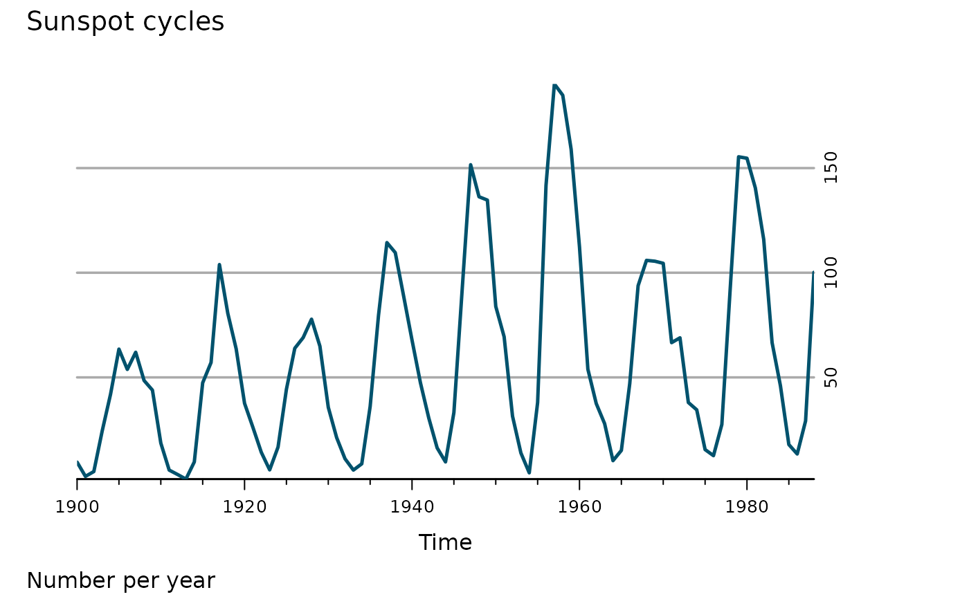
xyplot(window(sunspot.year, start = 1900),
main = "Sunspot cycles", sub = "Number per year",
par.settings = theEconomist.theme(box = "transparent"),
lattice.options = theEconomist.opts())
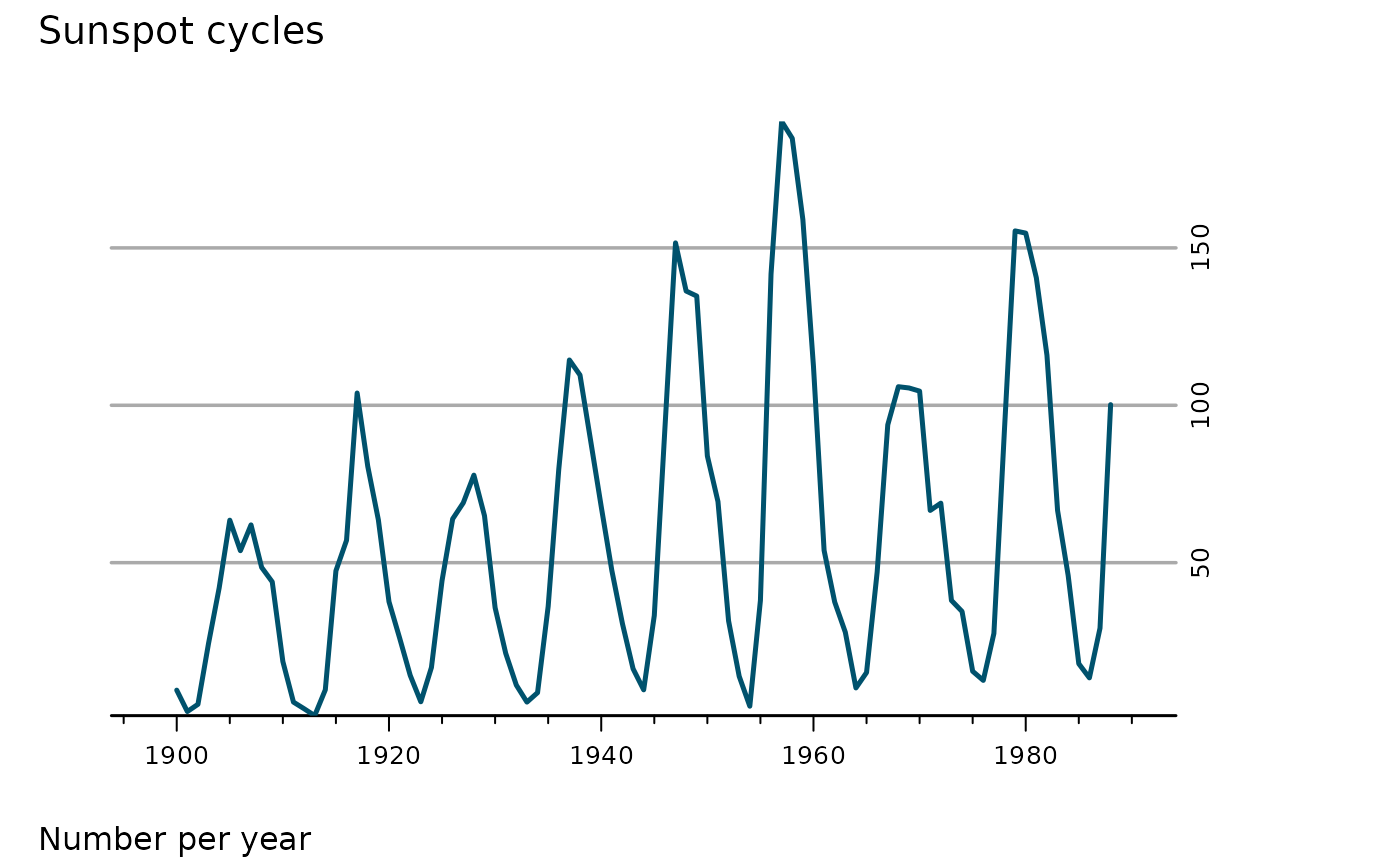
 asTheEconomist(xyplot(window(sunspot.year, start = 1900),
main = "Sunspot cycles", sub = "Number per year"))
asTheEconomist(xyplot(window(sunspot.year, start = 1900),
main = "Sunspot cycles", sub = "Number per year"))
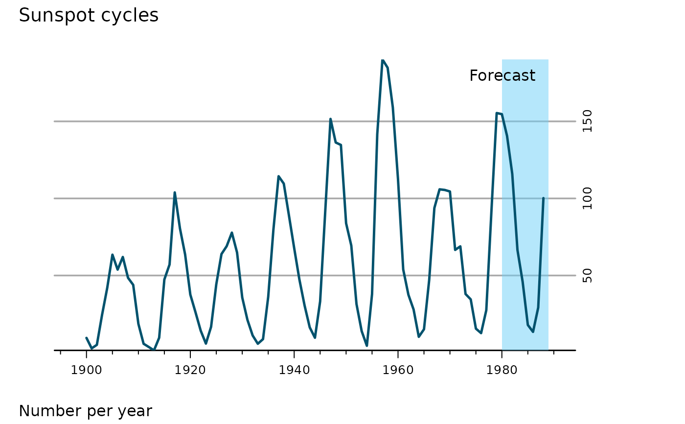
 trellis.last.object() +
layer_(panel.xblocks(x, x >= 1980, col = "#6CCFF6", alpha = .5)) +
layer(panel.text(1988, 180, "Forecast", font = 3, pos = 2))
trellis.last.object() +
layer_(panel.xblocks(x, x >= 1980, col = "#6CCFF6", alpha = .5)) +
layer(panel.text(1988, 180, "Forecast", font = 3, pos = 2))
 ## set as defaults -- remember to set back when finished.
opar <- trellis.par.get()
trellis.par.set(theEconomist.theme(box = "transparent"))
oopt <- lattice.options(theEconomist.opts())
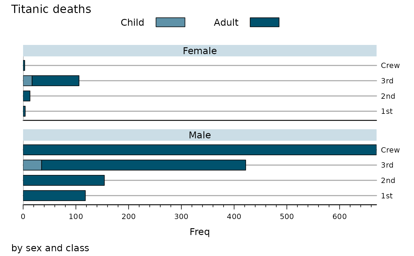
barchart(Titanic[,,,"No"], main = "Titanic deaths", layout = 1:2,
sub = "by sex and class", auto.key = list(columns = 2),
scales = list(y = list(alternating = 2)))
## set as defaults -- remember to set back when finished.
opar <- trellis.par.get()
trellis.par.set(theEconomist.theme(box = "transparent"))
oopt <- lattice.options(theEconomist.opts())
barchart(Titanic[,,,"No"], main = "Titanic deaths", layout = 1:2,
sub = "by sex and class", auto.key = list(columns = 2),
scales = list(y = list(alternating = 2)))
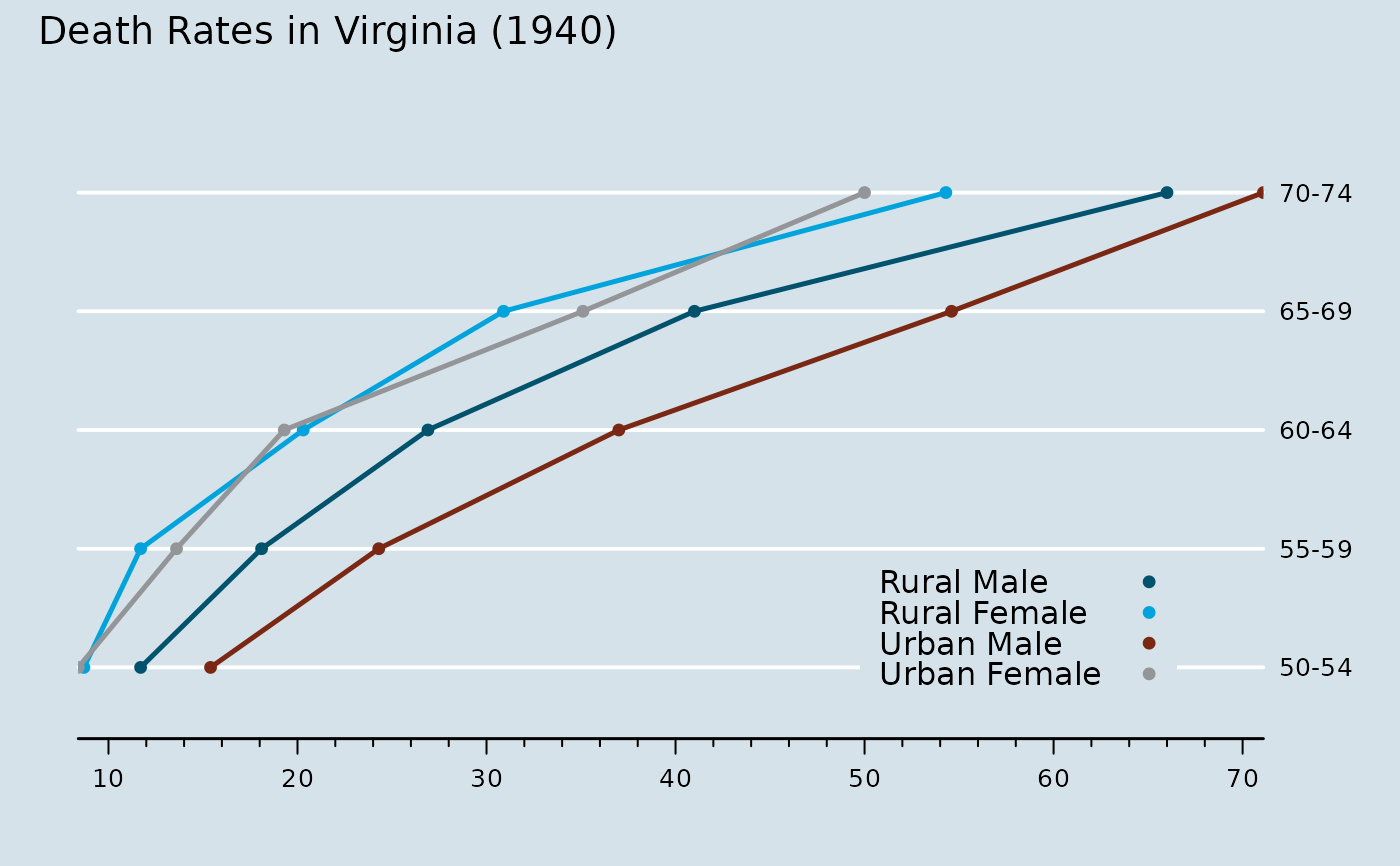
 asTheEconomist(
dotplot(VADeaths, main = "Death Rates in Virginia (1940)",
auto.key = list(corner = c(.9,0.1))),
type = "b", with.bg = TRUE)
asTheEconomist(
dotplot(VADeaths, main = "Death Rates in Virginia (1940)",
auto.key = list(corner = c(.9,0.1))),
type = "b", with.bg = TRUE)
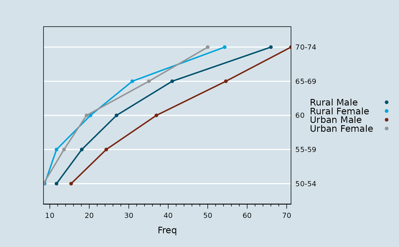
 dotplot(VADeaths, auto.key = TRUE, type = "b",
par.settings = theEconomist.theme(with.bg = TRUE))
dotplot(VADeaths, auto.key = TRUE, type = "b",
par.settings = theEconomist.theme(with.bg = TRUE))
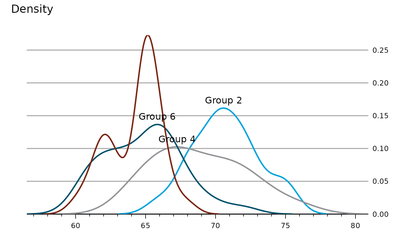
 asTheEconomist(
densityplot(~ height, groups = voice.part, data = singer,
subset = grep("1", voice.part), plot.points = FALSE)) +
glayer(d <- density(x), i <- which.max(d$y),
ltext(d$x[i], d$y[i], paste("Group", group.number), pos = 3))
asTheEconomist(
densityplot(~ height, groups = voice.part, data = singer,
subset = grep("1", voice.part), plot.points = FALSE)) +
glayer(d <- density(x), i <- which.max(d$y),
ltext(d$x[i], d$y[i], paste("Group", group.number), pos = 3))
 ## reset
trellis.par.set(opar)
lattice.options(oopt)
## reset
trellis.par.set(opar)
lattice.options(oopt)