vignettes/basics.Rmd
basics.RmdThis document explains concepts and basics of ggfortify. ggfortify helps plotting some popular R packages with ggplot2 in a unified way. See github to check the list of supported packages / classes.
Using ggplot2::autoplot
This is the easiest way provided by ggfortify. Calling
autoplot with supported instance should output appropriate
plot based on its type, as standard plot function does.
autoplot(AirPassengers)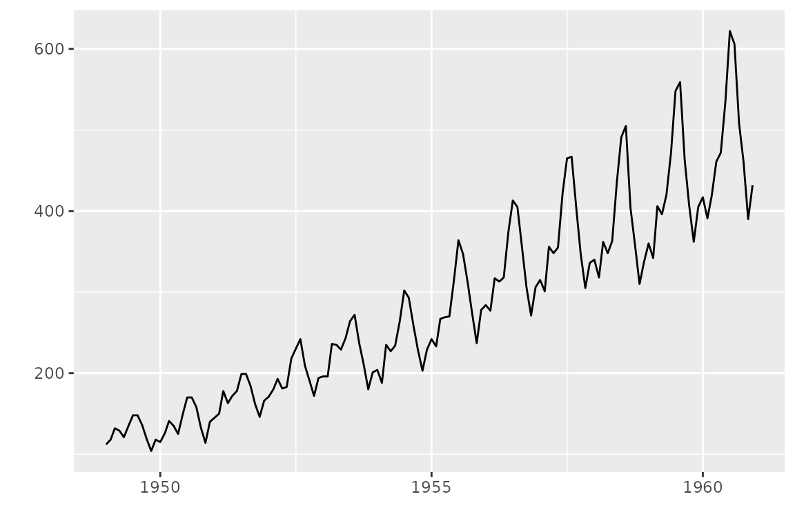
You can specify some options to control how plot looks. As is often
the case with statistic classes, there are some objects to be drawn,
such as actual value, predicted value and confidence interval, etc.
Thus, each plotting option has a dot-separated format like
<target name>.<ggplot option name> such as
ts.colour and conf.int.linetype.
These options can be used for the similar type of instances commonly.
For example, ts.colour works for all time-series-likes
(there is no separate options like xts.colour and
timeSeries.colour, etc). To check available options, use
help(autoplot.ts) or help(autoplot.*) for any
other objects.
autoplot(AirPassengers, ts.colour = 'blue')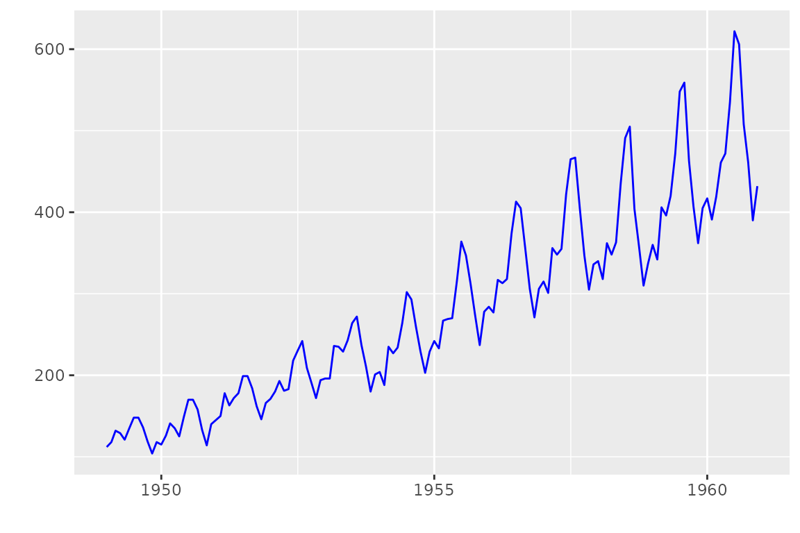
Decorating Plots
autoplot returns ggplot instance. Thus, you
can decorate as the same as in ggplot2. To make
autoplot API simple, ggfortify only offers
some limited options which must be done during ggplot
instance creation. Additional decoration should be done against the
returned ggplot instance.
## [1] "ggplot2::ggplot" "ggplot"          "ggplot2::gg"     "S7_object"
## [5] "gg"
# plot as it is
p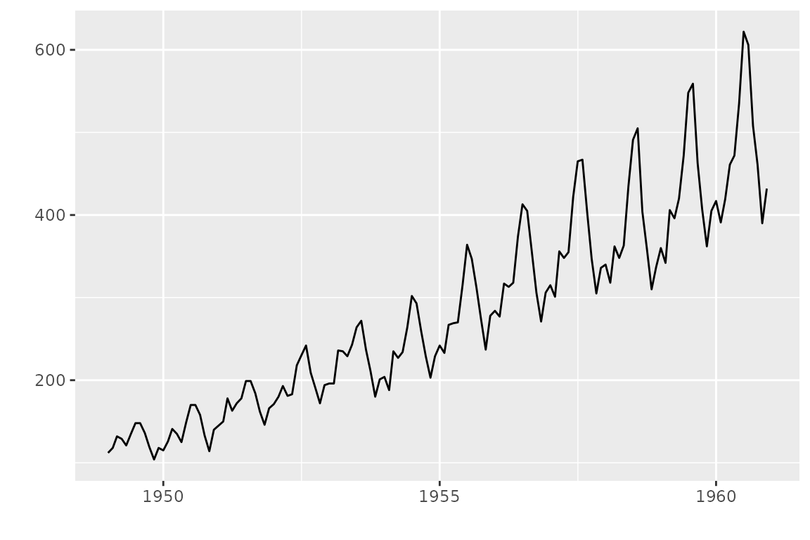
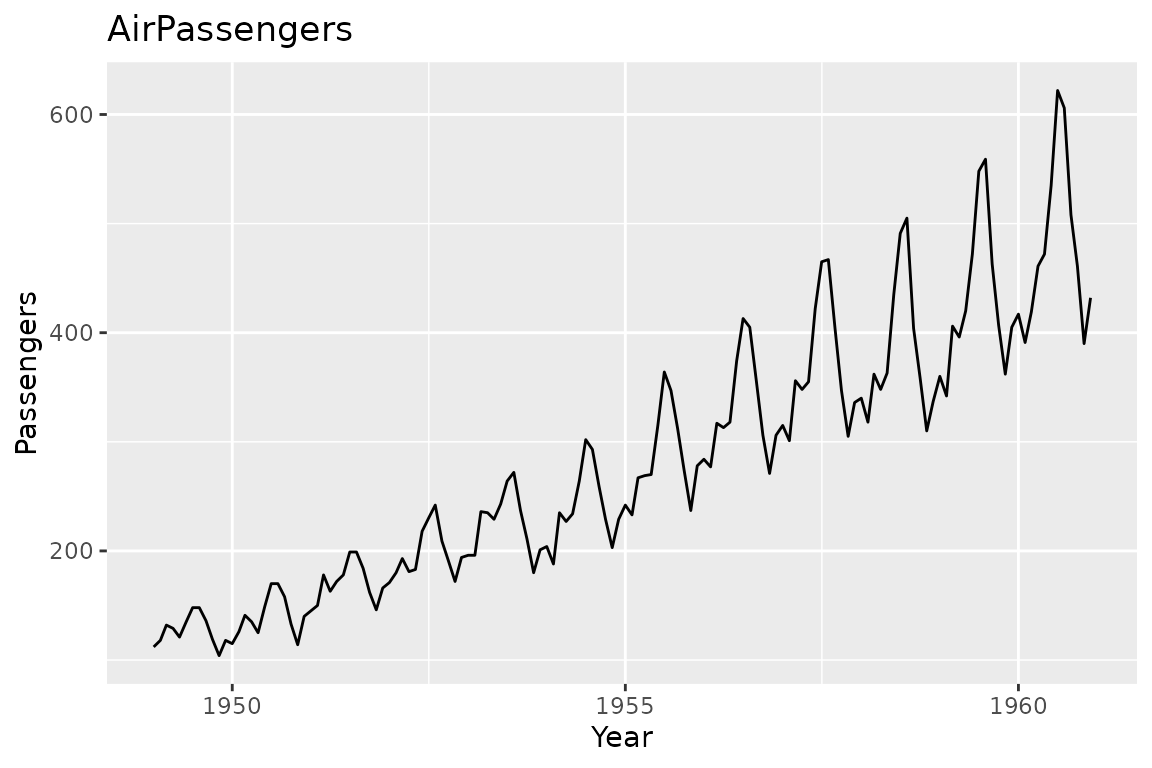
# these common options are supported as keywords
autoplot(AirPassengers, title = 'AirPassengers', xlab = 'Year', ylab = 'Passengers')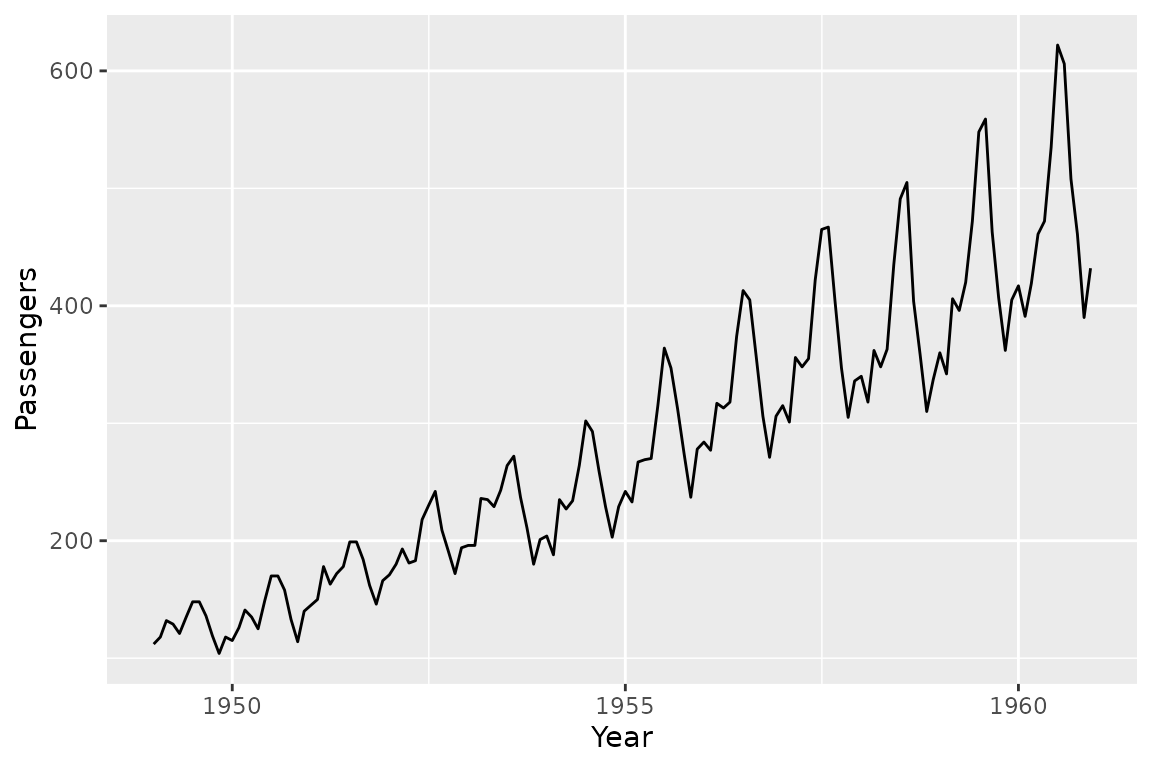
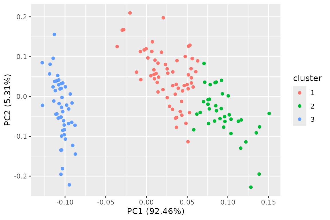
# change colour mapping
p + scale_colour_brewer()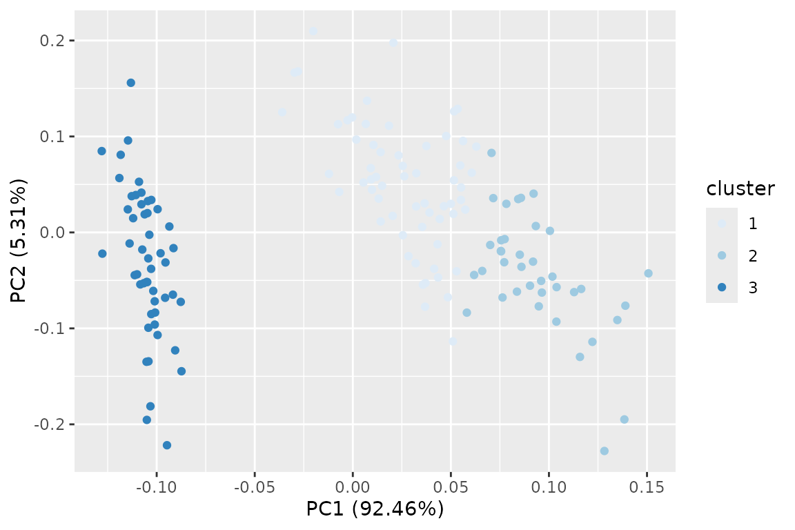
Want Different Plots?
Internally, autoplot calls a generic function named
ggplot2::fortify to convert the passed instance to
data.frame. ggfortify defines
fortify function for all supported classes. If you want a
different type of plot, you can use fortify to get
data.frame, then call ggplot in a normal
way.
Following example shows a bar plot counting records per k-means clusters.
##   Sepal.Length Sepal.Width Petal.Length Petal.Width Species cluster
## 1          5.1         3.5          1.4         0.2  setosa       1
## 2          4.9         3.0          1.4         0.2  setosa       1
## 3          4.7         3.2          1.3         0.2  setosa       1
## 4          4.6         3.1          1.5         0.2  setosa       1
## 5          5.0         3.6          1.4         0.2  setosa       1
## 6          5.4         3.9          1.7         0.4  setosa       1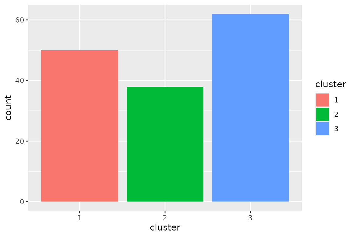
Handling Subplots
autoplot may draw subplots in some classes. For exmple,
autoplot.lm draws diagnostics plots as below.
Because ggplot2 itself cannot handle different kinds
of plots in a single instance, ggfortify handle them
using its original class named ggmultiplot. You can use
+ operator to decorate ggmultiplot.
Also, + operator appends plots if ggplot or
ggmultiplot instance is given as right-hand-side. Following
example attaches 2 scatter plots after diagnostics.
mp +
  (ggplot(trees, aes(Girth, Volume)) + geom_point()) +
  (ggplot(trees, aes(Girth, Height)) + geom_point())
You can extract subset using [ and [[
operators.
mp[2:3]
mp[[1]]You can extract arbitrary subset, modify, and draw.
mp[2:3] <- mp[2:3] + theme_bw()
mp
Draw Multiple Instances as Subplots
Assuming you want to plot multiple instances at once.
ggfortify can accept list of supported
instances and can output subplots.
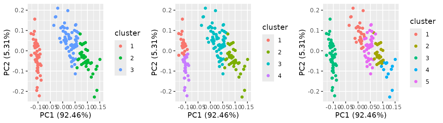
Following example shows 3 kmeans plots changing number
of clusters.
Next example shows multiple survival curves as subplots.
library(survival)
res <- list(a = survfit(Surv(time, status) ~ 1, data = lung),
            b = survfit(Surv(time, status) ~ sex, data = lung))
autoplot(res)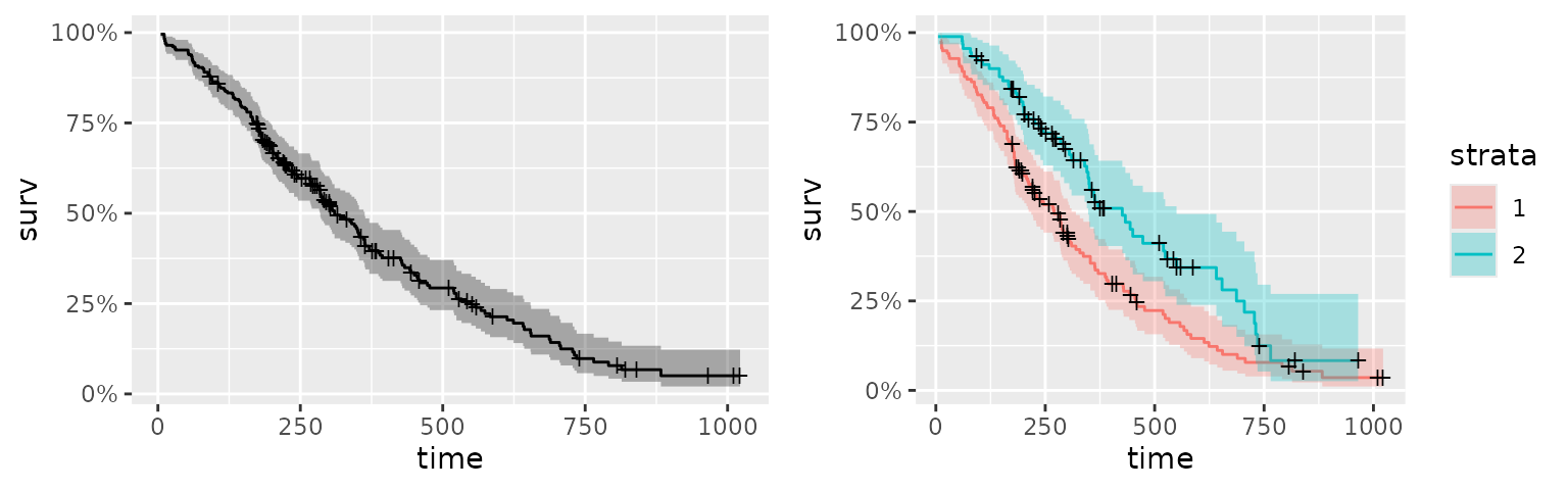
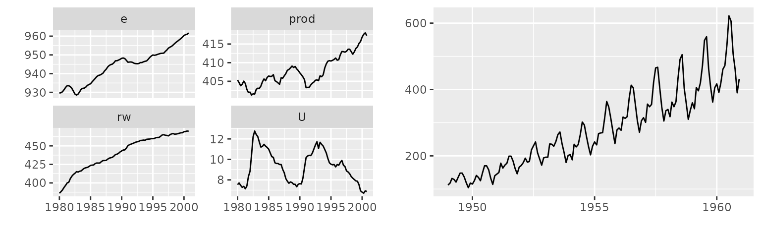
You can pass a list contains different classes to
autoplot.
Create your own subplots
You can instanciate ggmultiplot from a list
of ggplot instances.
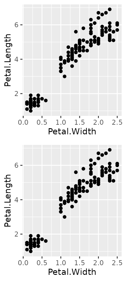
p1 <- ggplot(iris, aes(Petal.Width, Petal.Length)) + geom_point()
p2 <- ggplot(iris, aes(Petal.Width, Petal.Length)) + geom_point()
new('ggmultiplot', plots = list(p1, p2))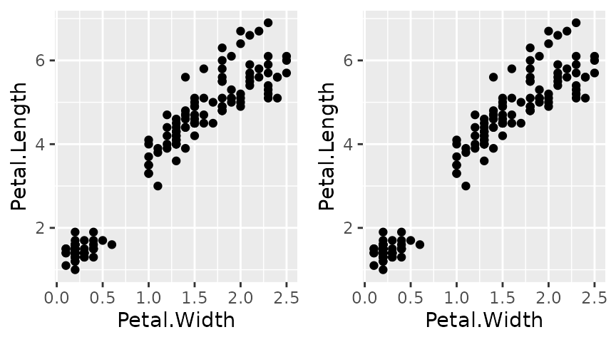
Layout can be specified via nrow and ncol
keywords.