vignettes/plot_pca.Rmd
plot_pca.RmdThis document explains PCA, clustering, LFDA and MDS related plotting using ggplot2 and ggfortify.
Plotting PCA (Principal Component Analysis)
ggfortify let ggplot2 know how to
interpret PCA objects. After loading ggfortify, you can
use ggplot2::autoplot function for
stats::prcomp and stats::princomp objects.
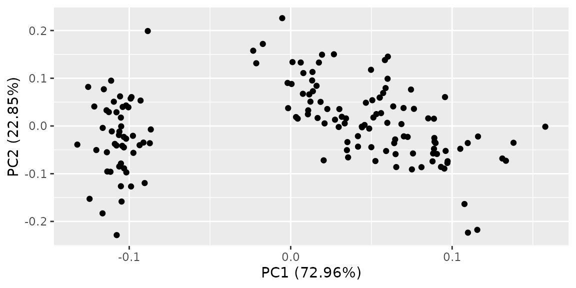
PCA result should only contains numeric values. If you want to
colorize by non-numeric values which original data has, pass original
data using data keyword and then specify column name by
colour keyword. Use help(autoplot.prcomp) (or
help(autoplot.*) for any other objects) to check available
options.
autoplot(pca_res, data = iris, colour = 'Species')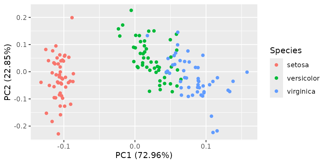
Passing label = TRUE draws each data label using
rownames
autoplot(pca_res, data = iris, colour = 'Species', label = TRUE, label.size = 3)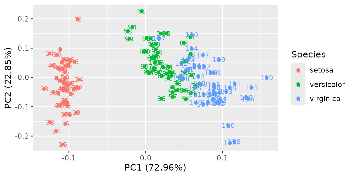
Passing shape = FALSE makes plot without points. In this
case, label is turned on unless otherwise specified.
autoplot(pca_res, data = iris, colour = 'Species', shape = FALSE, label.size = 3)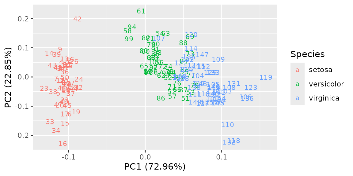
Passing loadings = TRUE draws eigenvectors.
autoplot(pca_res, data = iris, colour = 'Species', loadings = TRUE)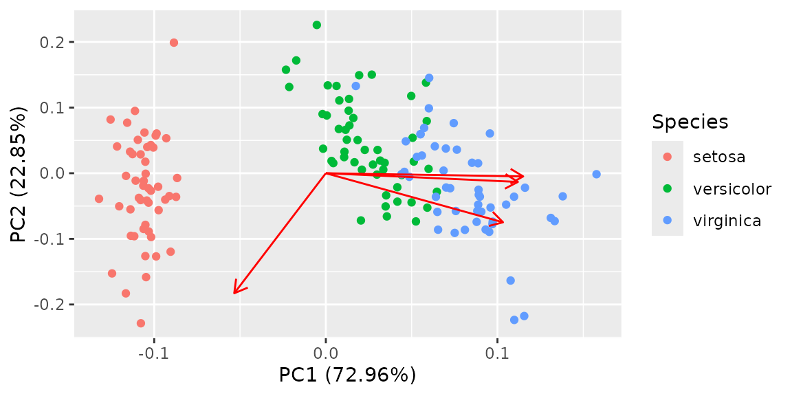
You can attach eigenvector labels and change some options.
autoplot(pca_res, data = iris, colour = 'Species',
         loadings = TRUE, loadings.colour = 'blue',
         loadings.label = TRUE, loadings.label.size = 3)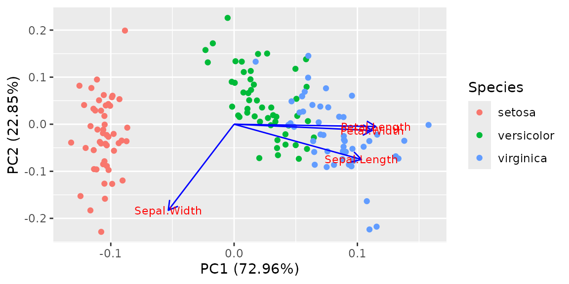
By default, each component are scaled as the same as standard
biplot. You can disable the scaling by specifying
scale = 0
autoplot(pca_res, scale = 0)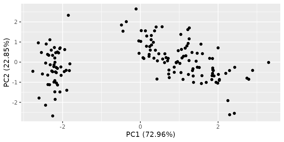
Plotting Factor Analysis
ggfortify supports stats::factanal object
as the same manner as PCAs. Available opitons are the same as PCAs.
Important You must specify scores
option when calling factanal to calcurate sores (default
scores = NULL). Otherwise, plotting will fail.
d.factanal <- factanal(state.x77, factors = 3, scores = 'regression')
autoplot(d.factanal, data = state.x77, colour = 'Income')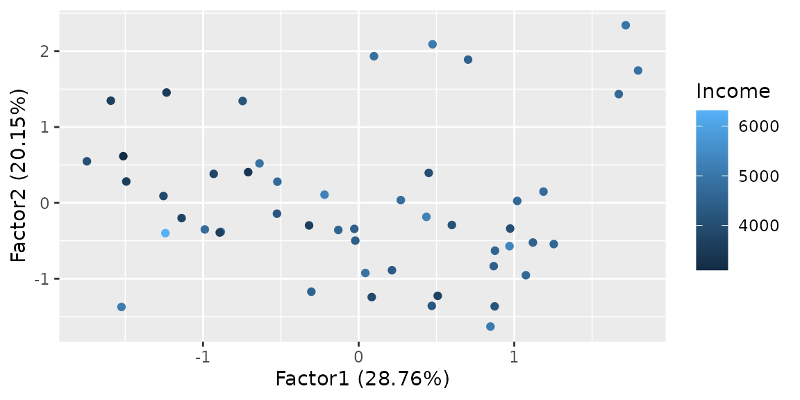
autoplot(d.factanal, label = TRUE, label.size = 3,
         loadings = TRUE, loadings.label = TRUE, loadings.label.size  = 3)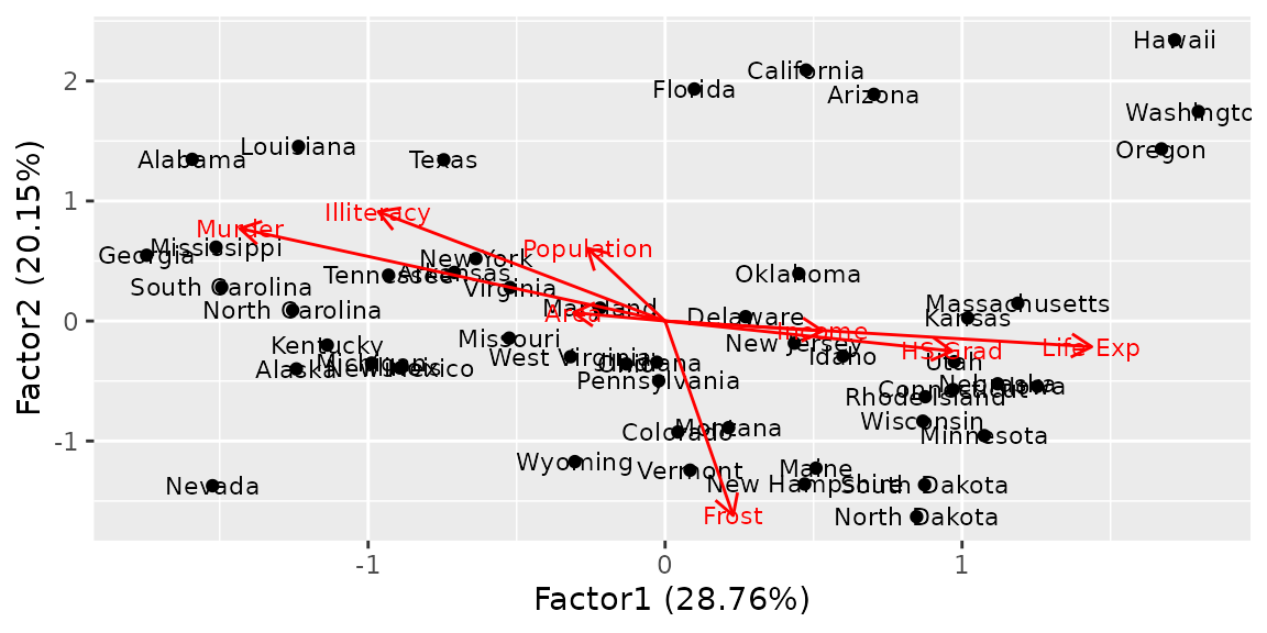
Plotting K-means
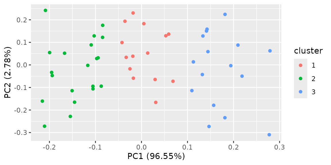
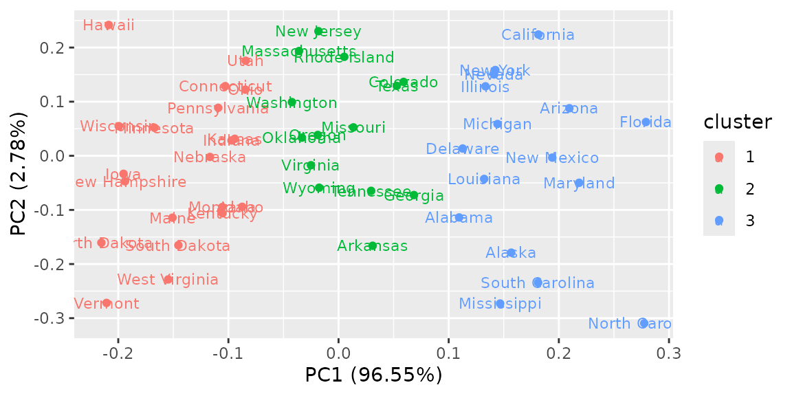
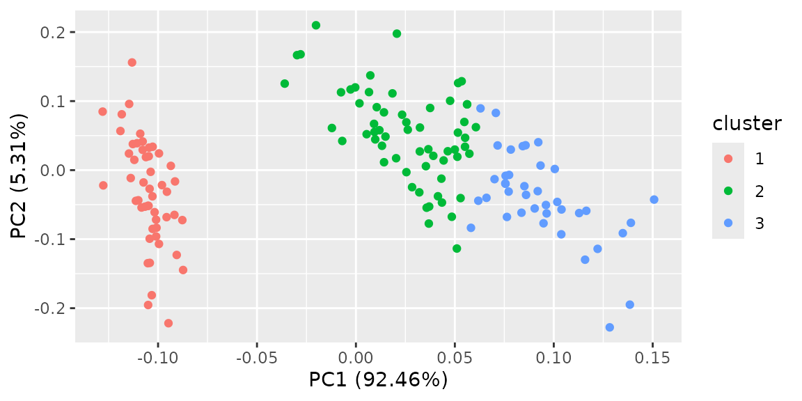
ggfortify supports stats::kmeans class.
You must explicitly pass original data to autoplot function
via data keyword. Because kmeans object
doesn’t store original data. The result will be automatically colorized
by categorized cluster.
Plotting cluster package
ggfortify supports cluster::clara,
cluster::fanny, cluster::pam as well as
cluster::silhouette classes. Because these instances should
contains original data in its property, there is no need to pass
original data explicitly.
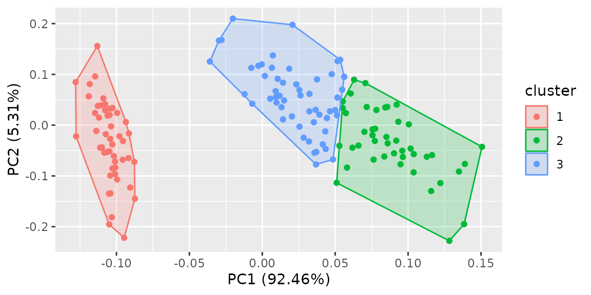
Specifying frame = TRUE in autoplot for
stats::kmeans and cluster::* draws convex for
each cluster.
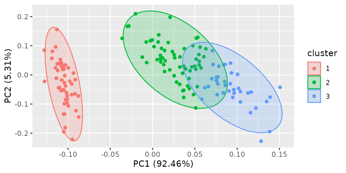
If you want probability ellipse, ggplot2 1.0.0 or
later is required. Specify whatever supported in ggplot2::stat_ellipse’s
type keyword via frame.type option.
If you want a Silhouette plot, pass a Silhouette object to
autoplot function.
autoplot(silhouette(pam(iris[-5], 3L)))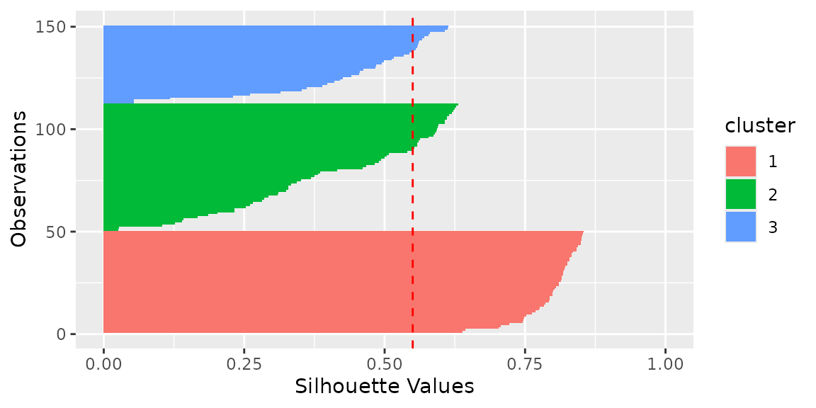
For more information on Silhouette plots and how they can be used, see base R example, scikit-learn example and original paper.
Plotting Local Fisher Discriminant Analysis with {lfda}
package
lfda package supports a set of Local Fisher
Discriminant Analysis methods. You can use autoplot to plot
the analysis result as the same manner as PCA.
library(lfda)

# Local Fisher Discriminant Analysis (LFDA)
model <- lfda(iris[-5], iris[, 5], r = 3, metric="plain")
autoplot(model, data = iris, frame = TRUE, frame.colour = 'Species')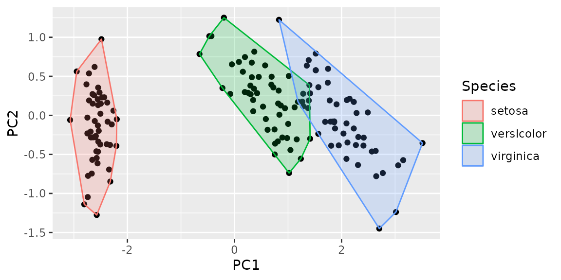
# Semi-supervised Local Fisher Discriminant Analysis (SELF)
model <- self(iris[-5], iris[, 5], beta = 0.1, r = 3, metric="plain")
autoplot(model, data = iris, frame = TRUE, frame.colour = 'Species')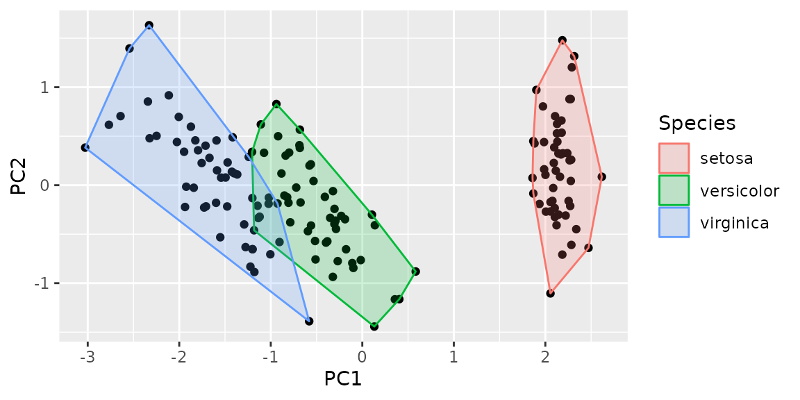
Plotting Multidimensional Scaling
Before Plotting
Even though MDS functions returns matrix or
list (not specific class), ggfortify can
infer background class from list attribute and perform
autoplot.
NOTE Inference from matrix is not
supported.
NOTE ggfortify can plot
stats::dist instance as heatmap.
autoplot(eurodist)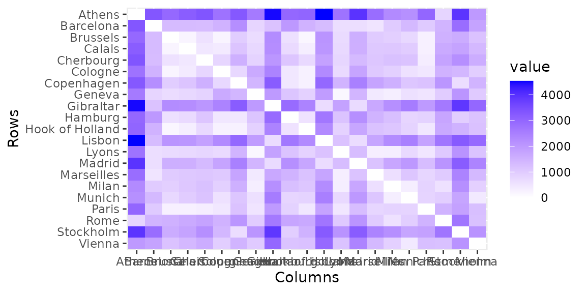
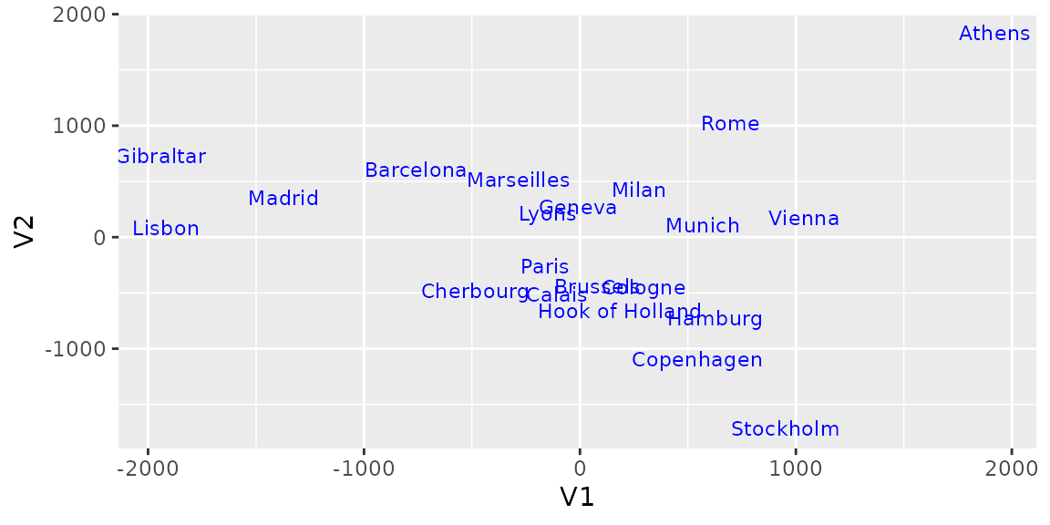
Plotting Classical (Metric) Multidimensional Scaling
stats::cmdscale performs Classical MDS and returns point
coodinates as matrix, thus you can not use
autoplot in this case. However, either
eig = TRUE, add = True or
x.ret = True is specified, stats::cmdscale
return list instead of matrix. In these cases,
ggfortify can infer how to plot it via
autoplot. Refer to help(cmdscale) to check
what these options are.
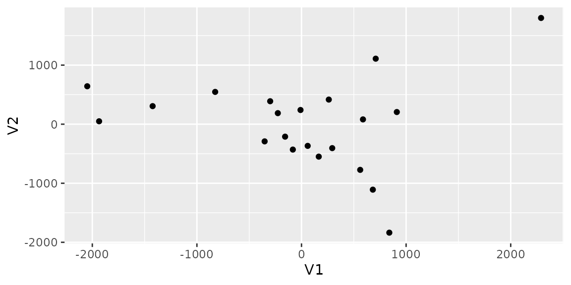
Specify label = TRUE to plot labels.
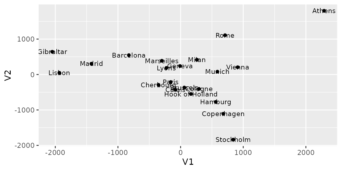
Plotting Non-metric Multidimensional Scaling
MASS::isoMDS and MASS::sammon perform
Non-metric MDS and return list which contains point
coordinates. Thus, autoplot can be used.
NOTE On background, autoplot.matrix is
called to plot MDS. See help(autoplot.matrix) to check
available options.
## initial  value 7.505733
## final  value 7.505688
## converged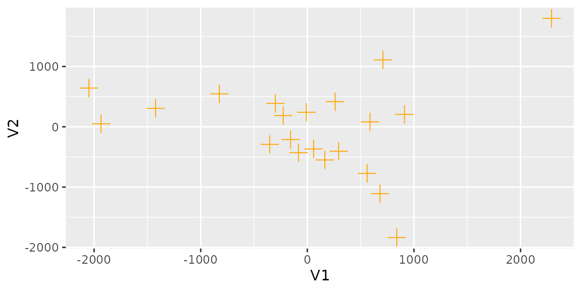
Passing shape = FALSE makes plot without points. In this
case, label is turned on unless otherwise specified.
## Initial stress        : 0.01705
## stress after  10 iters: 0.00951, magic = 0.500
## stress after  20 iters: 0.00941, magic = 0.500