vignettes/plot_ts.Rmd
plot_ts.RmdThis document explains time series related plotting using
ggplot2 and ggfortify.
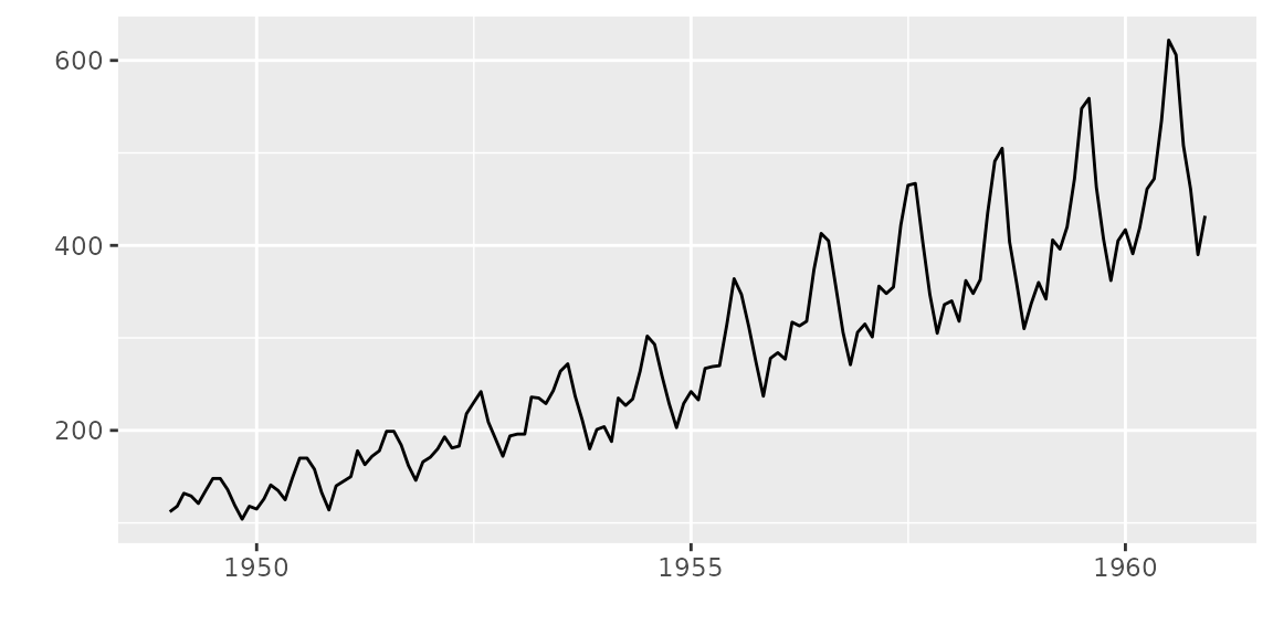
Plotting ts objects
ggfortify let ggplot2 know how to
interpret ts objects. After loading
ggfortify, you can use ggplot2::autoplot
function for ts objects.
To change line colour and line type, use ts.colour and
ts.linetype options. Use help(autoplot.ts) (or
help(autoplot.*) for any other objects) to check available
options.
autoplot(AirPassengers, ts.colour = 'red', ts.linetype = 'dashed')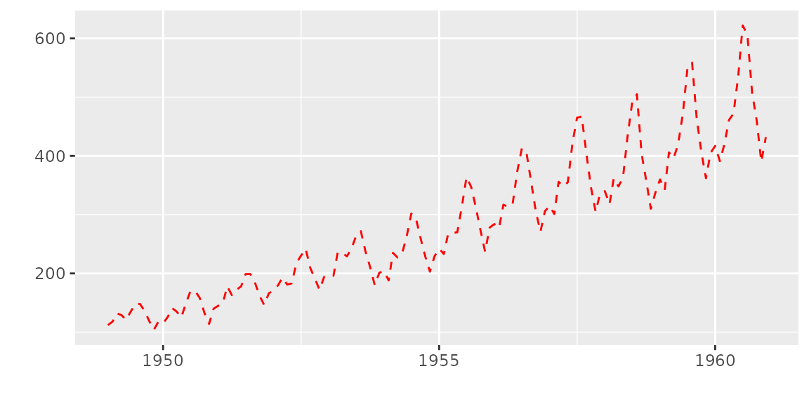
Multivariate time series will be drawn with facets.
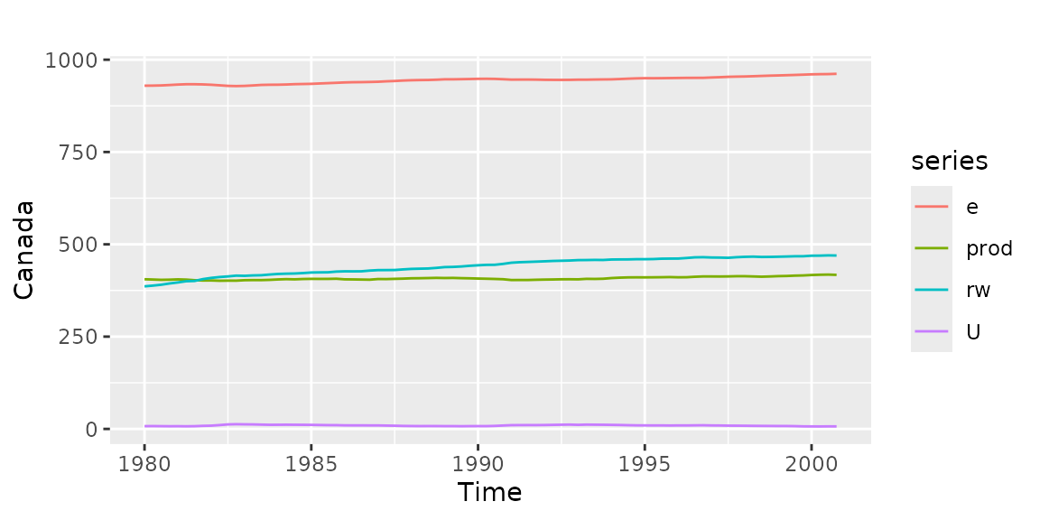
Specify facets = FALSE to draw on single axes.
autoplot(Canada, facets = FALSE)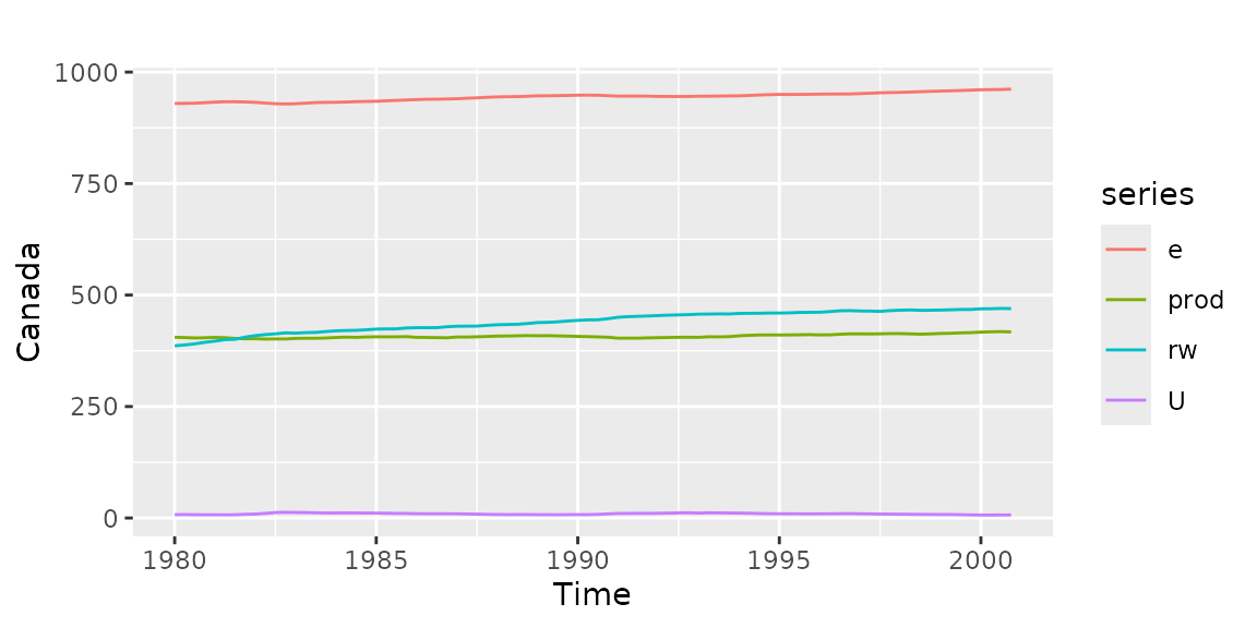
Also, autoplot can handle other time-series-likes.
Supported packages are:
zoo::zooregxts::xtstimeSeries::timSeriestseries::irts
library(xts)
autoplot(as.xts(AirPassengers), ts.colour = 'green')

library(timeSeries)
autoplot(as.timeSeries(AirPassengers), ts.colour = ('dodgerblue3'))
Specifying geometrics
You can change ggplot2 geometrics specifying by its
name. Geometrics currently supported are line,
bar, ribbon and point.
autoplot(AirPassengers, ts.geom = 'bar', fill = 'blue')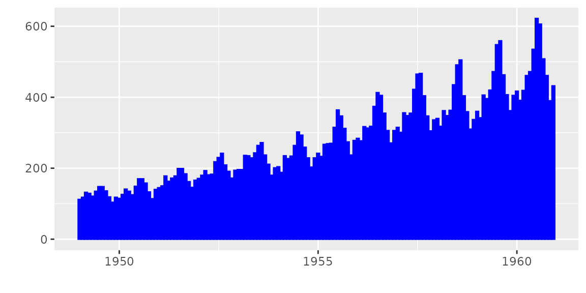
autoplot(AirPassengers, ts.geom = 'ribbon', fill = 'green')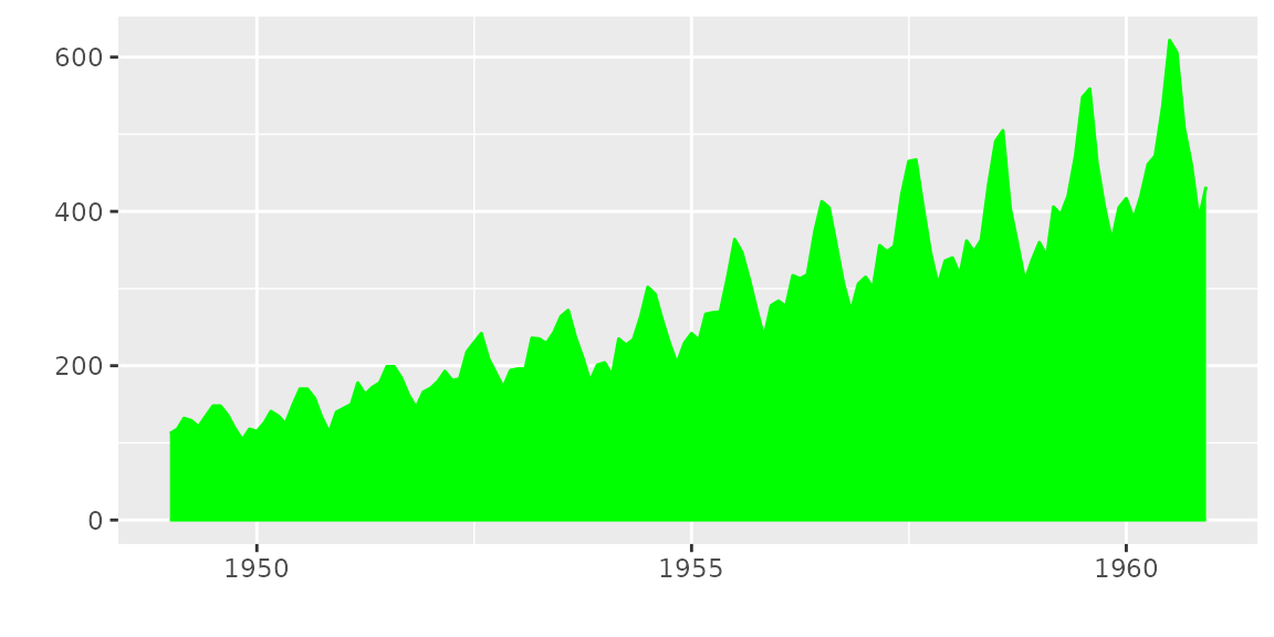
autoplot(AirPassengers, ts.geom = 'point', shape = 3)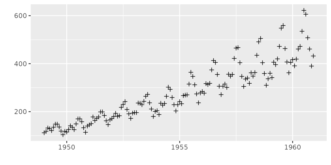
As described above, multivariate timeseries can be drawn in a single
grid specifying facets = FALSE. Time series are not stacked
by default. Specifying stacked = TRUE allows stacking.
mts <- ts(data.frame(a = c(1, 2, 3, 4, 4, 3), b = c(3, 2, 3, 2, 2, 1)), start = 2010)
autoplot(mts, ts.geom = 'bar', facets = FALSE)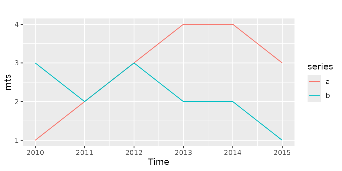
autoplot(mts, ts.geom = 'bar', facets = FALSE, stacked = TRUE)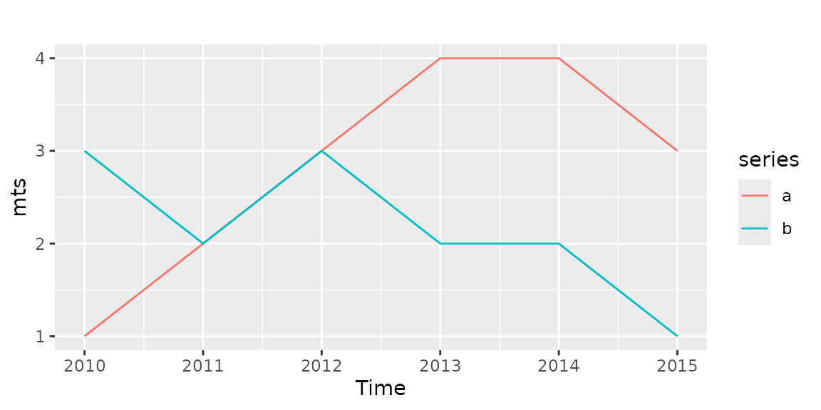
autoplot(mts, ts.geom = 'ribbon', facets = FALSE)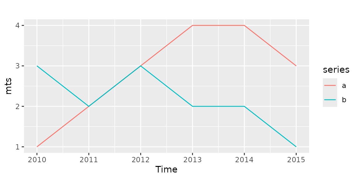
autoplot(mts, ts.geom = 'ribbon', facets = FALSE, stacked = TRUE)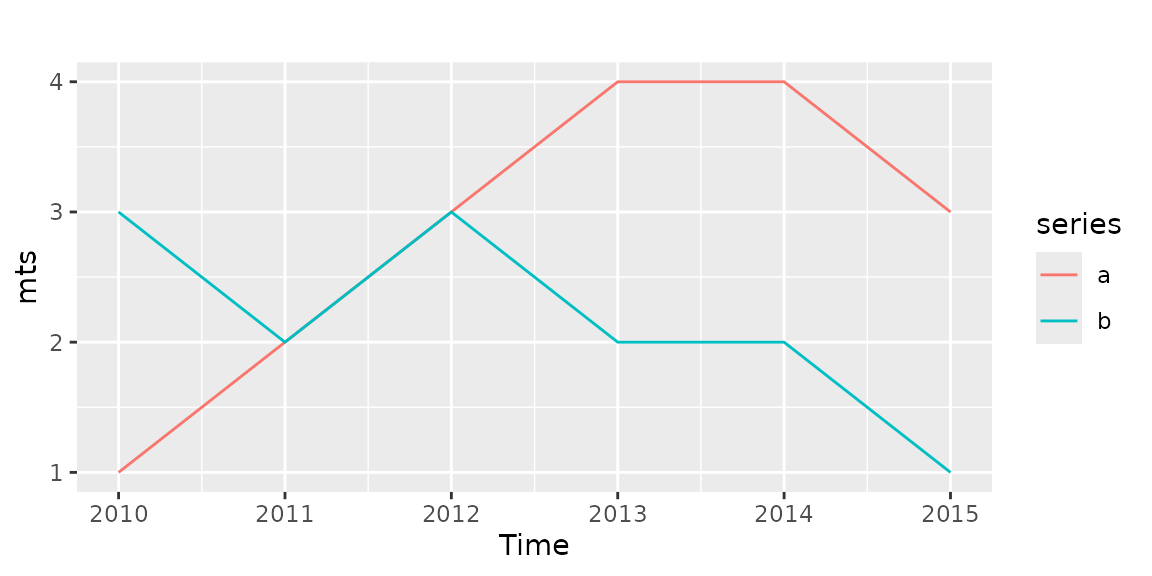
Plotting with forecast package
ggfortify supports forecast object in the
forecast package.
library(forecast)
d.arima <- auto.arima(AirPassengers)
d.forecast <- forecast(d.arima, level = c(95), h = 50)
autoplot(d.forecast)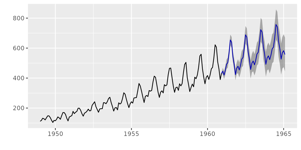
There are some options to change basic settings.
autoplot(d.forecast, ts.colour = 'firebrick1', predict.colour = 'red',
         predict.linetype = 'dashed', conf.int = FALSE)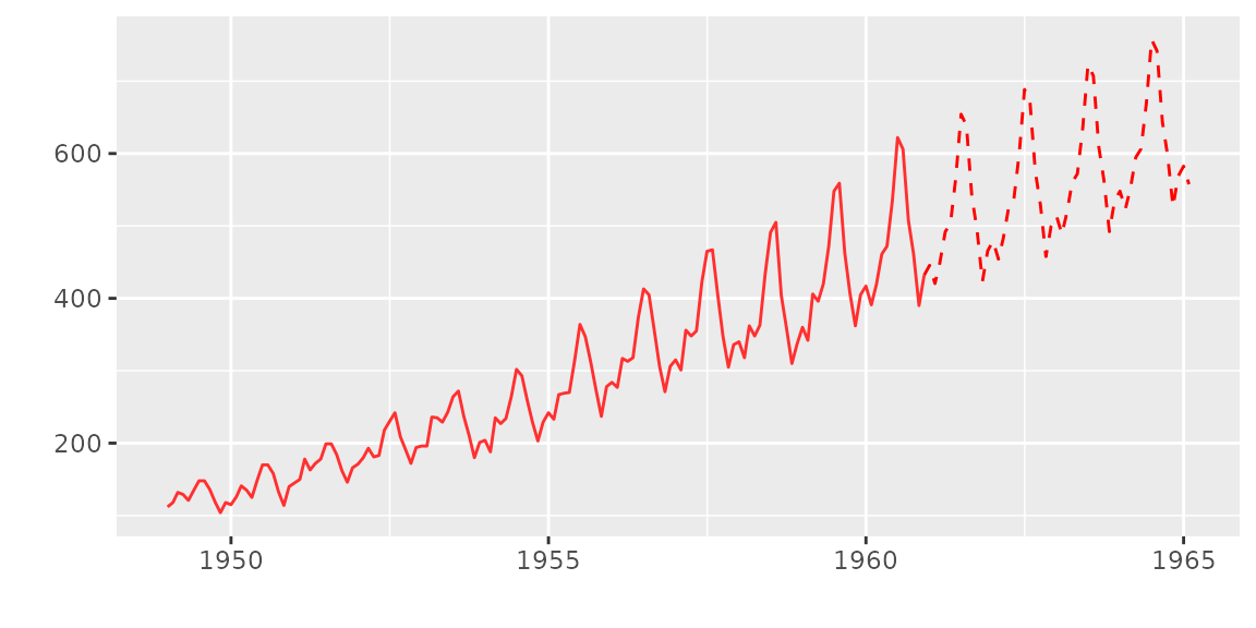
Plotting with vars package
ggfortify supports varpred object in
vars package.
library(vars)
d.vselect <- VARselect(Canada, lag.max = 5, type = 'const')$selection[1]
d.var <- VAR(Canada, p = d.vselect, type = 'const')
Available options are the same as forecast.
autoplot(predict(d.var, n.ahead = 50), ts.colour = 'dodgerblue4',
         predict.colour = 'blue', predict.linetype = 'dashed')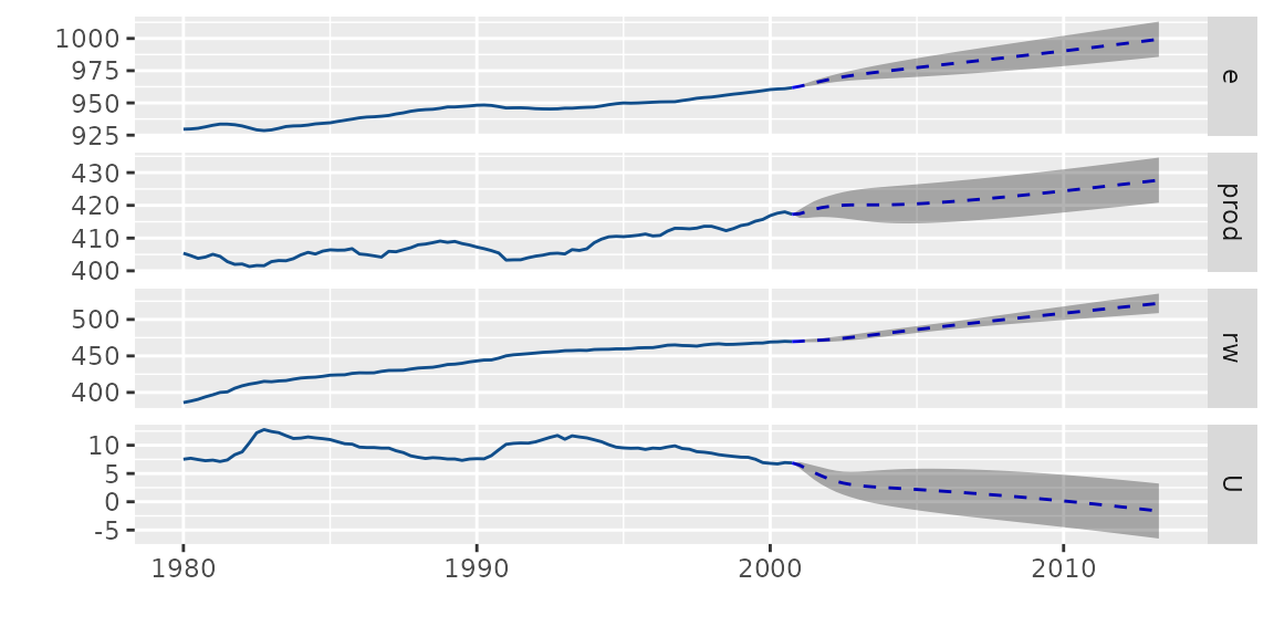
Plotting with changepoint package
{ggfortify, eval=hasDep} supports cpt
object in changepoint package.
library(changepoint)
autoplot(cpt.meanvar(AirPassengers))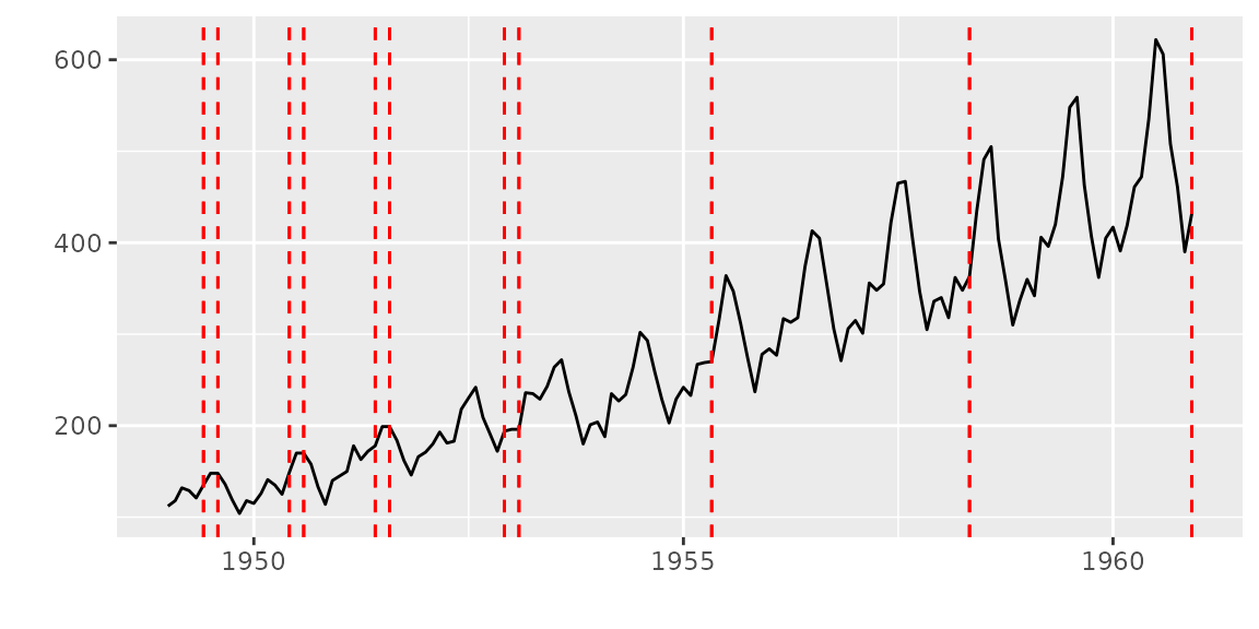
You can change some options for cpt.
autoplot(cpt.meanvar(AirPassengers), cpt.colour = 'blue', cpt.linetype = 'solid')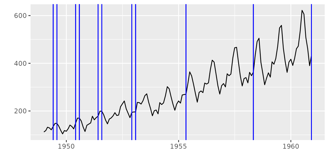
Plotting with strucchange package
ggfortify supports breakpoints object in
strucchange package. Same plotting options as
changepoint are available.
library(strucchange)
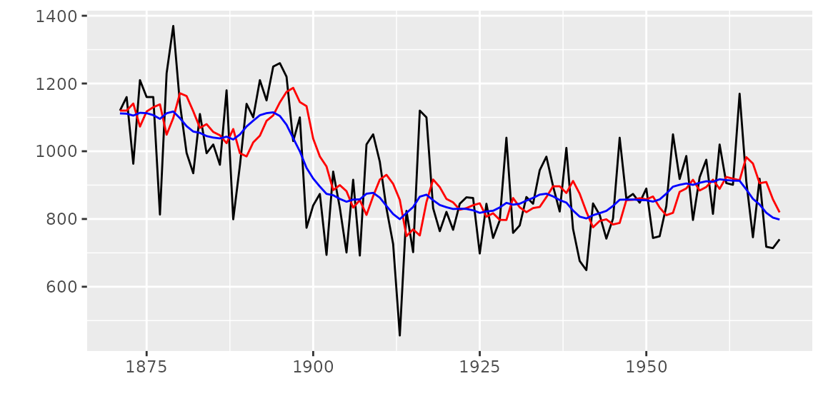
autoplot(breakpoints(Nile ~ 1), ts.colour = 'blue', ts.linetype = 'dashed',
         cpt.colour = 'dodgerblue3', cpt.linetype = 'solid')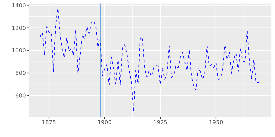
Plotting with {KFAS} package
You can use autoplot in almost the same manner as
{dlm}. Note that autoplot draws smoothed
result if it exists in KFAS::KFS instance, and
KFAS::KFS contains smoothed result by default.
library(KFAS)
model <- SSModel(
  Nile ~ SSMtrend(degree=1, Q=matrix(NA)), H=matrix(NA)
)

fit <- fitSSM(model=model, inits=c(log(var(Nile)),log(var(Nile))), method="BFGS")
smoothed <- KFS(fit$model)
autoplot(smoothed)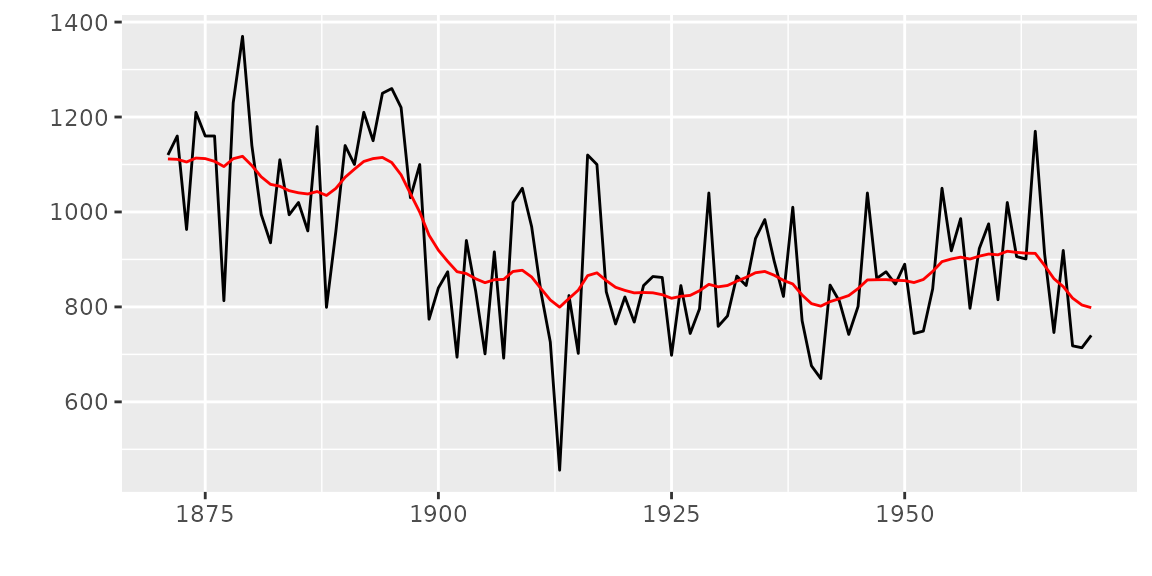
If you want filtered result, specify smoothing='none'
when calling KFS. For details, see
help(KFS).
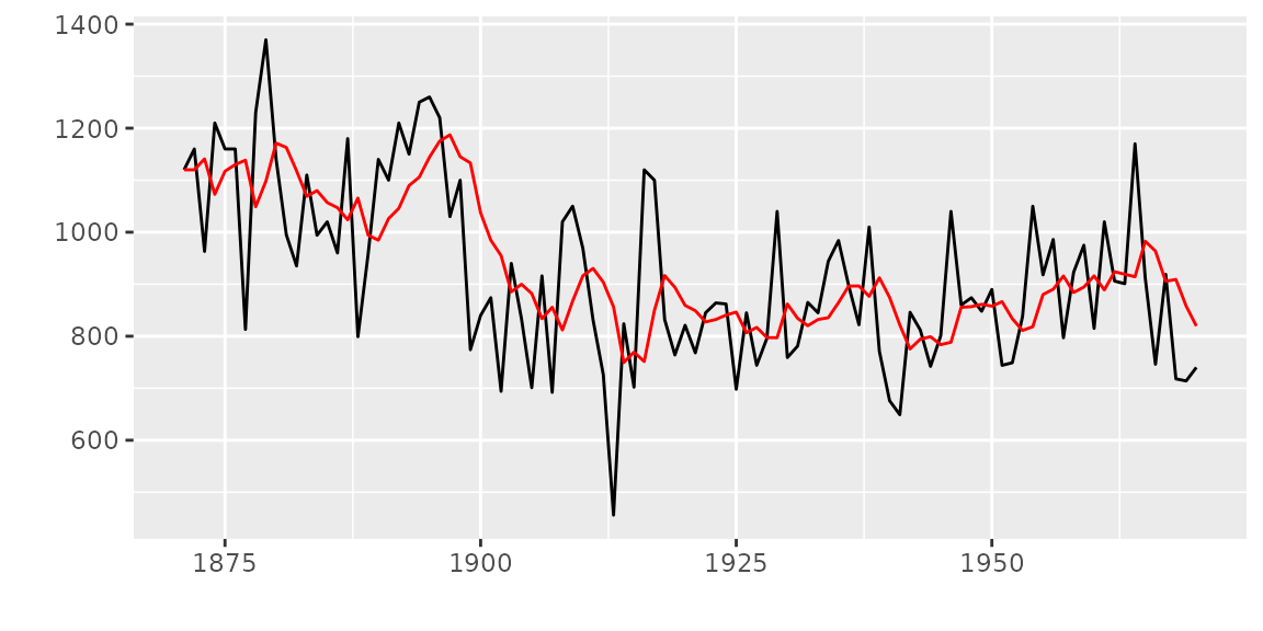
Also, KFAS::signal will retrieve specific state from
KFAS::KFS instance. The result will be a list
which contains the retrieved state as ts in
signal attribute. ggfortify can autoplot it
using class inference.
## [1] "list"Because signal is a ts instance, you can
use autoplot and p option as the same as
dlm::dlmSmooth example.
Plotting time series statistics
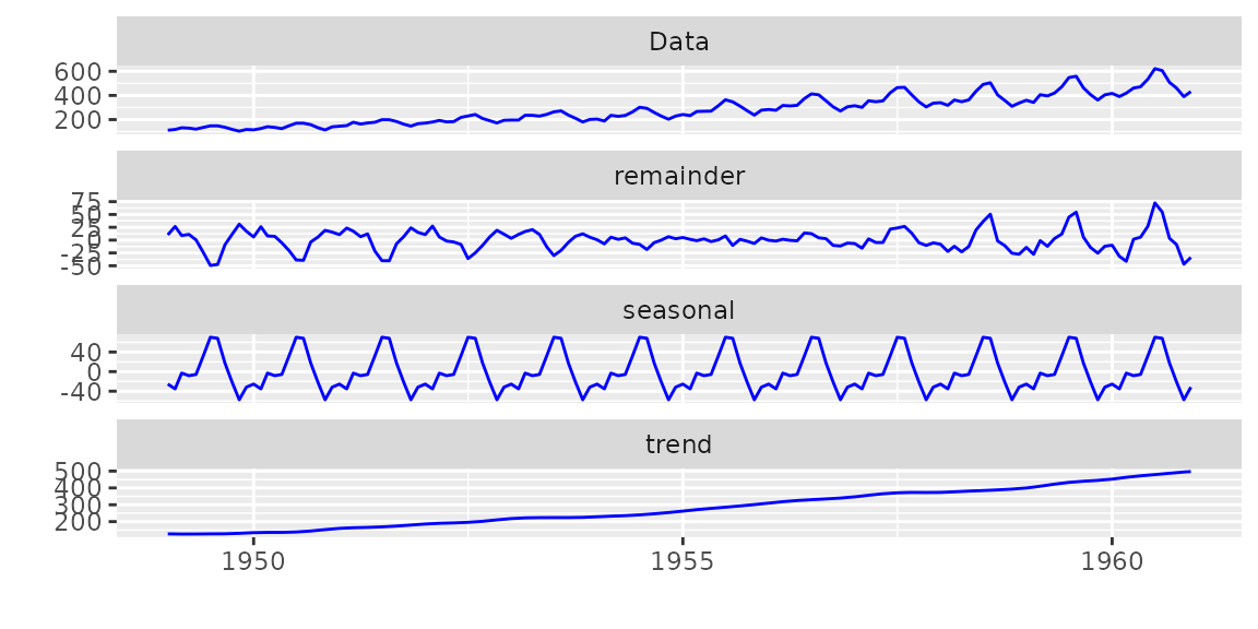
ggfortify supports following time series related
statistics in stats package:
-
stl,decomposed.ts -
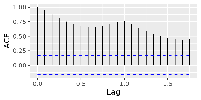
acf,pacf,ccf -
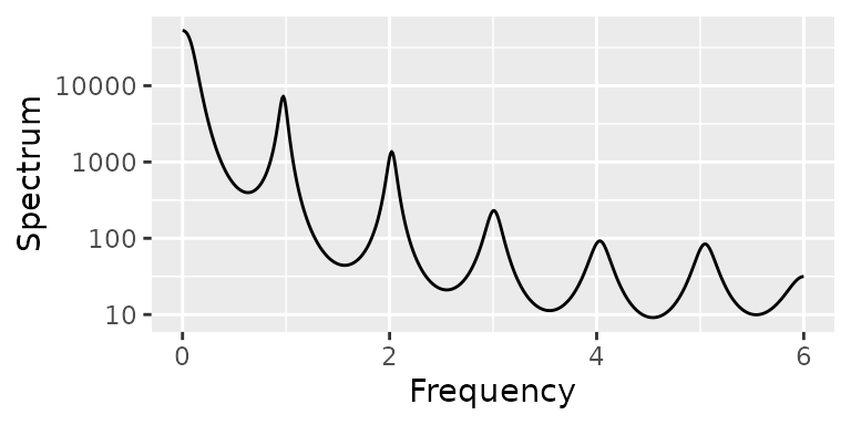
spec.ar,spec.pgram -
cpgram(covered byggcpgram)
NOTE With acf and spec.*,
specify plot = FALSE to suppress default plotting
outputs.
You can pass some options when plotting acf via
autoplot. Built-in acf calcurates the
confidence interval at plotting time and doesn’t hold the result,
equivalent options can be passed to autoplot. Following
example shows to change the value of confidence interval and method (use
ma assuming the input follows MA model).
autoplot(acf(AirPassengers, plot = FALSE), conf.int.fill = '#0000FF', conf.int.value = 0.8, conf.int.type = 'ma')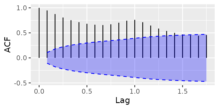
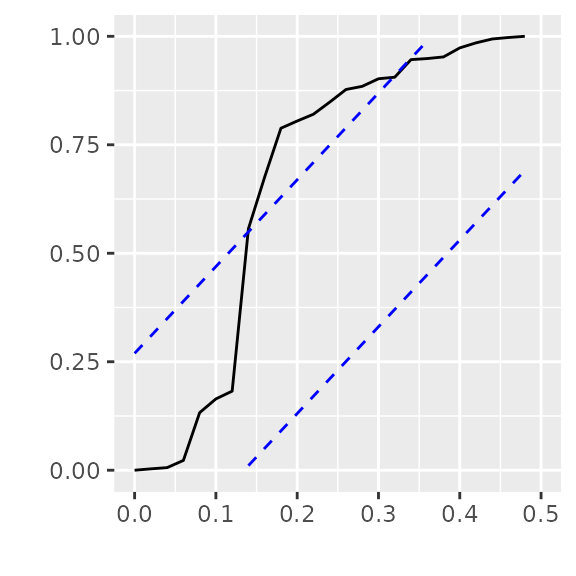
ggcpgram should output the cumulative periodogram as the
same as cpgram. Because cpgram doesn’t have
return value, we cannot use autoplot(cpgram(...)).
ggtsdiag should output the similar diagram as
tsdiag.
library(forecast)
ggtsdiag(auto.arima(AirPassengers))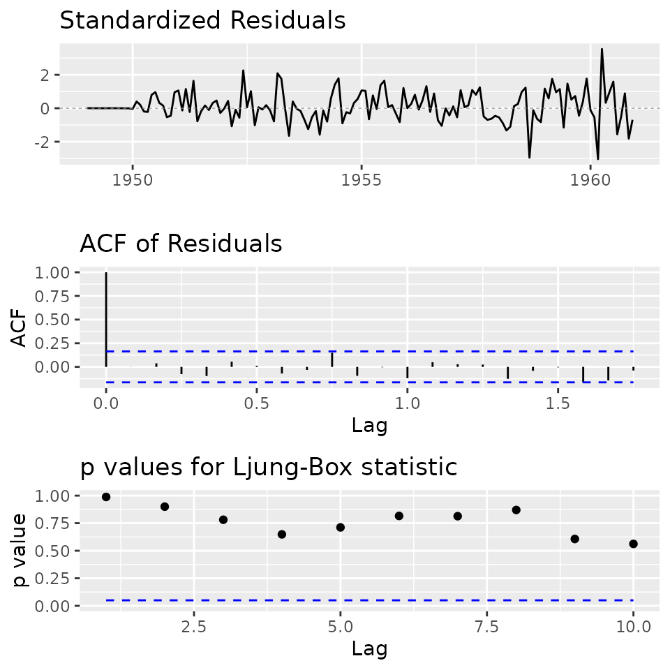
ggfreqplot is a genelarized month.plot. You
can pass freq if you want, otherwise time-series’s
frequency will be used.
ggfreqplot(AirPassengers)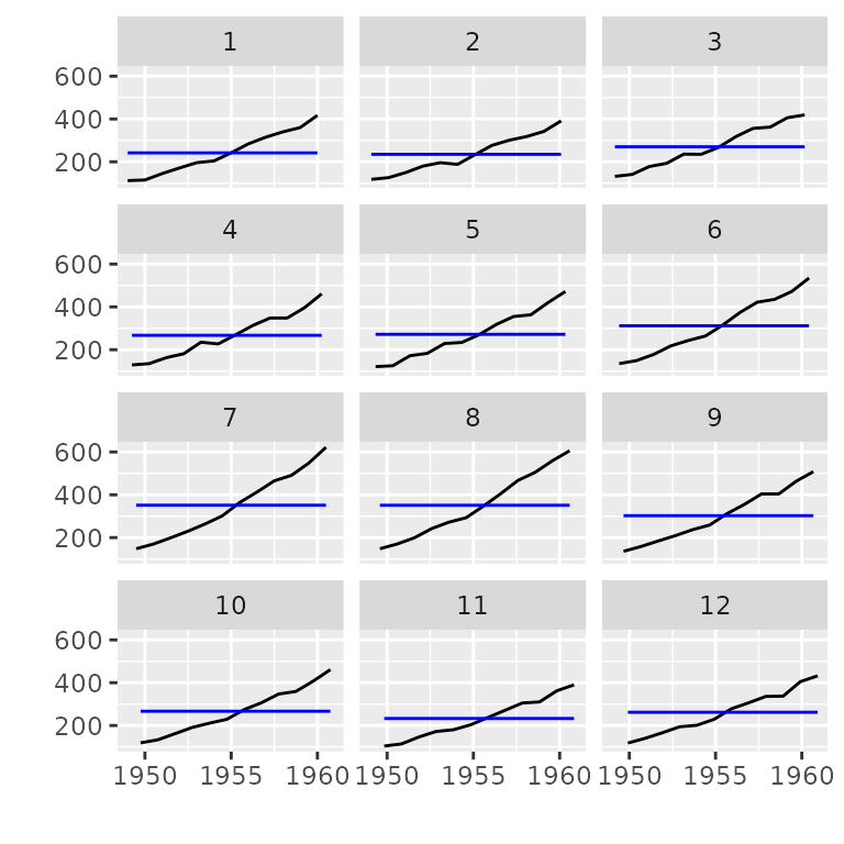
ggfreqplot(AirPassengers, freq = 4)